

HTML5 responsive banner
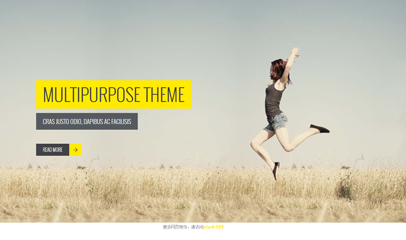
HTML5 responsive banner
All resources on this site are contributed by netizens or reprinted by major download sites. Please check the integrity of the software yourself! All resources on this site are for learning reference only. Please do not use them for commercial purposes. Otherwise, you will be responsible for all consequences! If there is any infringement, please contact us to delete it. Contact information: admin@php.cn
Related Article
 Sony Touts 'Strong' Marathon Engagement, Confirms Release Window
14 Jun 2025
Sony’s Herman Hulst made a point during his overview of PlayStation’s portfolio to highlight Marathon as “an innovative and bold take on the extraction shooter genre.” A corresponding slide under the “FY25 Focus” banner added that there is “Strong ea
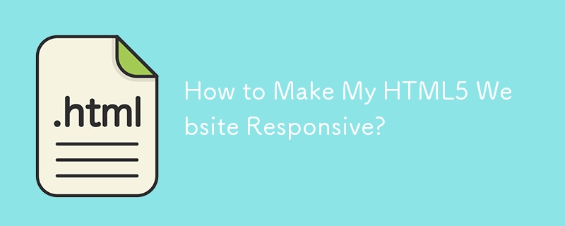 How to Make My HTML5 Website Responsive?
10 Mar 2025
This article details creating responsive HTML5 websites. It emphasizes using viewport meta tags, flexible layouts (with relative units), CSS media queries, and responsive images. Various CSS frameworks (Bootstrap, Tailwind CSS, etc.) and testing me
 Applying HTML5 Principles to Responsive Web Design
15 Jul 2025
HTML5 improves responsive design through semantic tags, viewport control, responsive pictures and form optimization. 1. Use semantic tags such as, etc. to improve structural clarity, making it easier to flexibly arrange content blocks according to different devices; 2. By controlling mobile display, ensure that the page is correctly scaled and improve the mobile experience; 3. Use responsive image loading with tags, load adaptive resources according to screen size, and improve performance; 4. Use HTML5 form types such as email and tel to optimize mobile input, trigger the corresponding keyboard to improve user experience.
 Html5 Css3 Banner Animation multi-directional movement effects_html/css_WEB-ITnose
24 Jun 2016
Html5 Css3 Banner Animation multi-directional movement effects
 Using HTML5 Source Set for Responsive Images (srcset)
05 Jul 2025
How to implement responsive image loading on different devices? Use HTML5's srcset and sizes properties. The specific methods are: 1. Prepare pictures of multiple sizes and mark the width with w units; 2. Define the viewport ratio of pictures under different screen widths in sizes, such as (max-width: 600px)100vw; 3. Pay attention to setting DPR high-definition adaptation, such as 1x/2x descriptor; 4. Always keep src as a compatibility solution; 5. Plan the image size according to the device breakpoint, such as 480px/768px/1024px, etc.; 6. Test the loading effect of each size through the developer tool. This ensures that the browser accurately selects the best picture, taking into account loading speed and display quality.
 Implementing Responsive Images with the HTML5 Picture Element
14 Jul 2025
Elements are container elements introduced by HTML5 for implementing responsive pictures, which select the most suitable image resource according to device characteristics through multiple and one tag. 1. It supports loading adaptive pictures according to different screen widths to improve loading performance; 2. It can provide priority to modern formats such as WebP, which will fall back to traditional formats if not supported; 3. It can switch different compositions according to the aspect ratio of the device to optimize visual display; in addition, it is always necessary to add descriptive alt text, ensure correct paths, test compatibility and standardized naming to improve maintainability.
 How to make a responsive image gallery with HTML5?
09 Jul 2025
To create a responsive picture gallery, the core is to use HTML5 and CSS to achieve adaptation of structure and layout. 1. Use and semantic organization of image content; 2. Use CSSGrid or Flexbox for responsive layout, and Grid is recommended to automatically adjust the multi-column arrangement of the number of columns; 3. Set the image width 100%, adapt highly and use object-fit to maintain proportional filling; 4. Pay attention to details such as gap, minmax and alt attributes to improve aesthetics and accessibility.
 How to use the HTML5 picture element for responsive images
05 Jul 2025
The core of using HTML5's picture elements to implement responsive pictures is to load the most suitable image resources according to the device characteristics. The specific methods are as follows: 1. The elements contain multiple and one, and the browser matches the conditions in order that meets the conditions, otherwise it will fall back; 2. Combining the srcset and sizes attributes, let the browser automatically choose the best size; 3. Prioritize loading of modern formats (such as WebP) by specifying the type attribute, and downgrade supporting traditional formats; 4. Pay attention to order, retain as fallback, consider compatibility and SEO optimization.
 How to make a responsive website with HTML5 and CSS3?
13 Jul 2025
The key to making a responsive website lies in the reasonable cooperation between HTML5 and CSS3, and the core is to make web pages display well on different devices. 1. Use HTML5 semantic tags to build clear structures, such as, , etc., to make the code easier to read and facilitate search engine crawling; 2. Use CSS3 media query to achieve multi-device adaptation, and apply different rules by detecting screen width, such as setting breakpoints such as mobile phones and tablets; 3. Use elastic layout (Flexbox or Grid) to deal with alignment and arrangement issues, and ensure that the navigation bar and other content automatically adapt to the screen; 4. Set image adaptation, use max-width:100% and srcset attributes to ensure that the image does not destroy the layout and improve the loading effect. Mastering these four key points can achieve compatibility with multiple settings


Hot Tools
Lightweight 3D carousel image automatic switching jQuery plug-in
Lightweight 3D carousel image automatic switching jQuery plug-in

Supports responsive mobile jQuery image carousel plug-in unslider
Supports responsive mobile phone side jQuery image carousel plug-in unslider, a very powerful jQuery plug-in that supports responsive mobile side, supports function callbacks, and supports left and right button switching. You can customize whether to use responsive fluid:true/false and whether to display dots. Switch dots: true/false, whether to support keyboard switching keys: true/false, and it is very simple to use.

Full screen adaptive blinds animation switching js code
Full screen adaptive blinds animation switching js code
jQuery blinds style image switching code
The jQuery shutter style image switching code is a code based on shutter.js to create a variety of image carousel switching effects.

js left category menu image carousel code
The js left category menu image carousel code is a code suitable for home screen page product images and navigation menu layout style codes for various malls.