Found a total of 10000 related content
12 jQuery Fullscreen Plugins
Article Introduction:12 amazing jQuery full screen plug-ins to create a fascinating website!
Sometimes, full-screen websites are really cool! If a website looks plain, how long do you think visitors will stay? So, we have prepared some good stuff to help you: 12 jQuery full-screen plugins that give your website a stunning full-screen responsive effect! These plugins will add extraordinary visuals to your website. Ready?
Related recommendations:
100 jQuery picture/content slider plug-ins
30 jQuery responsive layout plug-ins
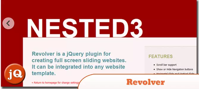
Revolver
A jQuery plugin for creating full-screen sliding websites. It can be integrated into any website template.
Source code
2025-02-25
comment 0
558

What should I pay attention to when centering the Bootstrap picture
Article Introduction:Bootstrap picture centering tips: Basics: Flexbox and Grid systems are used for layout, and text-center only centers the text baseline horizontally. Horizontal centering: Use justify-content-center attribute (Flexbox), or abuse margin: 0 auto; (unstable). Vertical centering: same as above, add align-items: center; the parent container needs to be set to fixed height. Responsive design: Use responsive classes to control layouts under different screen sizes. Common errors: Forgot to set height, abuse margin, ignore responsive design. Performance optimization: Select the appropriate image format, compress the image volume, and avoid excessively large images. **
2025-04-07
comment 0
851

How do I use the element for responsive images?
Article Introduction:Use the <picture> elements combined with <source> and <img> tags to create responsive pictures, enabling multi-conditional control based on screen size or pixel density. 1. As a container, the browser loads the first applicable image according to matching conditions; 2. Use srcset and sizes attributes to improve flexibility, allowing the browser to select the appropriate image according to the viewport size; 3. Provide WebP format and fallback to JPEG to take into account performance and compatibility. Examples include: large screen loading large.jpg, medium screen loading medium.jpg, small screen loading small.j
2025-06-20
comment 0
959
What are common breakpoints for responsive design?
Article Introduction:The common breakpoint settings in responsive design are as follows: 1. The vertical screen of the mobile phone (0~767px) adopts a single-column layout, uses max-width:767px media query, optimizes touch operation and content priority; 2. The tablet and small-screen devices (768px~1023px) can introduce two-column layouts, uses min-width:768px and max-width:1023px media query, supports horizontal and vertical screen switching; 3. The desktop devices (1024px and above) use min-width:1024px media query, supports multi-column layout and high-definition image sources; 4. Other supplements include separate processing of mobile horizontal screens, large-screen optimization, focusing on viewport size rather than pixel ratio, and flexible use units. Really good
2025-06-29
comment 0
279

How to make a responsive image in HTML?
Article Introduction:The core method of implementing responsive images in HTML includes the following steps: 1. Use max-width:100% to adapt the image to the container to ensure that the image is scaled to scale and does not overflow; 2. Use srcset and sizes attributes to enable the browser to load pictures of the appropriate size according to the screen width, improving loading efficiency; 3. Pay attention to the original size and format of the image to avoid excessively large images being displayed, and use modern formats such as WebP to optimize loading performance; 4. Solve common problems in layout, such as undefined container size, unadaptive height, and blurred high-resolution screen display, clear sizes should be set and srcset should be used in combination with high-definition pictures. These practices jointly ensure the good display and performance of pictures on various devices.
2025-07-12
comment 0
716

Implementing Native Lazy Loading for Images in HTML
Article Introduction:Native lazy loading is a built-in browser function that enables lazy loading of pictures by adding loading="lazy" attribute to the tag. 1. It does not require JavaScript or third-party libraries, and is used directly in HTML; 2. It is suitable for pictures that are not displayed on the first screen below the page, picture gallery scrolling add-ons and large picture resources; 3. It is not suitable for pictures with first screen or display:none; 4. When using it, a suitable placeholder should be set to avoid layout jitter; 5. It should optimize responsive image loading in combination with srcset and sizes attributes; 6. Compatibility issues need to be considered. Some old browsers do not support it. They can be used through feature detection and combined with JavaScript solutions.
2025-07-12
comment 0
827

Implementing Native Lazy Loading for HTML5 Images and Iframes
Article Introduction:How to implement lazy loading of images and iframes in HTML5? By adding loading="lazy" attribute to the and tags, the browser delays loading these elements until they are about to enter the viewport. Applicable scenarios include non-first-screen content at the bottom of the page, gallery or product pages with a large number of pictures, content skipped by mobile terminals in responsive design, and pages with multiple iframes embedded. It is not recommended to use lazy loading for key content on the home screen such as logo or banner. Notes include: 1. When it is compatible with old browsers, you must introduce polyfill; 2. Ensure that the search engine can recognize the image content to avoid SEO influence; 3. Set placeholders to prevent layout jitter; 4. Dynamically inserted pictures need to be manually processed and lazy loaded.
2025-07-07
comment 0
409
Strategies for building responsive designs with CSS Media Queries
Article Introduction:The key to responsive design is to reasonably divide breakpoints and adjust the styles in a targeted manner. 1. Understand the basic structure of media query, use @media plus conditional judgment, such as setting styles according to screen width; multiple conditions can be combined to adapt to different devices. 2. Setting reasonable breakpoints should be based on content and design drafts. It is recommended to gradually adapt to large screens starting from the mobile terminal. Common reference values ??include vertical screen max-width:767px for mobile phones, vertical screens on tablets, and above 1023px for desktop browsers. 3. To modify the key styles in a targeted manner, you only need to adjust the parts that really need to be changed, such as layout switching, font size, image button size, element display and hidden. 4. Use the mobile-first strategy to write the mobile style first and then gradually expand it to improve loading speed and maintenance efficiency
2025-07-06
comment 0
645


Dave The Diver: How To Catch Spider Crabs
Article Introduction:In Dave The Diver, there are some creatures that are not easy to catch. Or, catch alive that is. The spider crab is one of those very species, making it seem like the only way to bring these crustaceans back up to land is to viciously crack them up w
2025-01-10
comment 0
806

Prepare for Interview Like a Pro with Interview Questions CLI
Article Introduction:Prepare for Interview Like a Pro with Interview Questions CLI
What is the Interview Questions CLI?
The Interview Questions CLI is a command-line tool designed for JavaScript learners and developers who want to enhance their interview
2025-01-10
comment 0
1436


