Found a total of 10000 related content
CSS - display: flex vs inline-flex
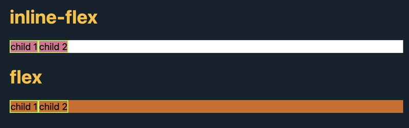
Article Introduction:inline-flex
A child container with display: inline-flex does not automatically fill the parent container. Its size depends on its content and any additional styles applied to it.
flex
A child container with display: flex automatical
2024-11-30
comment 0
796
How does `flex-grow`, `flex-shrink`, and `flex-basis` work?
Article Introduction:flex-grow, flex-shrink and flex-basis together constitute the elastic behavior of projects in the Flex container. 1.flex-grow determines the relative expansion ratio of the project when there is extra space, and the larger the value, the more expansion; 2.flex-shrink determines the relative shrinkage ratio of the project when there is insufficient space, and the larger the value, the more shrink; 3.flex-basis sets the initial size of the project before the space is not allocated, which can be a fixed value or based on content. The three are combined to achieve precise control of layout through the abbreviation of flex attributes.
2025-07-17
comment 0
968


What do the flex-grow, flex-shrink, and flex-basis properties do?
Article Introduction:In a Flexbox layout, flex-grow, flex-shrink, and flex-basis are the three core attributes that control the behavior of child elements. 1.flex-grow determines how much the element can expand when there is extra space, and the larger the value, the larger the proportion; 2.flex-shrink determines the proportion of element shrinkage when there is insufficient space, and the larger the value, the more shrinkage; 3.flex-basis is the initial size of an element before it is stretched and can be set to a fixed value or percentage. They are usually set together by flex abbreviation properties. For example, flex:11200px means that equal proportion expansion and shrinkage are allowed, and adjusted from 200px as the starting point, thereby achieving a flexible and controllable layout effect.
2025-06-24
comment 0
163
Why Aren't My Flex Items Wrapping?
Article Introduction:Why Flex Items Are Not Wrapping?In this scenario, flex items fail to wrap because of the default "flex-wrap: nowrap" setting for flex containers....
2024-12-25
comment 0
802
What is the shorthand flex property?
Article Introduction:The flex abbreviation attribute of CSS is used to quickly set the three attributes of flex-grow, flex-shrink and flex-basis at the same time. The format is "flex:;", for example, "flex:11200px;" means that the element will grow and shrink as needed in the container, with an initial size of 200px. Common abbreviation values ??include "flex:1;" (equivalent to "flex:110;") to fill the available space, "flex:auto;" (equivalent to "flex:11auto;") to automatically resize based on content, and "flex:none;" to prohibit growth or shrinkage. When using abbreviation, you must pay attention to the order of flex-grow.
2025-06-26
comment 0
998
What Does `flex: 1` Mean in CSS Flexbox?
Article Introduction:Understanding the Flexbox Property: What Does "flex: 1" Represent?The flex property, a convenient shorthand for flex-grow, flex-shrink, and...
2024-12-30
comment 0
888

Why Doesn't `display: flex` Work on `` Elements?
Article Introduction:Why the Fieldset Element Doesn't Behave as a Flex ContainerStyling a fieldset element with display: flex or display: inline-flex may leave you...
2024-12-13
comment 0
1044


