Found a total of 10000 related content

How to use wordpress theme template
Article Introduction:Use WordPress Theme Templates to quickly change the look and functionality of your website: Select a theme template to consider the purpose, industry, and audience. Install and activate theme templates in WordPress dashboard. Customize theme settings such as title, menu, colors, and typography. Use the WordPress editor to add content. Preview and publish the website to ensure proper appearance and functionality.
2025-04-20
comment 0
505

How to change the theme homepage template by wordpress
Article Introduction:Steps to modify WordPress homepage template: Log in to the WordPress dashboard. Go to Appearance >Theme Editor. Find and back up the "index.php" file. Update home page template elements, including title, content, sidebar, and footer. Save changes and preview them.
2025-04-20
comment 0
1118

How to make a WordPress theme responsive
Article Introduction:To implement responsive WordPress theme design, first, use HTML5 and mobile-first Meta tags, add viewport settings in header.php to ensure that the mobile terminal is displayed correctly, and organize the layout with HTML5 structure tags; second, use CSS media query to achieve style adaptation under different screen widths, write styles according to the mobile-first principle, and commonly used breakpoints include 480px, 768px and 1024px; third, elastically process pictures and layouts, set max-width:100% for the picture and use Flexbox or Grid layout instead of fixed width; finally, fully test through browser developer tools and real devices, optimize loading performance, and ensure response
2025-06-28
comment 0
501
Why does html/template escape \'\'?
Article Introduction:Understanding HTML/Template EscapingAn issue has been raised regarding html/template unnecessarily escaping "
2024-11-04
comment 0
968

HTML Responsive Images Guide
Article Introduction:This guide is about the HTML syntax for responsive images (and a little bit of CSS for good measure). We'll go over srcset and , plus a whole bunch of things to consider to help you get the best performance and design control from your image
2025-04-05
comment 0
311

HTML5 Template: A Base Starter HTML Boilerplate for Any Project
Article Introduction:Building your own HTML5 template: A concise guide
This article will guide you on how to create your own HTML5 template. We will step by step explaining the key elements of the HTML basic template, and finally providing a simple template that you can use and further build.
After reading this article, you will have your own HTML5 template. If you want to get the HTML template code now, read this article later, here is our final HTML5 template.
Key Points
HTML5 templates, as reusable templates, contain the necessary HTML elements, help avoid repeated code writing at the beginning of each project.
A basic HTML5 template should contain document type declarations, elements with language attributes, and passed characters
2025-02-08
comment 0
746

Building Responsive Web Layouts with HTML
Article Introduction:The core of responsive web layout is to combine HTML and CSS to adapt the website to different devices. 1. Add viewport meta tags to ensure that the mobile device renders the page correctly; 2. Use Flexbox or Grid to create flexible layouts to automatically adjust elements; 3. Use media queries to set breakpoints and apply specific styles according to different devices; 4. Set pictures and containers to responsiveness to prevent content overflow; 5. Follow the mobile priority principle to improve development efficiency. After mastering these key points, responsive layout will be simpler and more efficient.
2025-07-18
comment 0
475
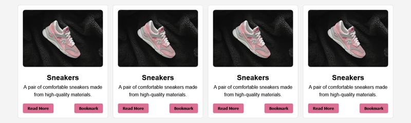
Building Responsive Card Layouts with HTML and CSS Flexbox
Article Introduction:In our previous articles, we’ve explored the importance of structured HTML and how CSS Flexbox simplifies web layouts. This article builds on those concepts by bringing them together to create something practical, a responsive card layout. Think of i
2024-12-31
comment 0
612

How to create a responsive HTML email?
Article Introduction:The following methods are required to create responsive HTML messages: 1. Use inline styles to ensure compatibility; 2. Use table layout to replace Flexbox or Grid; 3. Set viewport tags, fixed-width containers, picture max-width and use table simulation buttons for mobile adaptation; 4. Previews must be tested on multiple clients and real devices. This can improve the display stability and user experience on different devices and email clients.
2025-07-10
comment 0
924

What is the purpose and usage of the html template element?
Article Introduction:The HTML element is used to store HTML structures that are not rendered immediately. It is cloned through JavaScript and inserted into the page to achieve reuse and dynamic update of content. The advantage is to keep the page clean and avoid flickering of unreleased content; it is often found in duplicate UI components, dynamic page updates and template localization management. Specific usage steps: 1. Define the template tag with id; 2. Cloning the content with document.importNode; 3. Modifying the cloned node data; 4. Insert it into the DOM. Notes include avoiding ID conflicts, using class selectors, deep copy nodes, and placing template locations reasonably. In addition, the scripts in the template will not be executed automatically. You need to manually touch the page after inserting it.
2025-07-09
comment 0
588

Creating responsive HTML tables using best practices.
Article Introduction:The key to making responsive HTML tables is to ensure that the content on different devices is clear and readable and has a reasonable structure. 1. Use semantic HTML tags and class names, such as, class="name", etc., to facilitate style control and JavaScript operations; 2. Optimize the display method for small screens. Common practice is to place tables into containers with overflow-x:auto to achieve horizontal scrolling, or hide secondary columns or convert them into card-style layouts; 3. You can add fixed table headers, sorting functions, search filtering and other interactions to improve user experience, and pay attention to maintaining good performance.
2025-07-03
comment 0
329

Giveaway: Free Themes from Gridgum
Article Introduction:Gridgum: A Responsive Theme Marketplace for WordPress, Bootstrap, and More
Need a responsive website theme that looks great on all devices? Gridgum offers a curated marketplace of premium responsive themes for WordPress, Bootstrap, and other framewo
2025-02-19
comment 0
879


