Found a total of 10000 related content

How to Make My HTML5 Website Responsive?
Article Introduction:This article details creating responsive HTML5 websites. It emphasizes using viewport meta tags, flexible layouts (with relative units), CSS media queries, and responsive images. Various CSS frameworks (Bootstrap, Tailwind CSS, etc.) and testing me
2025-03-10
comment 0
431

HTML5 Template: A Base Starter HTML Boilerplate for Any Project
Article Introduction:Building your own HTML5 template: A concise guide
This article will guide you on how to create your own HTML5 template. We will step by step explaining the key elements of the HTML basic template, and finally providing a simple template that you can use and further build.
After reading this article, you will have your own HTML5 template. If you want to get the HTML template code now, read this article later, here is our final HTML5 template.
Key Points
HTML5 templates, as reusable templates, contain the necessary HTML elements, help avoid repeated code writing at the beginning of each project.
A basic HTML5 template should contain document type declarations, elements with language attributes, and passed characters
2025-02-08
comment 0
740

Applying HTML5 Principles to Responsive Web Design
Article Introduction:HTML5 improves responsive design through semantic tags, viewport control, responsive pictures and form optimization. 1. Use semantic tags such as, etc. to improve structural clarity, making it easier to flexibly arrange content blocks according to different devices; 2. By controlling mobile display, ensure that the page is correctly scaled and improve the mobile experience; 3. Use responsive image loading with tags, load adaptive resources according to screen size, and improve performance; 4. Use HTML5 form types such as email and tel to optimize mobile input, trigger the corresponding keyboard to improve user experience.
2025-07-15
comment 0
191

How do I use HTML5 template elements for reusable markup?
Article Introduction:The article discusses using HTML5 <template> elements for reusable markup, their benefits for code consistency, performance improvements, and integration with JavaScript for dynamic content.
2025-03-17
comment 0
352

Creating Reusable Content Structures with HTML5 Template Tag
Article Introduction:HTML5 tags are used to create reusable lazy content structures. The specific steps are: 1. Define the template; 2. Obtain and clone the template content through JavaScript; 3. Insert the clone content into the page. Its features include default invisible, support for any HTML, and require JS operations. It is suitable for scenarios such as component structure, dynamic loading, and preloading resources. The scripts and styles in the template need to be specially processed and cannot be nested in specific tags.
2025-07-06
comment 0
927

How to make a responsive image gallery with HTML5?
Article Introduction:To create a responsive picture gallery, the core is to use HTML5 and CSS to achieve adaptation of structure and layout. 1. Use and semantic organization of image content; 2. Use CSSGrid or Flexbox for responsive layout, and Grid is recommended to automatically adjust the multi-column arrangement of the number of columns; 3. Set the image width 100%, adapt highly and use object-fit to maintain proportional filling; 4. Pay attention to details such as gap, minmax and alt attributes to improve aesthetics and accessibility.
2025-07-09
comment 0
667

Implementing Responsive Images with the HTML5 Picture Element
Article Introduction:Elements are container elements introduced by HTML5 for implementing responsive pictures, which select the most suitable image resource according to device characteristics through multiple and one tag. 1. It supports loading adaptive pictures according to different screen widths to improve loading performance; 2. It can provide priority to modern formats such as WebP, which will fall back to traditional formats if not supported; 3. It can switch different compositions according to the aspect ratio of the device to optimize visual display; in addition, it is always necessary to add descriptive alt text, ensure correct paths, test compatibility and standardized naming to improve maintainability.
2025-07-14
comment 0
512

Using the HTML5 `` element for reusable content.
Article Introduction:Elements are native tools in HTML5 for storing unreleased HTML fragments, and can be efficiently reused after cloning through JavaScript. 1. Get template nodes; 2. Cloning content; 3. Filling data; 4. Inserting page. When using it, you need to pay attention to: the content and styles must be accessed through cloning, and must be defined separately and compatible with modern browsers. Suitable scenarios include dynamic lists, pop-up components, table rows and other duplicate structures.
2025-07-08
comment 0
480

How to use the HTML5 picture element for responsive images
Article Introduction:The core of using HTML5's picture elements to implement responsive pictures is to load the most suitable image resources according to the device characteristics. The specific methods are as follows: 1. The elements contain multiple and one, and the browser matches the conditions in order that meets the conditions, otherwise it will fall back; 2. Combining the srcset and sizes attributes, let the browser automatically choose the best size; 3. Prioritize loading of modern formats (such as WebP) by specifying the type attribute, and downgrade supporting traditional formats; 4. Pay attention to order, retain as fallback, consider compatibility and SEO optimization.
2025-07-05
comment 0
872

Using HTML5 Source Set for Responsive Images (srcset)
Article Introduction:How to implement responsive image loading on different devices? Use HTML5's srcset and sizes properties. The specific methods are: 1. Prepare pictures of multiple sizes and mark the width with w units; 2. Define the viewport ratio of pictures under different screen widths in sizes, such as (max-width: 600px)100vw; 3. Pay attention to setting DPR high-definition adaptation, such as 1x/2x descriptor; 4. Always keep src as a compatibility solution; 5. Plan the image size according to the device breakpoint, such as 480px/768px/1024px, etc.; 6. Test the loading effect of each size through the developer tool. This ensures that the browser accurately selects the best picture, taking into account loading speed and display quality.
2025-07-05
comment 0
435

How to make a responsive website with HTML5 and CSS3?
Article Introduction:The key to making a responsive website lies in the reasonable cooperation between HTML5 and CSS3, and the core is to make web pages display well on different devices. 1. Use HTML5 semantic tags to build clear structures, such as, , etc., to make the code easier to read and facilitate search engine crawling; 2. Use CSS3 media query to achieve multi-device adaptation, and apply different rules by detecting screen width, such as setting breakpoints such as mobile phones and tablets; 3. Use elastic layout (Flexbox or Grid) to deal with alignment and arrangement issues, and ensure that the navigation bar and other content automatically adapt to the screen; 4. Set image adaptation, use max-width:100% and srcset attributes to ensure that the image does not destroy the layout and improve the loading effect. Mastering these four key points can achieve compatibility with multiple settings
2025-07-13
comment 0
485

Using the HTML5 `` and `` elements
Article Introduction:The sum elements in HTML5 can be developed componentically by defining HTML structures that are not rendered immediately and dynamic content placeholders. Used to create reusable DOM templates that are rendered only when inserted into the DOM by JavaScript; then serve as content insertion points, allowing custom content to be filled in different usage scenarios. The combination of the two can be used to build UI components with unified structure and dynamic expansion capabilities, such as modal boxes or tab pages. When using it, you should pay attention to: test the default content of the slot, avoid excessive nesting, keep the template simple, deal with script delayed execution issues, and pay attention to differences in slot behavior in ShadowDOM.
2025-07-13
comment 0
274
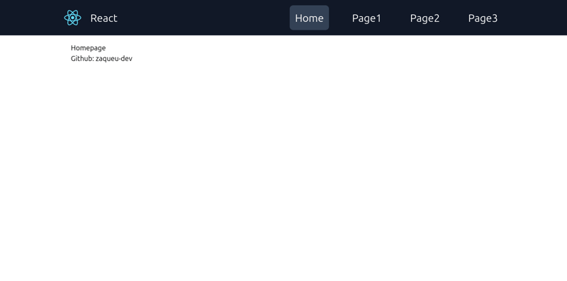
React/Tailwind template with default responsive NavBar.
Article Introduction:I was just annoyed with excluding App.test.js and all those default files that I would not use in my React project, and also I've never found a good navbar other than that free version of navbar from Tailwind UI website, which is not the best navbar
2024-11-16
comment 0
1171

What are the best practices for HTML5 development?
Article Introduction:The article outlines best practices for HTML5 development, focusing on semantic HTML, responsive design, accessibility, and performance optimization. It also lists productivity tools and resources for staying updated with HTML5 standards.
2025-03-17
comment 0
1011

Using Device Orientation in HTML5
Article Introduction:HTML5 Device Orientation API: A Comprehensive Guide
This article explores the HTML5 Device Orientation API, a powerful tool for creating responsive web applications that react to a device's physical orientation. We'll cover its functionality, implem
2025-02-21
comment 0
883

Convert the below data into Tabular format in HTML5?
Article Introduction:Here is the converted data into a tabular format using HTML5, including examples and strategies for responsive design, best practices for styling, and semantic HTML5 tags used within a table structure:<!DOCTYPE html>
<html lang=&
2025-04-30
comment 0
913

