
 Web Front-end
HTML Tutorial
CSS3 image flip switching case and analysis of important attributes
Web Front-end
HTML Tutorial
CSS3 image flip switching case and analysis of important attributes
CSS3 image flip switching case and analysis of important attributes
Aug 26, 2016 am 10:13 AM
Image flip switching, without using CSS3, generally use JS to implement animation, and simultaneously operate the width and left, or height and top of the element to simulate the flip effect, and change the src or z-index when appropriate. Picture switching.
I accidentally discovered the CSS3 solution, http://www.webhek.com/css-flip/. Learn it quickly and summarize it as follows
First upload the code (most of them are copied from the above link, there are big compatibility issues, use with caution)
HTML:
<span style="color: #0000ff;"><</span><span style="color: #800000;">div </span><span style="color: #ff0000;">class</span><span style="color: #0000ff;">="flip-container"</span><span style="color: #0000ff;">></span>
    <span style="color: #0000ff;"><</span><span style="color: #800000;">div </span><span style="color: #ff0000;">class</span><span style="color: #0000ff;">="flipper"</span><span style="color: #0000ff;">></span>
        <span style="color: #0000ff;"><</span><span style="color: #800000;">div </span><span style="color: #ff0000;">class</span><span style="color: #0000ff;">="front"</span><span style="color: #0000ff;">></span>here is content : AA<span style="color: #0000ff;"></</span><span style="color: #800000;">div</span><span style="color: #0000ff;">></span>
        <span style="color: #0000ff;"><</span><span style="color: #800000;">div </span><span style="color: #ff0000;">class</span><span style="color: #0000ff;">="back"</span><span style="color: #0000ff;">></span>here is content : BB<span style="color: #0000ff;"></</span><span style="color: #800000;">div</span><span style="color: #0000ff;">></span>
    <span style="color: #0000ff;"></</span><span style="color: #800000;">div</span><span style="color: #0000ff;">></span>
<span style="color: #0000ff;"></</span><span style="color: #800000;">div</span><span style="color: #0000ff;">></span>
CSS:
<span style="color: #800000;">.flip-container </span>{<span style="color: #ff0000;">
    margin</span>:<span style="color: #0000ff;"> 30px</span>;<span style="color: #ff0000;">
    display</span>:<span style="color: #0000ff;"> inline-block</span>;<span style="color: #ff0000;">
    border</span>:<span style="color: #0000ff;"> 1px solid #aaa</span>;<span style="color: #ff0000;">
    -webkit-perspective</span>:<span style="color: #0000ff;"> 500</span>;<span style="color: #ff0000;">
    -moz-perspective</span>:<span style="color: #0000ff;"> 500</span>;<span style="color: #ff0000;">
    -ms-perspective</span>:<span style="color: #0000ff;"> 500</span>;<span style="color: #ff0000;">
    perspective</span>:<span style="color: #0000ff;"> 500</span>;<span style="color: #ff0000;">
    -ms-transform</span>:<span style="color: #0000ff;"> perspective(500px)</span>;<span style="color: #ff0000;">
    -moz-transform</span>:<span style="color: #0000ff;"> perspective(500px)</span>; <span style="color: #008000;">/*</span><span style="color: #008000;">重要</span><span style="color: #008000;">*/</span><span style="color: #ff0000;">
    transform-style</span>:<span style="color: #0000ff;"> preserve-3d</span>; <span style="color: #008000;">/*</span><span style="color: #008000;">重要</span><span style="color: #008000;">*/</span>
}<span style="color: #800000;">
.flipper </span>{<span style="color: #ff0000;">
    position</span>:<span style="color: #0000ff;"> relative</span>;<span style="color: #ff0000;">
    width</span>:<span style="color: #0000ff;"> 200px</span>;<span style="color: #ff0000;">
    height</span>:<span style="color: #0000ff;"> 200px</span>;<span style="color: #ff0000;">
    transition</span>:<span style="color: #0000ff;"> 0.6s</span>;<span style="color: #ff0000;">
    transform-style</span>:<span style="color: #0000ff;"> preserve-3d</span>; <span style="color: #008000;">/*</span><span style="color: #008000;">重要</span><span style="color: #008000;">*/</span>
}
<span style="color: #008000;">/*</span><span style="color: #008000;"> 觸發(fā)翻轉(zhuǎn) </span><span style="color: #008000;">*/</span><span style="color: #800000;">
.flip-container:hover .flipper</span>{<span style="color: #ff0000;">
    transform</span>:<span style="color: #0000ff;"> rotateY(180deg)</span>;

}<span style="color: #800000;">
.front ,.back</span>{<span style="color: #ff0000;">
    position</span>:<span style="color: #0000ff;"> absolute</span>;<span style="color: #ff0000;">
    left</span>:<span style="color: #0000ff;"> 0</span>;<span style="color: #ff0000;">
    top</span>:<span style="color: #0000ff;"> 0</span>;<span style="color: #ff0000;">
    backface-visibility</span>:<span style="color: #0000ff;"> hidden</span>;  <span style="color: #008000;">/*</span><span style="color: #008000;">重要</span><span style="color: #008000;">*/</span><span style="color: #ff0000;">
    width</span>:<span style="color: #0000ff;"> 100%</span>;<span style="color: #ff0000;">
    height</span>:<span style="color: #0000ff;"> 100%</span>;
}<span style="color: #800000;">
.front </span>{<span style="color: #ff0000;">
    transform</span>:<span style="color: #0000ff;"> rotateY(0deg)</span>;<span style="color: #ff0000;">
    z-index</span>:<span style="color: #0000ff;"> 2</span>;<span style="color: #ff0000;">
    background</span>:<span style="color: #0000ff;"> red</span>;
}<span style="color: #800000;">
.back </span>{<span style="color: #ff0000;">
    transform</span>:<span style="color: #0000ff;"> rotateY(-180deg)</span>;<span style="color: #ff0000;">
    background</span>:<span style="color: #0000ff;"> green</span>;
}
- Set the perspective attribute of the entire animation area on the outermost container element.
- When the outer container element encounters a mouseover event, the container storing the card inside rotates 180 degrees. This is also where the rotation speed is controlled. If you set the rotation value to -180deg, it is reverse rotation.
- means that the elements on the front and back of the card must be absolutely positioned so that they block each other in the same position. Their backface-visibility property is set to hidden so that the back of each card is not visible when flipped.
- Set the front of the card to a higher z-index value than the back, so that the front of the card is on top.
- Rotate the back card 180 degrees so that it plays the role of the back.
End of copying, there are important comments in CSS that require special attention.
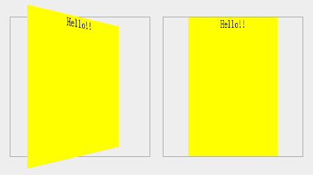
Theperspective property defines the distance of the 3D element from the view, in pixels. The intuitive phenomenon is that the inner element will overflow the outer border when flipped. If it is not written, or the attribute value is 0, it will only change within the outer border.
And special attention needs to be paid to the attribute value to adapt to the width and height of the element that needs to be flipped. Too little will overflow and it will be exaggerated. Too much will have little difference from setting it to 0. The difference effect is shown in the picture below
transform-style: preserve-3d; The transform-style attribute specifies how to render nested elements in 3D space (copied from w3cschool).
Both flip-container and flipper need to be set. If flip-container is not set, the overflow 3D effect will be missing. If flipper is not set, after the container is flipped, we will still see the back of the front. Backface-visibility: hidden cannot reflect the effect.
What’s more annoying is that transform-style is not supported even in IE11.
So there is another solution that is compatible with IE, which is not to flip the container, but to flip the front and back at the same time. Fortunately, IE still supports backface-visibility: hidden, so the flipping effect is the same as the previous solution.
HTML is as follows:
<span style="color: #0000ff;"><</span><span style="color: #800000;">div </span><span style="color: #ff0000;">class</span><span style="color: #0000ff;">="flip-container"</span><span style="color: #0000ff;">></span>
    <span style="color: #0000ff;"><</span><span style="color: #800000;">div </span><span style="color: #ff0000;">class</span><span style="color: #0000ff;">="front"</span><span style="color: #0000ff;">></span>here is content : AA<span style="color: #0000ff;"></</span><span style="color: #800000;">div</span><span style="color: #0000ff;">></span>
    <span style="color: #0000ff;"><</span><span style="color: #800000;">div </span><span style="color: #ff0000;">class</span><span style="color: #0000ff;">="back"</span><span style="color: #0000ff;">></span>here is content : BB<span style="color: #0000ff;"></</span><span style="color: #800000;">div</span><span style="color: #0000ff;">></span>
<span style="color: #0000ff;"></</span><span style="color: #800000;">div</span><span style="color: #0000ff;">></span>
Since the front and back are flipped directly, the flipper becomes redundant and the flipper is removed.
The CSS code is as follows (after many tests, we tried our best to support various browsers, and downgraded browsers that did not support CSS3 flip, retaining the switching effect)
<span style="color: #800000;">.flip-container </span>{<span style="color: #ff0000;">
    -webkit-perspective</span>:<span style="color: #0000ff;"> 500</span>;<span style="color: #ff0000;">
    -moz-perspective</span>:<span style="color: #0000ff;"> 500</span>;<span style="color: #ff0000;">
    -ms-perspective</span>:<span style="color: #0000ff;"> 500</span>;<span style="color: #ff0000;">
    perspective</span>:<span style="color: #0000ff;"> 500</span>;<span style="color: #ff0000;">
    -ms-transform</span>:<span style="color: #0000ff;"> perspective(500px)</span>;<span style="color: #ff0000;">
    -moz-transform</span>:<span style="color: #0000ff;"> perspective(500px)</span>;<span style="color: #ff0000;">
    -moz-transform-style</span>:<span style="color: #0000ff;"> preserve-3d</span>;<span style="color: #ff0000;">
    -ms-transform-style</span>:<span style="color: #0000ff;"> preserve-3d</span>;<span style="color: #ff0000;">
    margin</span>:<span style="color: #0000ff;"> 30px</span>;<span style="color: #ff0000;">
    display</span>:<span style="color: #0000ff;"> inline-block</span>;<span style="color: #ff0000;">
    border</span>:<span style="color: #0000ff;"> 1px solid #aaa</span>;<span style="color: #ff0000;">
    position</span>:<span style="color: #0000ff;"> relative</span>;
}
<span style="color: #008000;">/*</span><span style="color: #008000;">由于內(nèi)層絕對(duì)定位導(dǎo)致高度缺少,這里顯式設(shè)置了寬高</span><span style="color: #008000;">*/</span><span style="color: #800000;">
.flip-container, .front, .back </span>{<span style="color: #ff0000;">
    width</span>:<span style="color: #0000ff;"> 200px</span>;<span style="color: #ff0000;">
    height</span>:<span style="color: #0000ff;"> 200px</span>;
}<span style="color: #800000;">

.flip-container:hover .front </span>{<span style="color: #ff0000;">
    -webkit-transform</span>:<span style="color: #0000ff;"> rotateY(180deg)</span>;<span style="color: #ff0000;">
    -moz-transform</span>:<span style="color: #0000ff;"> rotateY(180deg)</span>;<span style="color: #ff0000;">
    -o-transform</span>:<span style="color: #0000ff;"> rotateY(180deg)</span>;<span style="color: #ff0000;">
    -ms-transform</span>:<span style="color: #0000ff;"> rotateY(180deg)</span>;<span style="color: #ff0000;">
    transform</span>:<span style="color: #0000ff;"> rotateY(180deg)</span>;
}<span style="color: #800000;">
.flip-container:hover .back </span>{<span style="color: #ff0000;">
    -webkit-transform</span>:<span style="color: #0000ff;"> rotateY(0deg)</span>;<span style="color: #ff0000;">
    -moz-transform</span>:<span style="color: #0000ff;"> rotateY(0deg)</span>;<span style="color: #ff0000;">
    -o-transform</span>:<span style="color: #0000ff;"> rotateY(0deg)</span>;<span style="color: #ff0000;">
    -ms-transform</span>:<span style="color: #0000ff;"> rotateY(0deg)</span>;<span style="color: #ff0000;">
    transform</span>:<span style="color: #0000ff;"> rotateY(0deg)</span>;<span style="color: #ff0000;">
    z-index</span>:<span style="color: #0000ff;"> 3</span>; <span style="color: #008000;">/*</span><span style="color: #008000;"> 降級(jí)處理不支持CSS3的瀏覽器,只是簡單的將back上升蓋住front </span><span style="color: #008000;">*/</span>
}<span style="color: #800000;">

.front, .back </span>{<span style="color: #ff0000;">
    -webkit-backface-visibility</span>:<span style="color: #0000ff;"> hidden</span>;<span style="color: #ff0000;">
    -moz-backface-visibility</span>:<span style="color: #0000ff;"> hidden</span>;<span style="color: #ff0000;">
    -ms-backface-visibility</span>:<span style="color: #0000ff;"> hidden</span>;<span style="color: #ff0000;">
    backface-visibility</span>:<span style="color: #0000ff;"> hidden</span>;<span style="color: #ff0000;">
    -webkit-transition</span>:<span style="color: #0000ff;"> 0.6s</span>;<span style="color: #ff0000;">
    -moz-transition</span>:<span style="color: #0000ff;"> 0.6s</span>;<span style="color: #ff0000;">
    -o-transition</span>:<span style="color: #0000ff;"> 0.6s</span>;<span style="color: #ff0000;">
    -ms-transition</span>:<span style="color: #0000ff;"> 0.6s</span>;<span style="color: #ff0000;">
    transition</span>:<span style="color: #0000ff;"> 0.6s</span>;<span style="color: #ff0000;">
    position</span>:<span style="color: #0000ff;"> absolute</span>;<span style="color: #ff0000;">
    top</span>:<span style="color: #0000ff;"> 0px</span>;<span style="color: #ff0000;">
    left</span>:<span style="color: #0000ff;"> 0px</span>;
}<span style="color: #800000;">
.front </span>{<span style="color: #ff0000;">
    background</span>:<span style="color: #0000ff;"> red</span>;<span style="color: #ff0000;">
    z-index</span>:<span style="color: #0000ff;"> 2</span>;
}<span style="color: #800000;">
.back </span>{<span style="color: #ff0000;">
    background</span>:<span style="color: #0000ff;"> green</span>;<span style="color: #ff0000;">
    -webkit-transform</span>:<span style="color: #0000ff;"> rotateY(-180deg)</span>;<span style="color: #ff0000;">
    -moz-transform</span>:<span style="color: #0000ff;"> rotateY(-180deg)</span>;<span style="color: #ff0000;">
    -o-transform</span>:<span style="color: #0000ff;"> rotateY(-180deg)</span>;<span style="color: #ff0000;">
    -ms-transform</span>:<span style="color: #0000ff;"> rotateY(-180deg)</span>;<span style="color: #ff0000;">
    transform</span>:<span style="color: #0000ff;"> rotateY(-180deg)</span>;
}
There may be a lot of unnecessary compatibility code in the above, and the level is limited. Welcome to exchange more concise writing methods.
There is also a little TIPS. When using hover to trigger element flipping in other situations, you should use it as follows. The parent element with fixed width and height triggers, and the child element flips
<span style="color: #800000;">.outer </span>{<span style="color: #ff0000;">
    width</span>:<span style="color: #0000ff;"> 200px</span>;<span style="color: #ff0000;">
    height</span>:<span style="color: #0000ff;"> 200px</span>;
}<span style="color: #800000;">
.inner </span>{<span style="color: #ff0000;">
    transition</span>:<span style="color: #0000ff;"> 0.6s</span>;
}<span style="color: #800000;">
.outer:hover .inner</span>{<span style="color: #ff0000;">
    transform</span>:<span style="color: #0000ff;"> rotateY(180deg)</span>;
}
Triggering the flip directly on the element hover as follows will have a big usage problem, because during the flipping process of the element, the element area becomes smaller and the cursor is separated from the element, so the element is restored and the hover is triggered to become smaller, causing unsmoothness
<span style="color: #800000;">.inner </span>{<span style="color: #ff0000;">
    width</span>:<span style="color: #0000ff;"> 200px</span>;<span style="color: #ff0000;">
    height</span>:<span style="color: #0000ff;"> 200px</span>;<br>  transition: 0.6s;
}<span style="color: #800000;">
.inner:hover</span>{<span style="color: #ff0000;">
    transform</span>:<span style="color: #0000ff;"> rotateY(180deg)</span>;
}

Hot AI Tools

Undress AI Tool
Undress images for free

Undresser.AI Undress
AI-powered app for creating realistic nude photos

AI Clothes Remover
Online AI tool for removing clothes from photos.

Clothoff.io
AI clothes remover

Video Face Swap
Swap faces in any video effortlessly with our completely free AI face swap tool!

Hot Article
Hot Tools

Notepad++7.3.1
Easy-to-use and free code editor

SublimeText3 Chinese version
Chinese version, very easy to use

Zend Studio 13.0.1
Powerful PHP integrated development environment

Dreamweaver CS6
Visual web development tools

SublimeText3 Mac version
God-level code editing software (SublimeText3)


 Implementing Clickable Buttons Using the HTML button Element
Jul 07, 2025 am 02:31 AM
Implementing Clickable Buttons Using the HTML button Element
Jul 07, 2025 am 02:31 AM
To use HTML button elements to achieve clickable buttons, you must first master its basic usage and common precautions. 1. Create buttons with tags and define behaviors through type attributes (such as button, submit, reset), which is submitted by default; 2. Add interactive functions through JavaScript, which can be written inline or bind event listeners through ID to improve maintenance; 3. Use CSS to customize styles, including background color, border, rounded corners and hover/active status effects to enhance user experience; 4. Pay attention to common problems: make sure that the disabled attribute is not enabled, JS events are correctly bound, layout occlusion, and use the help of developer tools to troubleshoot exceptions. Master this
 Configuring Document Metadata Within the HTML head Element
Jul 09, 2025 am 02:30 AM
Configuring Document Metadata Within the HTML head Element
Jul 09, 2025 am 02:30 AM
Metadata in HTMLhead is crucial for SEO, social sharing, and browser behavior. 1. Set the page title and description, use and keep it concise and unique; 2. Add OpenGraph and Twitter card information to optimize social sharing effects, pay attention to the image size and use debugging tools to test; 3. Define the character set and viewport settings to ensure multi-language support is adapted to the mobile terminal; 4. Optional tags such as author copyright, robots control and canonical prevent duplicate content should also be configured reasonably.
 Best HTML tutorial for beginners in 2025
Jul 08, 2025 am 12:25 AM
Best HTML tutorial for beginners in 2025
Jul 08, 2025 am 12:25 AM
TolearnHTMLin2025,chooseatutorialthatbalanceshands-onpracticewithmodernstandardsandintegratesCSSandJavaScriptbasics.1.Prioritizehands-onlearningwithstep-by-stepprojectslikebuildingapersonalprofileorbloglayout.2.EnsureitcoversmodernHTMLelementssuchas,
 HTML for email templates tutorial
Jul 10, 2025 pm 02:01 PM
HTML for email templates tutorial
Jul 10, 2025 pm 02:01 PM
How to make HTML mail templates with good compatibility? First, you need to build a structure with tables to avoid using div flex or grid layout; secondly, all styles must be inlined and cannot rely on external CSS; then the picture should be added with alt description and use a public URL, and the buttons should be simulated with a table or td with background color; finally, you must test and adjust the details on multiple clients.
 How to associate captions with images or media using the html figure and figcaption elements?
Jul 07, 2025 am 02:30 AM
How to associate captions with images or media using the html figure and figcaption elements?
Jul 07, 2025 am 02:30 AM
Using HTML sums allows for intuitive and semantic clarity to add caption text to images or media. 1. Used to wrap independent media content, such as pictures, videos or code blocks; 2. It is placed as its explanatory text, and can be located above or below the media; 3. They not only improve the clarity of the page structure, but also enhance accessibility and SEO effect; 4. When using it, you should pay attention to avoid abuse, and apply to content that needs to be emphasized and accompanied by description, rather than ordinary decorative pictures; 5. The alt attribute that cannot be ignored, which is different from figcaption; 6. The figcaption is flexible and can be placed at the top or bottom of the figure as needed. Using these two tags correctly helps to build semantic and easy to understand web content.
 What are the most commonly used global attributes in html?
Jul 10, 2025 am 10:58 AM
What are the most commonly used global attributes in html?
Jul 10, 2025 am 10:58 AM
class, id, style, data-, and title are the most commonly used global attributes in HTML. class is used to specify one or more class names to facilitate style setting and JavaScript operations; id provides unique identifiers for elements, suitable for anchor jumps and JavaScript control; style allows for inline styles to be added, suitable for temporary debugging but not recommended for large-scale use; data-properties are used to store custom data, which is convenient for front-end and back-end interaction; title is used to add mouseover prompts, but its style and behavior are limited by the browser. Reasonable selection of these attributes can improve development efficiency and user experience.
 How to handle forms submission in HTML without a server?
Jul 09, 2025 am 01:14 AM
How to handle forms submission in HTML without a server?
Jul 09, 2025 am 01:14 AM
When there is no backend server, HTML form submission can still be processed through front-end technology or third-party services. Specific methods include: 1. Use JavaScript to intercept form submissions to achieve input verification and user feedback, but the data will not be persisted; 2. Use third-party serverless form services such as Formspree to collect data and provide email notification and redirection functions; 3. Use localStorage to store temporary client data, which is suitable for saving user preferences or managing single-page application status, but is not suitable for long-term storage of sensitive information.
 Implementing Native Lazy Loading for Images in HTML
Jul 12, 2025 am 12:48 AM
Implementing Native Lazy Loading for Images in HTML
Jul 12, 2025 am 12:48 AM
Native lazy loading is a built-in browser function that enables lazy loading of pictures by adding loading="lazy" attribute to the tag. 1. It does not require JavaScript or third-party libraries, and is used directly in HTML; 2. It is suitable for pictures that are not displayed on the first screen below the page, picture gallery scrolling add-ons and large picture resources; 3. It is not suitable for pictures with first screen or display:none; 4. When using it, a suitable placeholder should be set to avoid layout jitter; 5. It should optimize responsive image loading in combination with srcset and sizes attributes; 6. Compatibility issues need to be considered. Some old browsers do not support it. They can be used through feature detection and combined with JavaScript solutions.
