


This article is excerpted from Tiffany's new book "CSS Master, Second Edition". We will explore two CSS naming methodologies. Both methods were created to improve the development process for large websites and large teams; however, they are equally applicable to single teams. You can choose either, either, or mix it, depending on yourself. The purpose of introducing them is to help you think about ways to write your own CSS.
Key Points
- BEM (block-element-modifier) ??is a CSS methodology that encourages developers to think of a website as a collection of reusable component blocks. It provides a clear naming system that makes it easier to understand the relationships between different parts of the website, especially for large development teams.
- In contrast, atomic CSS focuses on creating highly fine-grained, reusable styles, rather than creating rule sets for each component. It reduces specific conflicts and allows for rapid HTML component development. However, it is better suited for small teams or individual developers.
- BEM and atomic CSS can be used together to combine the structure of BEM with the reusability of atomic CSS. This can produce a highly organized and easy to maintain CSS code base.
- Although they have benefits, both BEM and atomic CSS may not be useful in situations where developers do not have full control over the tags (such as using CMS). In this case, developers may need to use lengthy and specific selectors to achieve their goals.
Block-Element-Modifier (BEM)
BEM, or block-element-modifier, is a methodology, naming system and a set of related tools. BEM was born in Yandex and aims to be developed rapidly by large development teams. In this section, we will focus on concepts and naming systems. BEM methodology encourages designers and developers to think of a website as a collection of reusable components blocks that can be mixed and matched to create interfaces. Blocks are just part of the document, such as the title, footer, or sidebar, as shown in the following figure. Perhaps confusingly, "block" here refers to the HTML snippet that makes up a page or application.
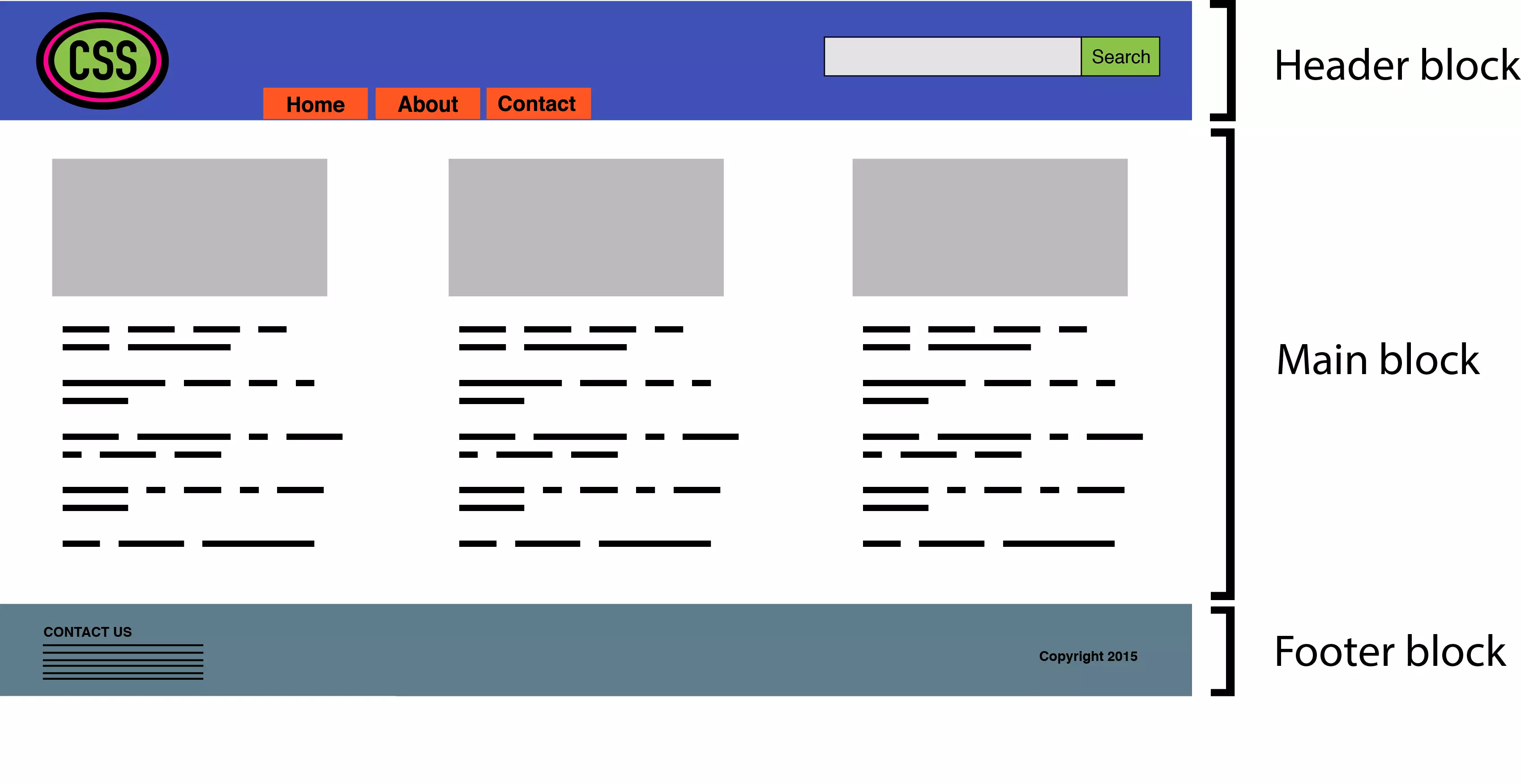
Blocks can contain other blocks. For example, the title block may also contain a logo, navigation, and search form blocks as shown below. The footer block may contain site map tiles.

The elements are more finer than blocks. As the BEM documentation explains:
Theelement is part of a block that performs a specific function. Elements depend on context: they only make sense in the context of the block to which they belong.
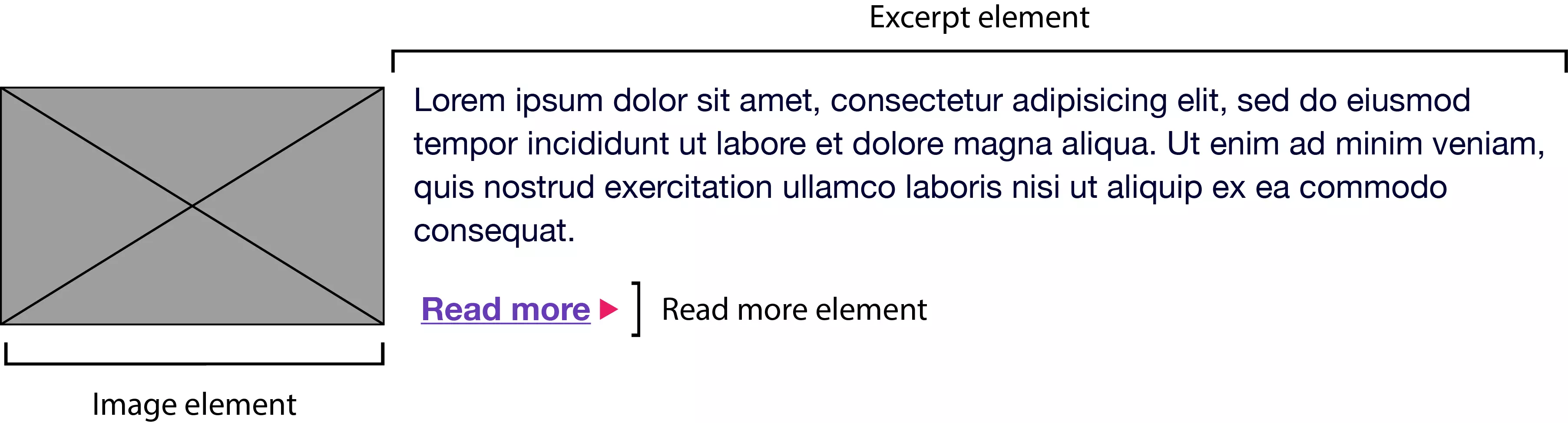
For example, a search form block contains text input elements and submit button elements, as shown in the figure below. (For the sake of clarity, we are using "elements" in the sense of design elements, not "elements" in the sense of HTML elements.)

On the other hand, the main content block may have an article list block. This post list block may contain a series of post promotion blocks. Each article promotion block may contain images, excerpts, and "Read More" elements as shown below.
Blocks and elements together form the basis of the BEM naming convention. According to BEM rules:
- Block names must be unique in a project
- Element names must be unique in a block Variants of
- blocks—for example, search boxes with dark backgrounds—should add modifiers in class names
Block names and element names are usually separated by double underscores (.block__element). Block and element names are usually separated by double hyphens with modifier names (for example, .block--modifier or .block__element--modifier). Here is the BEM look like using the search form example:
<div class="search">
  <label for="s" class="search__label">Search for: </label>
  <input type="text" id="s" class="search__input">
  <button class="search__submit">Search</button>
</div>
Variants of this form with a dark background may use the following tags:
<div class="search search--inverse">
  <label for="s" class="search__label search__label--inverse">Search for: </label>
  <input type="text" id="s" class="search__input">
  <button class="search__submit search__submit--inverse">Search</button>
</div>
Our CSS may look like this:
.search {
    color: #333;
}
.search--inverse {
    color: #fff;
    background: #333;
}
.search__submit {
    background: #333;
    border: 0;
    color: #fff;
    height: 2rem;
    display: inline-block;
}
.search__submit--inverse {
    color: #333;
    background: #ccc;
}
In our tags and CSS, search--inverse and search__label--inverse are the class names that are attached to . They are not alternatives to search and search__label. The class name is the only selector type used in the BEM system. Subselectors and descendants can be used, but descendants should also be class names. Element and ID selectors are prohibited. Enforcing the uniqueness of block and element names also prevents naming conflicts, which can become a problem in the team. This method has several advantages:
- New team members can easily read marks and CSS and understand their behavior
- Adding more developers can improve team productivity
- Consistent naming reduces the possibility of class name conflicts and side effects
- CSS is independent of markup
- CSS is highly reusable
Atomic CSS
If BEM is the industry darling, then atomic CSS is its rebel. Yahoo's Thierry Kobleentz named and explained atomic CSS in its 2013 article "Challenging CSS Best Practices", which uses a compact library of class names. These class names are usually abbreviated and are out of touch with what they affect. In an atomic CSS system, you can know what class names do - but there is no relationship between class names (at least, the class names used in the style sheet) and content type. Let's use an example to illustrate. Here is a set of rules we might call in what we call traditional CSS architectures. These rule sets use the class name that describes the content of their application—the global message box, and the style of the Success, Warning, and Error message boxes:
<div class="search">
  <label for="s" class="search__label">Search for: </label>
  <input type="text" id="s" class="search__input">
  <button class="search__submit">Search</button>
</div>
To create an error message box, we need to add both msg and msg-error class names to the element's class attribute:
<div class="search search--inverse">
  <label for="s" class="search__label search__label--inverse">Search for: </label>
  <input type="text" id="s" class="search__input">
  <button class="search__submit search__submit--inverse">Search</button>
</div>
Let's compare it with an atomic system, where each declaration becomes its own class:
.search {
    color: #333;
}
.search--inverse {
    color: #fff;
    background: #333;
}
.search__submit {
    background: #333;
    border: 0;
    color: #fff;
    height: 2rem;
    display: inline-block;
}
.search__submit--inverse {
    color: #333;
    background: #ccc;
}
This is more CSS. Now let's recreate our error message component. Using atomic CSS, our tag becomes:
.msg {
    background-color: #a6d5fa;
    border: 2px solid #2196f3;
    border-radius: 10px;
    font-family: sans-serif;
    padding: 10px;
}
.msg-success {
    background-color: #aedbaf;
    border: 2px solid #4caf50;
}
.msg-warning {
    background-color: #ffe8a5;
    border-color:  #ffc107;
}
.msg-error {
    background-color: #faaaa4;
    border-color: #f44336;
}
Our marks are also longer. But what happens when we create a warning message component?
<p class="msg msg-error">An error occurred.</p>
The two class names have changed: bg-d and bc-d are replaced by bg-c and bc-c. We reused five rule sets. Now, let's create a button:
.bg-a {
    background-color: #a6d5fa;
}
.bg-b {
    background-color: #aedbaf;
}
.bg-c {
    background-color: #ffe8a5;
}
.bg-d {
    background-color: #faaaa4;
}
.bc-a{
    border-color: #2196f3;
}
.bc-b {
    border-color: #4caf50;
}
.bc-c {
    border-color:  #ffc107;
}
.bc-d {
    border-color:  #f44336;
}
.br-1x {
    border-radius: 10px;
}
.bw-2x {
    border-width: 2px;
}
.bss {
    border-style: solid;
}
.sans {
    font-style: sans-serif;
}
.p-1x {
    padding: 10px;
}
Hey! Here we reuse four rule sets and avoid adding more rules to our stylesheets. In a powerful atomic CSS architecture, adding new HTML components (such as the post sidebar) does not require adding more CSS (though in reality, it may require adding more). Atomic CSS is a bit like using utility classes in CSS, but it reaches its limit. Specifically, it:
- Keep CSS concise by creating highly fine-grained, highly reusable styles instead of creating rule sets for each component
- Severely reduce specific conflicts by using low specific selector systems
- Once the initial rule set is defined, rapid HTML component development can be performed
However, atomic CSS is not without controversy.
Arguments against atomic CSS
Atomic CSS runs contrary to almost everything we learn about writing CSS. It feels almost as bad as pasting style attributes everywhere. In fact, one of the main criticisms of the atomic CSS methodology is that it blurs the line between content and presentation. If you float an element to the left and add a ten-pixel margin, what should you do when we no longer want the element to float to the left? Of course, one answer is to remove the fl class from our element. But now we are changing the HTML. The whole reason to use CSS is to keep the tags unaffected by the demonstration and vice versa. (We can also solve this by removing the .fl {float: left;} rule from the stylesheet, although this affects every element with the class name fl.) Nevertheless, updating HTML may be for the sake of simplicity The small price paid for CSS. In Kobleentz's original article, he used class names such as .M-10 (margin: 10px) and .P-10 (padding: 10px). The problem with this naming convention should be obvious. Changing to a five-pixel or 20-pixel margin means we need to update our CSS and HTML, otherwise it may cause the class name to not accurately describe its effect. Using class names such as p-1x, as described in this section, solves this problem. The 1x part in the class name represents the ratio, not the defined number of pixels. If the base padding is five pixels (i.e., .p-1x { padding: 5px; }), then .p-2x will set the ten pixel padding. Yes, this doesn't quite describe the work done by class names, but it also means we can change the CSS without updating HTML and not create misleading class names. The atomic CSS architecture does not prevent us from using the class name that describes the content in our tags . You can still add .button-close or .accordion-trigger to your code. For JavaScript and DOM operations, such class names are actually preferable.
BEM and atomic CSS
BEM works best when you have a large number of developers building CSS and HTML modules in parallel. It helps prevent bugs and bugs created by large teams. It scales well, partly because the naming convention is descriptive and predictable. BEM is not only suitable for large teams, but it is perfect for large teams. Atomic CSS works better when there is a small team or an engineer responsible for developing a set of CSS rules and a larger team builds a complete HTML component. With atomic CSS, developers can simply look at the style guide — or CSS source code — to determine the set of class names required by a particular module. Learn when to go your own path
In practice, your CSS may contain a mixture of multiple methods. In addition to the utility class names that affect the layout, you may also have some class names that describe content or components. If you don't have full control over the tag (for example using CMS), neither of these methods may be useful. You may even need to use lengthy and specific selectors to achieve what you want.
FAQs about CSS architecture: BEM and atomic CSS
What is the main difference between BEM and atomic CSS?
BEM (blocks, elements, modifiers) and atomic CSS are both methodologies for organizing and building CSS code. BEM focuses on a naming convention that makes CSS easier to read and understand. It divides the design into blocks, elements, and modifiers to create clear, strict relationships between CSS and HTML. Atomic CSS, on the other hand, is about writing small, single-purpose CSS classes that reflect visual functions. It encourages reusability and aims to reduce the amount of code.
How does BEM improve the scalability of CSS?
BEM improves the scalability of CSS by providing clear and strict relationships between CSS and HTML. It uses specific naming conventions to make it easier to understand the relationships between different elements. This makes the code easier to maintain and scale because it is easier to add new features or modify existing features without breaking anything.
Can I use BEM and atomic CSS at the same time?
Yes, BEM and atomic CSS can be used simultaneously. Some developers have found that combining these two approaches can achieve the best of both worlds. The strict naming convention of BEM can be used to build CSS, while the single-purpose class of atomic CSS can be used to style a single element. This combination can produce a highly organized and easy-to-maintain CSS code base.
What are the benefits of using atomic CSS?
Atomic CSS provides many benefits. It encourages reusability, which can greatly reduce the amount of CSS you need to write. It also improves design consistency, as the same class is used for different components. Additionally, atomic CSS can make your stylesheets easier to manage and understand, as each class has a single, well-defined purpose.
How does BEM handle CSS specificity issues?
BEM helps deal with CSS specificity issues by encouraging developers to use class selectors instead of ID selectors. This results in consistency in specificity throughout the project, making it easier to cover styles if necessary. Furthermore, the naming convention of BEM clearly indicates which elements are related, thus reducing the possibility of unexpected style conflicts.
Is atomic CSS suitable for large projects?
Yes, atomic CSS is suitable for large projects. Its focus on reusability and single-purpose classes can help keep CSS manageable even as projects continue to grow. However, it requires a rigorous approach to ensure that classes are consistent and meaningful.
How does BEM help in teamwork?
BEM's clear and strict naming convention makes it easier for team members to understand CSS code whenever they join the project. This improves collaboration because developers can easily understand and modify code written by others.
What are the potential disadvantages of using atomic CSS?
A potential drawback of atomic CSS is that it can lead to a large number of classes in HTML. This may make HTML harder to read and understand. Furthermore, atomic CSS requires a rigorous approach to ensure that classes are consistent and meaningful.
How to start implementing BEM in my project?
To start implementing BEM, you need to divide the design into blocks, elements, and modifiers. Then, use the BEM's naming convention to name your CSS class. This will create a clear relationship between your CSS and HTML, making your code easier to read and maintain.
Can I use BEM or atomic CSS with CSS preprocessors like Sass or Less?
Yes, both BEM and atomic CSS can be used with CSS preprocessors such as Sass or Less. These preprocessors can make managing CSS easier, and they fit well with the organizational principles of BEM and atomic CSS.
The above is the detailed content of CSS Architecture: Block-Element-Modifier (BEM) & Atomic CSS. For more information, please follow other related articles on the PHP Chinese website!

Hot AI Tools

Undress AI Tool
Undress images for free

Undresser.AI Undress
AI-powered app for creating realistic nude photos

AI Clothes Remover
Online AI tool for removing clothes from photos.

Clothoff.io
AI clothes remover

Video Face Swap
Swap faces in any video effortlessly with our completely free AI face swap tool!

Hot Article
Hot Tools

Notepad++7.3.1
Easy-to-use and free code editor

SublimeText3 Chinese version
Chinese version, very easy to use

Zend Studio 13.0.1
Powerful PHP integrated development environment

Dreamweaver CS6
Visual web development tools

SublimeText3 Mac version
God-level code editing software (SublimeText3)
Hot Topics


 What is 'render-blocking CSS'?
Jun 24, 2025 am 12:42 AM
What is 'render-blocking CSS'?
Jun 24, 2025 am 12:42 AM
CSS blocks page rendering because browsers view inline and external CSS as key resources by default, especially with imported stylesheets, header large amounts of inline CSS, and unoptimized media query styles. 1. Extract critical CSS and embed it into HTML; 2. Delay loading non-critical CSS through JavaScript; 3. Use media attributes to optimize loading such as print styles; 4. Compress and merge CSS to reduce requests. It is recommended to use tools to extract key CSS, combine rel="preload" asynchronous loading, and use media delayed loading reasonably to avoid excessive splitting and complex script control.
 External vs. Internal CSS: What's the Best Approach?
Jun 20, 2025 am 12:45 AM
External vs. Internal CSS: What's the Best Approach?
Jun 20, 2025 am 12:45 AM
ThebestapproachforCSSdependsontheproject'sspecificneeds.Forlargerprojects,externalCSSisbetterduetomaintainabilityandreusability;forsmallerprojectsorsingle-pageapplications,internalCSSmightbemoresuitable.It'scrucialtobalanceprojectsize,performanceneed
 Does my CSS must be on lower case?
Jun 19, 2025 am 12:29 AM
Does my CSS must be on lower case?
Jun 19, 2025 am 12:29 AM
No,CSSdoesnothavetobeinlowercase.However,usinglowercaseisrecommendedfor:1)Consistencyandreadability,2)Avoidingerrorsinrelatedtechnologies,3)Potentialperformancebenefits,and4)Improvedcollaborationwithinteams.
 CSS Case Sensitivity: Understanding What Matters
Jun 20, 2025 am 12:09 AM
CSS Case Sensitivity: Understanding What Matters
Jun 20, 2025 am 12:09 AM
CSSismostlycase-insensitive,butURLsandfontfamilynamesarecase-sensitive.1)Propertiesandvalueslikecolor:red;arenotcase-sensitive.2)URLsmustmatchtheserver'scase,e.g.,/images/Logo.png.3)Fontfamilynameslike'OpenSans'mustbeexact.
 What is Autoprefixer and how does it work?
Jul 02, 2025 am 01:15 AM
What is Autoprefixer and how does it work?
Jul 02, 2025 am 01:15 AM
Autoprefixer is a tool that automatically adds vendor prefixes to CSS attributes based on the target browser scope. 1. It solves the problem of manually maintaining prefixes with errors; 2. Work through the PostCSS plug-in form, parse CSS, analyze attributes that need to be prefixed, and generate code according to configuration; 3. The usage steps include installing plug-ins, setting browserslist, and enabling them in the build process; 4. Notes include not manually adding prefixes, keeping configuration updates, prefixes not all attributes, and it is recommended to use them with the preprocessor.
 What are CSS counters?
Jun 19, 2025 am 12:34 AM
What are CSS counters?
Jun 19, 2025 am 12:34 AM
CSScounterscanautomaticallynumbersectionsandlists.1)Usecounter-resettoinitialize,counter-incrementtoincrease,andcounter()orcounters()todisplayvalues.2)CombinewithJavaScriptfordynamiccontenttoensureaccurateupdates.
 CSS: When Does Case Matter (and When Doesn't)?
Jun 19, 2025 am 12:27 AM
CSS: When Does Case Matter (and When Doesn't)?
Jun 19, 2025 am 12:27 AM
In CSS, selector and attribute names are case-sensitive, while values, named colors, URLs, and custom attributes are case-sensitive. 1. The selector and attribute names are case-insensitive, such as background-color and background-Color are the same. 2. The hexadecimal color in the value is case-sensitive, but the named color is case-sensitive, such as red and Red is invalid. 3. URLs are case sensitive and may cause file loading problems. 4. Custom properties (variables) are case sensitive, and you need to pay attention to the consistency of case when using them.
 What is the conic-gradient() function?
Jul 01, 2025 am 01:16 AM
What is the conic-gradient() function?
Jul 01, 2025 am 01:16 AM
Theconic-gradient()functioninCSScreatescirculargradientsthatrotatecolorstopsaroundacentralpoint.1.Itisidealforpiecharts,progressindicators,colorwheels,anddecorativebackgrounds.2.Itworksbydefiningcolorstopsatspecificangles,optionallystartingfromadefin
