Found a total of 10000 related content

Giveaway: Free Themes from Gridgum
Article Introduction:Gridgum: A Responsive Theme Marketplace for WordPress, Bootstrap, and More
Need a responsive website theme that looks great on all devices? Gridgum offers a curated marketplace of premium responsive themes for WordPress, Bootstrap, and other framewo
2025-02-19
comment 0
878
5 Sick Mobile Website Bootstrap Helper Layouts
Article Introduction:Discover 5 Stunning Mobile Website Bootstrap Helper Layouts to Elevate Your Web Design! These responsive layouts will make your website more engaging and user-friendly. Let's explore! Related Articles:
10 Must-Have Metro Bootstrap Templates
jQuer
2025-02-23
comment 0
532
How to Close Bootstrap Responsive Menu on Click?
Article Introduction:Close Bootstrap Responsive Menu on ClickWhen viewing a website on mobile devices, the use of a navigation menu can often be cumbersome. To enhance...
2024-11-08
comment 0
1191
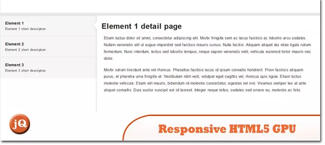
12 jQuery Fullscreen Plugins
Article Introduction:12 amazing jQuery full screen plug-ins to create a fascinating website!
Sometimes, full-screen websites are really cool! If a website looks plain, how long do you think visitors will stay? So, we have prepared some good stuff to help you: 12 jQuery full-screen plugins that give your website a stunning full-screen responsive effect! These plugins will add extraordinary visuals to your website. Ready?
Related recommendations:
100 jQuery picture/content slider plug-ins
30 jQuery responsive layout plug-ins
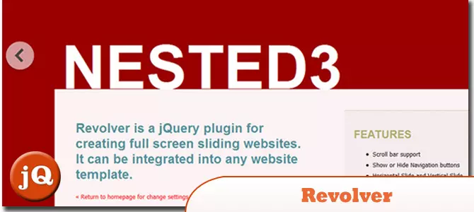
Revolver
A jQuery plugin for creating full-screen sliding websites. It can be integrated into any website template.
Source code
2025-02-25
comment 0
557
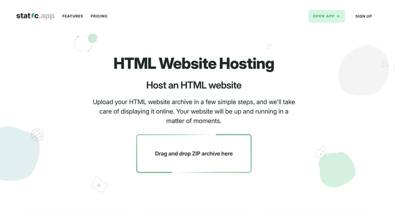
Tiiny Host Alternatives: Why Static.app is Better
Article Introduction:As a Bootstrap developer, you need a hosting platform that’s simple to use yet powerful enough to complement your responsive designs. Platforms like Tiiny Host and Static.app simplify static website hosting, but Static.app stands out for its develope
2024-12-20
comment 0
464

Best Web Designing Frameworks for 2014
Article Introduction:Responsive website design became increasingly important in 2014 due to the surge in mobile and tablet users, which will be a golden year for web design frameworks. Frameworks such as Twitter Bootstrap 3, Foundation Framework, Gumby Framework, Yahoo Pure CSS and InK Interface Kit are expected to be popular choices for web designers and developers.
Each web design framework has its unique features and advantages. For example, Twitter Bootstrap 3 provides flexible and responsive capabilities; Foundation Framework provides Sass
2025-02-22
comment 0
1142

How to use bootstrap studio
Article Introduction:Bootstrap Studio is a friendly visual website builder that creates responsive websites without coding. Its usage guide includes: Installing software and creating new projects. Build the page, drag and drop components and customize settings. Create a multi-page website and link to navigation. Design a responsive layout and adjust components to adapt to different devices. Add interactivity, use the action panel to add interactivity to components. Manage content, edit and manage in the Pages and Components tabs. Export and publish a website, select the file format and configure the publishing options.
2025-04-07
comment 0
436

How to layout bootstrap
Article Introduction:To use Bootstrap to layout a website, you need to use a grid system to divide the page into containers, rows, and columns. First add the container, then add the rows in it, add the columns within the row, and finally add the content in the column. Bootstrap's responsive layout function automatically adjusts the layout according to breakpoints (xs, sm, md, lg, xl). Different layouts under different screen sizes can be achieved by using responsive classes.
2025-04-07
comment 0
412

Using Bootstrap: Creating Modern and Mobile-First Websites
Article Introduction:Bootstrap is an open source front-end framework for creating modern, responsive, and user-friendly websites. 1) It provides grid systems and predefined styles to simplify layout and development. 2) Mobile-first design ensures compatibility and performance. 3) Through custom styles and components, the website can be personalized. 4) Performance optimization and best practices include selective loading and responsive images. 5) Common errors such as layout problems and style conflicts can be resolved through debugging techniques.
2025-04-30
comment 0
823

Bootstrap and Web Design: Best Practices and Techniques
Article Introduction:Bootstrap is an open source front-end framework developed by Twitter, suitable for building responsive websites quickly. 1) Its grid system is based on a 12-column structure, allowing for the creation of flexible layouts. 2) Responsive design function enables the website to adapt to different devices. 3) The basic usage includes building a navigation bar, and the advanced usage involves card components. 4) Common errors such as misuse of grid systems can be avoided by correctly setting the column width. 5) Performance optimization includes loading only necessary components, using CDN and file compression. 6) Best practices emphasize tidy code, custom styles and responsive design.
2025-04-29
comment 0
346

From Zero to Bootstrap: Getting Started Quickly
Article Introduction:Bootstrap is an open source front-end framework based on HTML, CSS and JavaScript, designed to help developers quickly build responsive websites. Its design philosophy is "mobile first", providing a wealth of predefined components and tools, such as grid systems, buttons, forms, navigation bars, etc., simplifying the front-end development process, improving development efficiency, and ensuring the responsiveness and consistency of the website. Using Bootstrap can start with a simple page and gradually add advanced components such as cards and modal boxes. Best practices for optimizing performance include customizing Bootstrap, using CDNs, and avoiding overuse of class names.
2025-04-27
comment 0
412
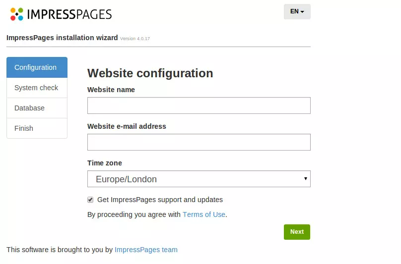
Getting Started with ImpressPages
Article Introduction:ImpressPages: An easy-to-use PHP framework that helps create responsive websites easily
ImpressPages is a PHP-based CMS with a unique code structure, highly customizable, Bootstrap-based admin panel, and an inline drag-and-drop editor. This article will guide you step by step how to quickly build a website using ImpressPages.
Advantages of ImpressPages:
Unique code structure and high customizability: distinguish it from other CMSs.
Bootstrap-based admin panel and inline drag-and-drop editor: Provides a user-friendly operation experience.
Easy theme installation and customization: Similar to Word
2025-02-19
comment 0
832

Bootstrap for Web Apps: Building Scalable & Maintainable Interfaces
Article Introduction:Bootstrap is widely used because it simplifies UI design and provides responsive design capabilities. 1) Its grid system and UI components such as navigation bars, buttons, etc., help quickly build a responsive website. 2) Customize the style through Sass variables to enhance the uniqueness of the application. 3) The basic usage is to introduce CSS and JavaScript files and build pages using classes and components. 4) Advanced usage includes using JavaScript components such as modal boxes to enhance the user experience. 5) Performance optimization is achieved through custom build tools and reducing nesting to improve loading speed and code maintainability.
2025-04-02
comment 0
572

Bootstrap Deep Dive: Responsive Design & Advanced Layout Techniques
Article Introduction:Bootstrap implements responsive design through grid systems and media queries, making the website adapted to different devices. 1. Use a predefined class (such as col-sm-6) to define the column width. 2. The grid system is based on 12 columns, and it is necessary to note that the sum does not exceed 12. 3. Use breakpoints (such as sm, md, lg) to define the layout under different screen sizes.
2025-04-10
comment 0
1076

Bootstrap Navbar Tutorial: Build a Responsive Navigation Menu
Article Introduction:Building a responsive navigation menu with Bootstrap can be achieved through the following steps: 1. Using basic settings, create a navbar with adjustable layout using Bootstrap's flexible grid system. 2. Make navbar more diverse through custom options such as changing colors, adding drop-down menus, integrating search forms, etc. 3. Pay attention to avoid common errors, such as incorrect use of collapse function and ignoring accessibility. 4. Optimize performance, consider using CDN and loading only the required components. 5. Follow best practices and keep navbar concise and consistent with website design. Navbar using Bootstrap can be quickly prototyped and iterated based on user feedback, thereby improving the website's ability
2025-06-27
comment 0
590


Dave The Diver: How To Catch Spider Crabs
Article Introduction:In Dave The Diver, there are some creatures that are not easy to catch. Or, catch alive that is. The spider crab is one of those very species, making it seem like the only way to bring these crustaceans back up to land is to viciously crack them up w
2025-01-10
comment 0
802


