Found a total of 10000 related content
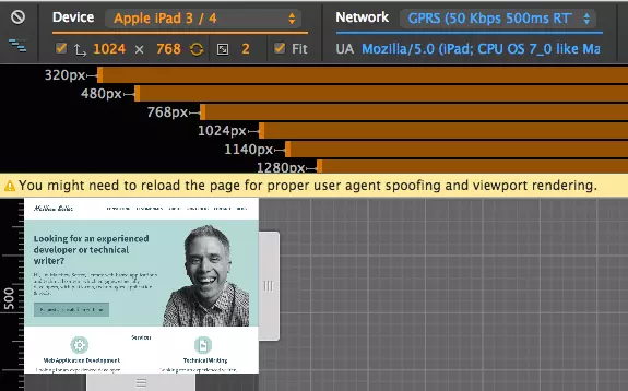
Better Responsive Website Testing in Google Chrome
Article Introduction:Google Chrome's mobile emulation capabilities are invaluable for testing responsive web designs. This built-in developer tool simulates various mobile devices and network speeds, providing a comprehensive view of website performance across different
2025-02-20
comment 0
1195

How to create a responsive blog layout with CSS?
Article Introduction:To create a responsive blog layout, the following steps must be followed: 1. Adopt a mobile-first design method, first write basic styles for the small screen, and then adapt to the large screen through media query; 2. Use CSSGrid or Flexbox to build a flexible page structure, such as using Grid to implement responsive grid layout of the main content and sidebar; 3. Add breakpoints to optimize the display effect of different devices, use two column layouts above 768px, and further improve the layout and font size above 1024px; 4. Use clamp() function to implement responsive fonts to ensure that the text has good readability on various devices; 5. Set max-width:100% to zoom the picture with the container to avoid overflow. Finally, through reasonable HTML structure and
2025-08-02
comment 0
512
How to create a responsive blog post layout with CSS?
Article Introduction:Use max-width and width percentage to create scalable centered containers to ensure cross-device readability; 2. Set max-width:100% and height:auto to prevent pictures and media from overflowing and maintain proportions; 3. Use em or rem units to optimize font and line spacing of paragraphs, quotations and code blocks to improve readability; 4. Embed responsive video with relative positioning containers with padding-bottom percentages to maintain a 16:9 aspect ratio; 5. Fine-tune the font and margins on the small screen through media query under the premise of mobile first; finally realize a frame-free responsive blog design through flexible layout, fluid media, good typography and appropriate spacing, and perform well on all devices.
2025-08-01
comment 0
199
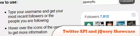
10 Helpful jQuery Plugins to Incorporate Twitter into Blog/Website
Article Introduction:Ten Powerful jQuery Plugins to Supercharge Your Twitter Integration
This article explores ten jQuery plugins that seamlessly integrate Twitter features into your website or blog, offering dynamic functionality and extensive customization. These plug
2025-03-01
comment 0
906
How to make a website responsive with CSS?
Article Introduction:Add viewport meta tags to ensure that the mobile device correctly renders the page; 2. Create a fluid layout using relative units such as percentages and rem; 3. Use CSS media queries to apply styles for different screen widths, and recommend mobile-first min-width breakpoints; 4. Use Flexbox or CSSGrid to achieve flexible and responsive layouts; 5. Use max-width:100% and background-size:cover to adapt the image and media container; 6. Use browser developer tools and real device testing to ensure cross-device compatibility. Combining these methods can make the website display and run well on all devices.
2025-07-30
comment 0
324
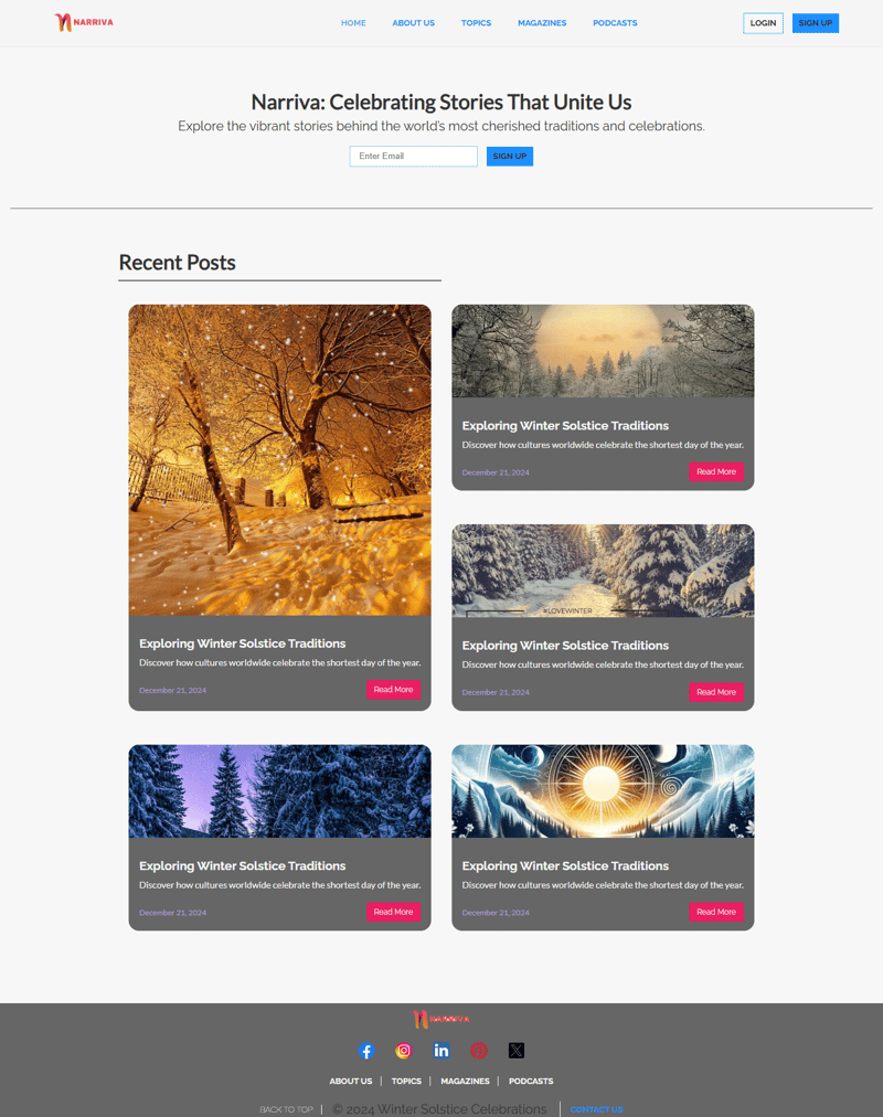
Narriva - A Minimalist Blog for Traditions and Celebrations**
Article Introduction:What I Built
Narriva is a minimalist and visually engaging blog website designed to spotlight traditions and celebrations. The goal was to create a blog site with a strong emphasis on modern design principles, responsive layouts, and interactiv
2024-12-27
comment 0
543

How to make a responsive website with HTML5 and CSS3?
Article Introduction:The key to making a responsive website lies in the reasonable cooperation between HTML5 and CSS3, and the core is to make web pages display well on different devices. 1. Use HTML5 semantic tags to build clear structures, such as, , etc., to make the code easier to read and facilitate search engine crawling; 2. Use CSS3 media query to achieve multi-device adaptation, and apply different rules by detecting screen width, such as setting breakpoints such as mobile phones and tablets; 3. Use elastic layout (Flexbox or Grid) to deal with alignment and arrangement issues, and ensure that the navigation bar and other content automatically adapt to the screen; 4. Set image adaptation, use max-width:100% and srcset attributes to ensure that the image does not destroy the layout and improve the loading effect. Mastering these four key points can achieve compatibility with multiple settings
2025-07-13
comment 0
505

How to Enhance Your CSS Skills: Effective Steps and Tips
Article Introduction:Developing a modern and responsive website can be an exciting and rewarding task. One effective way to learn is by mimicking existing real-world websites. This method is how I began creating my first modern UI and responsive website. By continuously
2024-11-17
comment 0
609

How to Make My HTML5 Website Responsive?
Article Introduction:This article details creating responsive HTML5 websites. It emphasizes using viewport meta tags, flexible layouts (with relative units), CSS media queries, and responsive images. Various CSS frameworks (Bootstrap, Tailwind CSS, etc.) and testing me
2025-03-10
comment 0
445

Giveaway: Free Themes from Gridgum
Article Introduction:Gridgum: A Responsive Theme Marketplace for WordPress, Bootstrap, and More
Need a responsive website theme that looks great on all devices? Gridgum offers a curated marketplace of premium responsive themes for WordPress, Bootstrap, and other framewo
2025-02-19
comment 0
888

How Can I Make My Website Images Responsive?
Article Introduction:Make Images Responsive: A Simple SolutionWhen creating responsive websites, it's crucial that all elements, including images, adapt to various...
2024-11-27
comment 0
821

These Top WordPress Themes Can Make 2018 Your Best Year Ever
Article Introduction:Key Advantages of Premium WordPress Themes for Responsive Websites
Premium WordPress themes significantly streamline responsive website creation, enabling businesses to concentrate on crafting engaging user experiences. This article highlights ten l
2025-02-10
comment 0
1150


