 Web Front-end
 PS Tutorial
 PS web design tutorial XXIV - Design a beautiful website from scratch
As a coder, my art foundation is weak. We can refer to some mature web PS tutorials to improve our design capabilities. To paraphrase a sentence, "If you are familiar with three hundred Tang poems, you can recite them even if you don't know how to compose them."
The tutorials in this series come from online PS tutorials, all from abroad, and all in English. I try to translate these excellent tutorials. Due to limited translation capabilities, the details of the translation still need to be worked out. I hope that the majority of netizens will give me some advice.
Agreement:
1. The software used in this article is the Photoshop CS5 version
2. The screenshots of the original tutorial are in English. I re-screened them based on the re-production. Chinese version of Figure
3. Some operations in the original text do not give parameters. I measured some parameters through repeated testing, which are displayed in red text. For some wrong parameters, the correct parameters are displayed directly in red text
For example: (90, 22, 231, 77) , indicating that the coordinates of the upper left corner of the rectangle are (90, 22) , width 231, height 77
For example: (90,22), indicating that the coordinates of the upper left corner of the rectangle are (90,22), the other two parameters of the rectangle have been specified in the tutorial
4. My own experience will be attached at the end of the tutorial. Some are optimizations of some steps in the tutorial, etc.
Have you ever wanted to design a beautiful website but just didn't know how? To be honest, a few years ago, that happened to me too. While browsing the web, I saw so many nice looking websites and wished I had the skills to create such designs. Today I can and I'm going to teach you how to do so too! Essentially, it requires a few Photoshop skills and an eye for detail. Through this tutorial, I will point out these tiny details which make a website design look beautiful. Fire up Photoshop and let's get going!
Have you ever wanted to design a beautiful website, but it didn't work? Don't know how to get started? To be honest, I used to be like this too. When I browse the web, I see so many beautiful web pages, and I wish I had the skills to create such works. Today, I will teach you how to make a design like this! In fact, it requires a bit of PS skills and the ability to grasp details. In this tutorial, I'll point out the little details that will make your web design look beautiful. Open PS and let’s get started!
Step 1 - Download the 960 Grid System Template
Step 1: Download the 960 Grid System Template
The designs I create are nearly all based on the 960 Grid System. So, before we begin we need to download the grid system Photoshop templates. You can find them on the 960.gs official website . Simply unpack the zip file and look for PSD templates. You will see that there are two different types of templates: one is 12_col and the other one is 16_col. The difference between these two are, as the name suggests, one is made with 12 columns and the other one with 16 columns. To explain it a bit more, if you have 3 boxes in your design you would choose the 12_col grid, because 12 is pisable by 3; or if you have 4 boxes in your design, you would choose either 12_col or 16_col grid because 12 and 16 are pisable by 4. If you follow this tutorial, you will see this in action.
Almost all of my designs are based on the 960 grid system. So, before we get started, we need to download the 960 Grid System PS template. You can find them on the 960.gs official website. Unzip the zip file and find the PSD template. You will see two different types of templates: one for 12_col and one for 16_col. The difference between the two, as the name suggests, is that one has 12 columns and the other has 16 columns. To explain this better, if you have 3 squares in your design, you will choose the 12_col one, because 12 is divisible by 3, or if your design has 4 squares, you will choose the 12_col or 16_col one, Because both 12 and 16 are divisible by 4. If you follow this tutorial, you will see this in action.
Step 2 - Defining the Structure
Step 2: Defining the structure of the web page
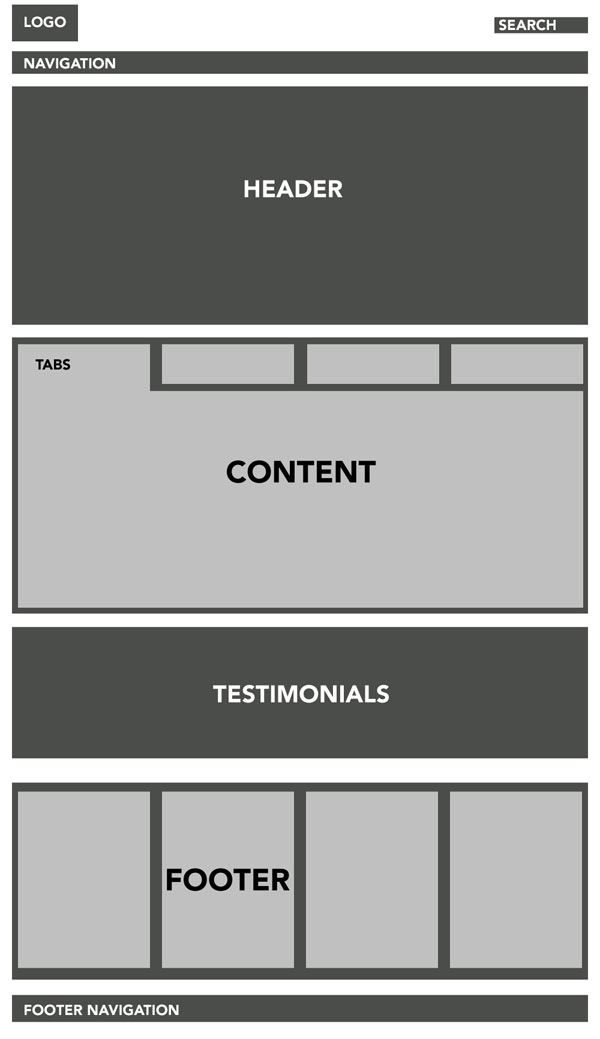
Before we open our PSD grid template and begin drawing, we first need to define the structure of our site. This is a bit more of a complicated structure because we have a layout inside a layout. You can see this exemplified in the image above.
Before we open the PSD grid template and start drawing, we first need to define the layout structure of our website. You can see the image above showing an example. This is a relatively complex structure because each of our layouts has its own layout.
Step 3
Step 3
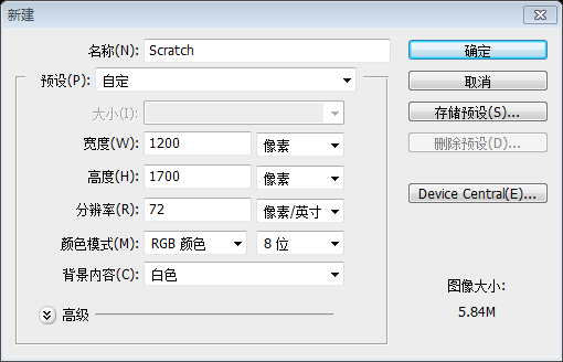
After we've defined our site structure we're ready to move on. Open your 16_col.psd template. Go to Image > Canvas size . Set the canvas to 1200px wide and 1700px high. Set the background color to # ffffff.
Continue after defining the structure of our website. Open the 16_col.psd template. Click: Image > Canvas Size. Set the canvas to 1200px wide and 1700px high. And set the background color: #ffffff
Since this translation tutorial does not download the 960 layout system, this step is changed to create a new document, size: 1200px*1700px. Background color: #ffffff
Step 4
Step 4
Now pick the Rectangle Tool and draw in a rectangle the full canvas width and about 80px high. Fill it with the color #dddddd.
Now pick the Rectangle Tool and draw in a rectangle the full canvas width and about 80px high. Draw a rectangle (0, 0, 1200, 80) with a width of the entire canvas and a height of 80px. Fill color: #dddddd
Step 5
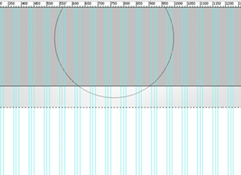
Create a new layer above the rectangle and set Layer mode to Overlay. Ctrl+click the rectangle layer. Now the rectangle will be selected. Choose a 600px soft brush, set the color to white, and click a few times with the edge of the brush just a bit over the selection, like shown on the image. This way you create a nice, subtle light effect. Additionally you can link these two layers.
Create a new image above the rectangle Layer, layer's
Blending ModeSelect Overlay. Ctrl+click on the rectangle layer. A selection of the rectangle will appear. Select a 600px soft brush, set the color to white, and click a few times with the bottom of the brush close to the top of the selection. With this you create a subtle shiny effect. Now the two layers can be linked.

Step 6
Step 6
New layer. Choose the Rectangle tool again and draw in a thin dark gray rectangle, as shown in the image.
New layer. layers. Select the
Rectangle Toolagain, and draw a thin, dark gray rectangle (0, 0, 1200, 6) as shown above, Color: #454545

Step 7
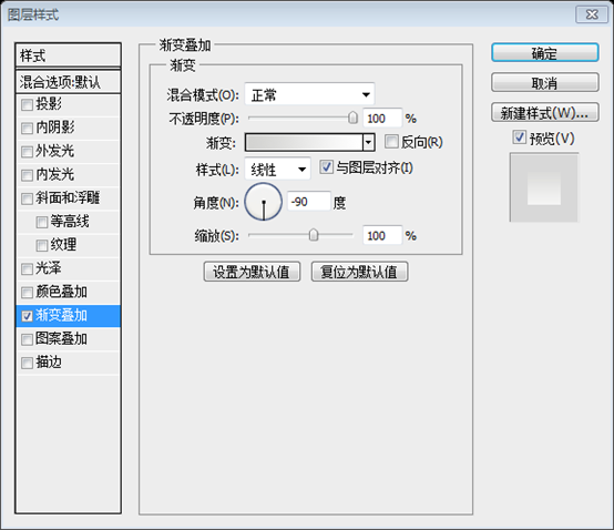
With the Rectangle tool selected, draw in a big box around 500px underneath the top rectangle. Make it 575px high and give it a Linear Gradient overlay from #d2d2d0 to #ffffff, direction -90, Scale 100%.
Continue to select
Rectangle Tool, draw a rectangle with a height of 575px at a distance of 500px from the upper rectangle (0, 540, 1200, 575). Note: The size of the original article seems to be an approximation, not very precise, and there are errors, so it has been corrected in this article. Set the gradient overlay layer style, with a gradient color from #d2d2d0 to #ffffff, an angle of -90, and a zoom of 100%.

Step 8
Step 8
Now we are going to create the same light effect as described in Step 5. We will be using this technique a lot; so next time I will just refer you to Step 5 for the effect.
Now we are going to like step 5. Add the same lighting effects. We'll be using this technique several times, so next time, I'll prompt using the effect from step 5.
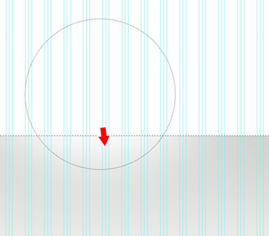
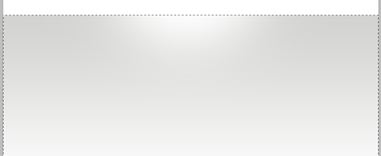
Create a new layer above all the current layers. Ctrl+click the big rectangle. Choose a 600px soft brush, set the color to white, and click a few times with the edge of the brush just a bit over the selection, as shown in the image.
Create a new layer on this layer. Ctrl+Click this large rectangle. Select a 600px soft brush, set the color to white, and click a few times with the bottom of the brush close to the top of the selection. As shown in the picture, through this you draw a subtle light effect.
Step 9
Step 9
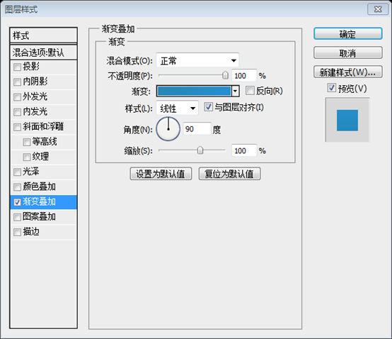
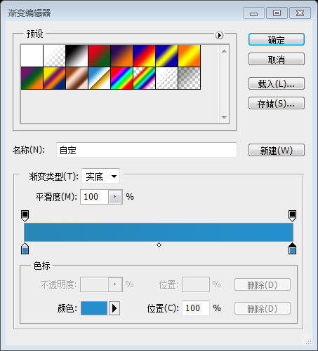
Create a new layer and draw in a big rectangle about 400px high. This one is used for our header. Fill it with a nice blue gradient from #2787b7 to #258fcd.
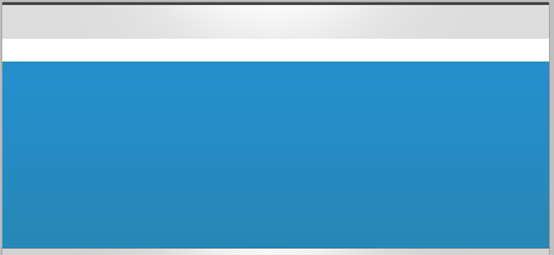
See how subtle the color change is?
Create a new layer and draw a large rectangle with a height of 400px (0, 130, 1200, 410). This will be used for our page header. Fill it with a nice blue gradient from #2787b7 to #258fcd
The following shows the subtle changes in color:
Step 10
Step 10
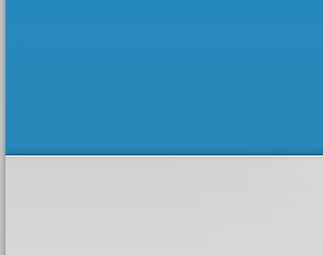
Add a dark blue 1px line on the bottom of the header box, apply the Drop shadow effect. For drop shadow use Blend mode: Multiply, Opacity: 65%, Angle: -90, Distance: 1px and Size: 6px. Next, create a new layer above and draw another 1px white line under the dark blue one. This way we create sharp edges for our content box. Basically you can apply this border technique on every box in your design just with different colors.
Draw a 1px dark blue (0, 539, 1200, 1) line at the bottom of the long square at the top of the page, Color: #0e517e, and add a drop shadow effect. Blending Mode: Multiply, Opacity: 65%, Direction: -90, Distance: 1px, Size: 6px. Then create a new layer and draw a 1px white line (0, 540, 1200, 1) below the dark blue line. This way we can create a sharp edge. You can use this technique with other color blocks in your design.

Step 11
Step 11
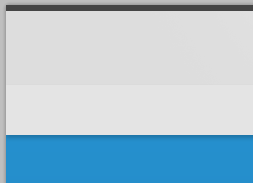
Create a new layer, and with the Rectangle Tool, draw a 50px high rectangle in the top part of the canvas, just as shown in the image. This will be used for our navigation.
Create a new layer, and use the Rectangle Tool to draw a rectangle with a height of 50px (0, 80, 1200, 50) on the top area of ??the canvas. Color: #e4e4e4, such as As shown in the figure. This will be used for our navigation bar.

Apply a Drop shadow. Use the values ??shown in the image.
Add a drop shadow effect and set the parameters as shown.

##Step 12
Step 12
Time for the navigation. Use the Rounded Rectangle Tool and set the radius to 5px. Draw a rectangle, fill it with #f6a836, and apply the following effects:
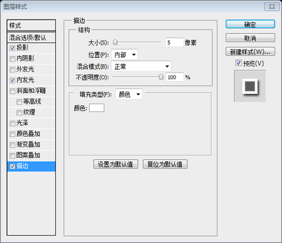
Inner Shadow – color: #ffffff, Blend mode: overlay, Opacity: 60%, Angle: 120*, Distance: 7px, Size: 6px.
Inner glow – Blend mode: normal, color: #ffffff, Size: 4px. Everything else leave default.
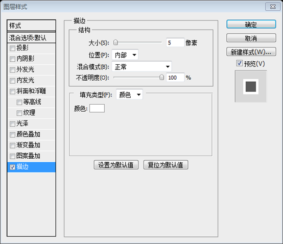
Stroke – Size: 1px, Position: inside, color: #ce7e01.
Rounded Rectangle Tool, set the radius to 5px, draw a rounded rectangle (130, 92, 70, 27), color: #f6a836, and then add the following effects to it:
1. Inner Shadow—Color: #ffffff, Blending Mode: Overlay, Opacity: 60%, Angle: 120, Distance: 7px, Size: 6px.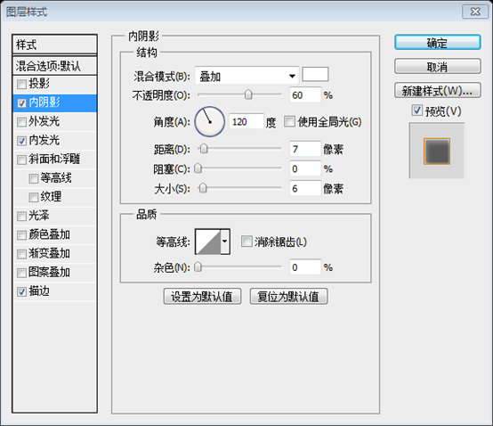
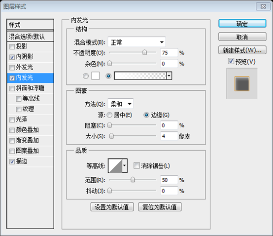
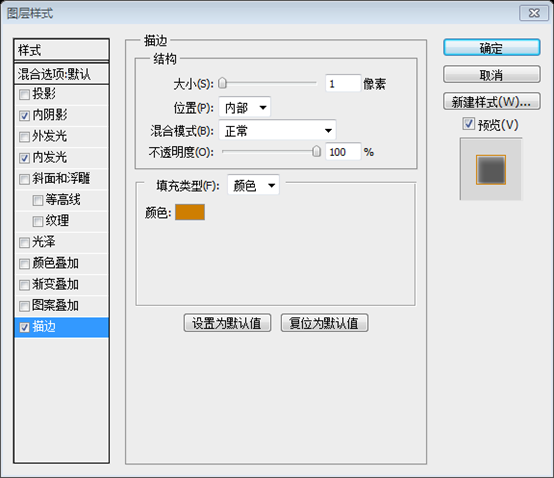
Now select the rectangle with Ctrl+click. Go to Select > Modify > Contract and enter 1px.
Click: Select> Modify> Shrink, enter 1px to confirm

Create a new image above Layer, set the blending mode to Overlay, and add the light effect as in step 5, but this time using a small brush. Then add the navigation bar text. I use Arial font as the navigation link font, and set all effects to "None".

#Step 13
Now let's create the search box. With the Rounded Rectangle Tool , radius 5px, create a search box positioned on the right side of the grid layout and in the middle of the top gray stripe from Step 4. Add these layer styles:
Inner Shadow – color: #000000, Blend mode: Multiply , Opacity: 9%, Angle: 90*, Distance: 0px, Size: 6px.
Stroke – Size: 1px, Position: inside, color: #dfdfdf.
Now start creating the search box. Use the Rounded Rectangle Tool with a radius of 5px. Create a rectangle for search (925) on the right side of the grid layout and in the middle of the top gray rectangle created in step 4. , 26, 142, 30), Color: #5c6457. Add the following styles:
Inner Shadow — Color: #000000, Blending Mode: Multiply, Opacity: 9%, Angle: 90, Distance: 0px, Size: 6px.
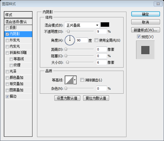
Stroke—Size: 1px, Position: Inside, Color: #dfdfdf.

I added the “search” text and a light gray “GO” button. This is how it should look.
Add above search text and a bright gray GO button. As shown in the picture below:
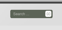
Color of text: #a0a39c. The stroke of the white rounded rectangle is the same as that of the search box.
So far we have a lot of layers and need to organize things a bit so we will create a new Layer folder and name it “search”. Select all layers that make the search field and just Click + drag inside the new folder. Later we're going to organize other content inside the folders so we have a nice organized layer palette.
Have created a lot of layers so far, for the sake of organization , we create a search group. Drag all search-related layers into this group. Later, we will organize the rest of the content in this way. This way we have a nice organized layers panel.
#Step 14
Step 14
Now create a new layer and draw a “Sign Up” button the same way we created the search field – just half the width. Place it under the search field in the middle of the navigation stripe.
Create a new layer and draw one in the same way we created the search box Sign Up button (998, 91, 73, 30), color: #258dca - only half width. Place it in the middle of the navigation area below the search box.
Create a new document in PS, size: 4px*4px, transparent background, use a brush to click 4 white dots from the upper left corner to the lower right corner
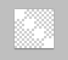
Then define the pattern and close the new document. Go back to the main document and add a pattern overlay style to the button
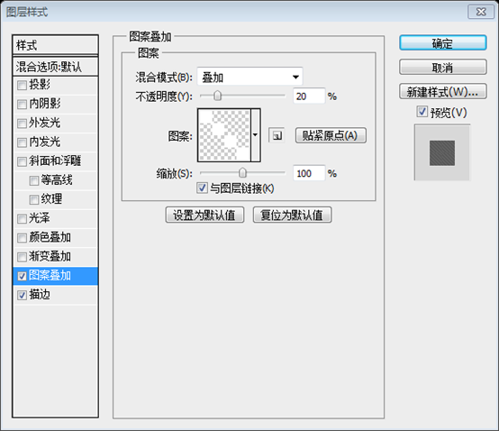
Add the same stroke style as the search box, and add the content as shown below Shadow style
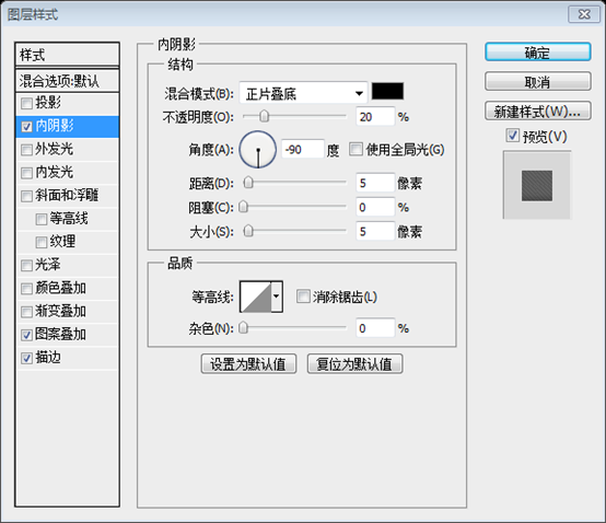
Add SIGN UP text on the button, the text color is white. Add the text Login (black) or (gray) to the left side of the button
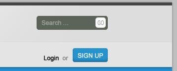
Again we're creating the effect from Step 5.
We create the effect from step 5 again
Use a smaller soft brush size. In this case it was 45px.
Use a smaller soft brush size. The one used here is 45px 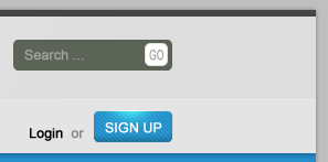
Step 15
Step 15
After adding the logo and the Tagline this is how our site should look like now.
After adding the LOGO and the website description , our web page looks like this.

Creation of LOGO:
Use Rounded Rectangle Tool to create a new rounded rectangle (132, 20, 77, 43), color: #2c2c2c
Use the method in step 5 to add a highlight effect above and below the rounded rectangle
Use the text tool to add text BVD, which is the same font and size as the text in the navigation bar. The text is scaled vertically by 300% and horizontally by 180%. Text color: #ffffff. Add the following drop shadow style to it
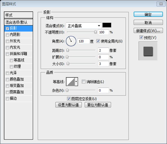
On the right side of the LOGO, add the text Beautiful website design. Font: Androgyne, font size: 30 points, color: fdfdfd. Add stroke style: Stroke color: #8e8e8e
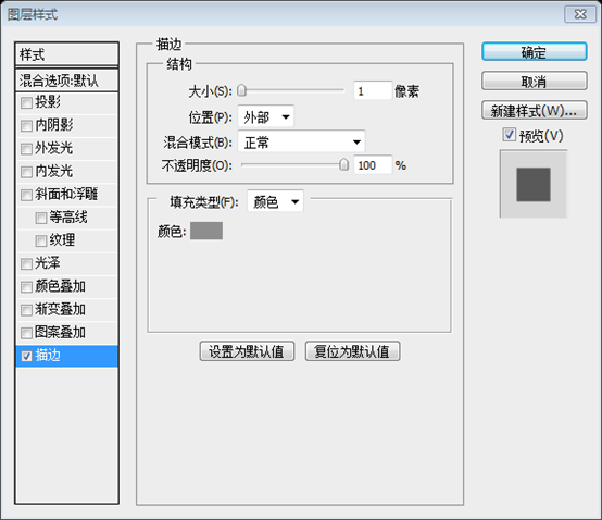
##Step 16
Step 16
Now we're coming back to our layer organization mentioned a few steps earlier. Create a new empty layer folder and name it “top_bar ”. Move all graphics from the top of the layout inside this folder (logo, tagline, search field, sign up button, navigation and backgrounds).
Create another empty layer folder and name it “header”. This is where we will put our header graphics. This is how it should look.
Step 17
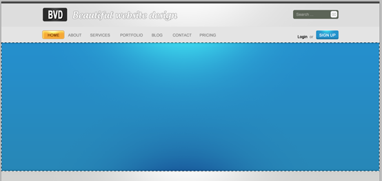
Our header looks a bit plain right now so we're going to add the same light effect everywhere else on the site. Select the header box (blue). Create a new empty layer above and set the mode to Overlay.頭The top part looks a bit bland, so we can add the same light effect anywhere. Select the blue head area. Create a new layer above it and set its blending style to Overlay.
Pick a large soft brush 600px, color #ffffff and click a few times in the area under the navigation. Furthermore, to gain more depth, we can switch the color to black and do the same thing just in the bottom part of the header. Give it a try!
Choose a large soft brush of 600px, color: #ffffff. Then click a few times below the navigation bar. If you want more depth, you can also change the color to black and repeat the same process at the bottom of the head area. Try it
Step 18
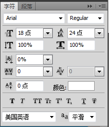
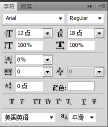
In this step I will explain to you how I created the reflection for the header images. Take two images of your choice, I used Safari screenshots of my two other templates, scale one down and place it behind the bigger one. Copy both layers, and with the Free Transform Tool, flip the first image and then the other one. Shift both images a few pixels down. Now make a selection from outside the bottom part to middle of the first flipped image with the Rectangular Marquee Tool. Go to Select > ; Modify > Feather and type 30px or more. You should have a selection similar to the shown in the image. Press the delete key a few times and you will create a nice faded reflection from the original image. Repeat this step for the second image. In this step, I will show you how to create a reflective effect in the head area of ??the image. Select your two pictures, I used the Safari screenshot of my other template (I used the two previous webpage snapshots), scale one of them and place it next to the larger picture rear. Duplicate all the layers and using the Free Transform Tool, flip the first image with the other image. Hold down the Shift key and move the image down a few pixels. Use the Rectangular Marquee ToolCreate a selection from the outer edge of the bottom of the first flipped image to the middle of the image. Click: Select > Modify > Feather, enter 30px or more. You will get a selection similar to the one shown below. Press the Delete key a few times and you'll create a nice faded reflection of the original image. Repeat these steps for the second image. Now to make those two images stand out a bit, create a new layer and set the mode to Overlay. Create the effect described in Step 5. In order to make the two pictures more prominent, you can create a new layer, set the blending mode of this layer to Overlay, and repeat the adding effect in Step 5. (Whether this step is necessary depends on the situation. After using these two pictures, I feel that this step is redundant) folder to keep things organized here ;) After adding After some buttons and nice text, the header area looks like this. Don’t forget to put all layers in the header group. The font of the first paragraph on the left is set as follows The font of the second paragraph on the left is set as follows The font setting of the third paragraph on the left is as follows The following two buttons, the button on the right (310, 455, 159, 38), color: #f6a836, style copies the style of the left button of the navigation bar. Text color: #ffffff The button on the left (130, 455, 159, 38), color: #c8c8c8, copy the style of the button on the right, and change the stroke color to : #7d7d7d. Text color: #5c5c5c Step 19 Step 19 If you look at the final rendering, you will see a beautiful switching page in the content area. To create this switch we need some extra steps, but it's necessary. First use the Rounded Rectangle Tool to create a rounded rectangle (128, 589, 944, 70) with a height of 70px and a radius of 10px. Color: #e1e1e1. Now let's not round the bottom corner so it forms a perfect corner. Use Direct Selection ToolClick on the path of this graphic, click on the vertical point and then hold down the shift key and pull down to the height of the horizontal coordinate axis. It looks good now, but it's still rather crude. Then you see a small control point. Click on it and move to the point on the path. Now we create a perfect corner. Just like shown in the picture. Repeat this step for the lower right corner as well, and add a 1px stroke to it, with the stroke color: #b0b0b0 Step 20 Step 20 Pick the Line tool and set it to 1px. 1px #Step 21
#Draw in gray separators while holding the Shift key. Hold down the Shift key and draw some separators (364, 589, 1, 70), (600, 589, 1, 70), (836, 589, 1, 70),
Place some icons, headings, and a description for each tab. I used Ray Cheung icons available from – WebAppers.com. Usually one tab is always active and the others are inactive. To make this clear in our design, we need to find a way to accomplish this. I desaturated the other icons and reduced the opacity for the headings and text while keeping the first active tab colorful and bright. and placed one of the icons in place of the image in the header area ) and lowered the opacity of the title and description text (60%) to keep the activity toggled The page is highlighted. Step 23 Step 23 To make the active tab more obvious, we're going to give it a faded white background. To do this first select the whole object and then subtract from the selection to get only the first tab selected. This is what your selection should look like. Your selection should look like the picture below With a smaller soft brush, paint in a white background. Create a new layer, use a small soft brush to paint the background with white Step 24 Step 24 Add the shadow. Create a dark gray rectangle (78, 609, 1044, 50) behind the switching page, color: #303030, as shown Click the little icon at the bottom of the layer palette to create a layer mask Set the color to black, select a large soft brush, and start deleting parts of the rectangle. part. As a result, we created a better-looking shadow effect You can also use theGradient toolto add a black to transparent gradient within the mask, as shown below Finally we add some details. Draw a 1px gray line (78, 659, 1044, 1) below the switching page, color: #b0b0b0. Then use the same method as the previous step to create gradients on the left and right ends. You can also use gradients as mentioned above to achieve . Now we have a more stylish and beautiful line at the back of the switching page, next to the shadow. Step 25 Step 25 It’s time to design the first switcher page content. We need a distinctive design image with a good-looking title and some text content. First we have to create this distinctive image. I thought it would be nice to break up the sharp edges of the design when we featured the design image to create a nice looking overlay photo effect. To do this, draw a 1px light gray (color: #b0b0b0) border to the white rectangle (136, 714, 404, 224), and a very subtle drop shadow effect. ## Copy this layer and rotate it slightly with the Free Transform Tool. Repeat this operation several times (3 times is better) , enter 5px, and confirm. Then click Add Layer Mask below the layer management area so that the image only shows the selection range. Step 26 Don't forget to keep things organized. So create more layer folders and organize your palette. This is how I have done it. Subtitle text font: Verdana; Font size: 14px, bold; Color: #494949 List text font: Verdana; Font size: 12px; Color: #494949 List The item number in front is composed of a circle and a check mark in the custom shape. The color of the circle: #227dac; the color of the check: #ffffff The text font under the list :Verdana; font size: 12px, bold; color: #494949
##And again some layer organization. Organize the layers I thought this one should be huge; so I've put this in a big box right after the main section. First draw a big light gray rectangle about 220px high. Give it a 1px gray border. I think this should be huge , so I put it in a big square underneath the main part. First draw a large bright gray rectangle (130, 1016, 940, 222) with a height of 220px, color: #f2f2f2 Then draw Another brighter rectangle (140, 1116, 920, 202) with an indent of 10px on each side, color: #f7f7f7. Also add a 1px gray border Finally add some text and we're done! Finally add some text to complete this Part of the production Font of the header text: Verdana; Font size: 12px, bold; Color: #de8d55 Font of the main text: Androgyne; Font size :24px; Color: #696969 Signing text, left text: Androgyne; Font size: 14px; Color: #696969; Right text: Verdana; Font size: 14px, bold; Color: #494949 Left button, rounded rectangle (257, 1190, 186, 27), corner radius: 3px, color: #f5f5f5, stroke color: #b0b0b0 Button text font: Verdana, font size: 12px; horizontal scaling 80%; color: #494949 Step 28 Step 28 ##It's time for the footer. Draw a big 400px high, dark gray rectangle. (color: #4b4d4a) rectangle (0, 1300, 1200, 400) Step 29 Step 29 Add some light effect the same way as described in Step 5. Step 30 Step 30 Next, draw a 10px high rectangle above the footer and add some subtle effect by adding two more lines on top and bottom like shown in the image. Make a 10 px high rectangle (0, 1290, 1200, 10), The four lines are: (0, 1290, 1200, 1), color: #a3a3a3; (0, 1291, 1200, 1), color: #ffffff; (0, 1299, 1200 , 1), color: #ffffff; (0, 1300, 1200, 1), color: #3e3e3e
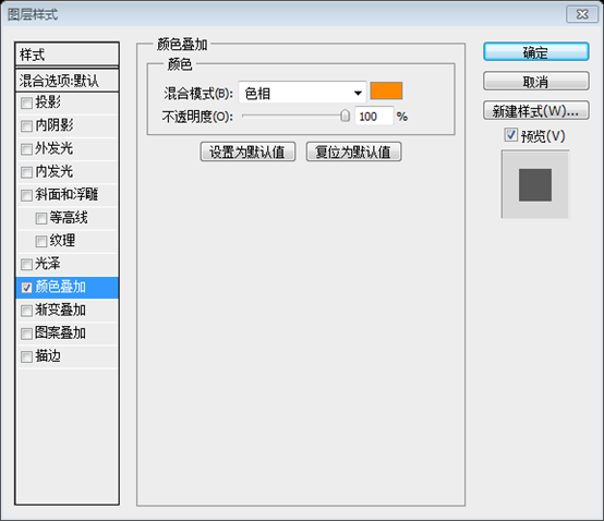
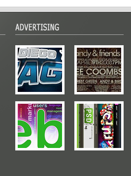
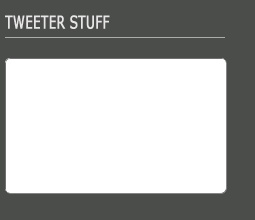
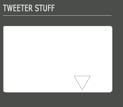
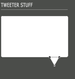
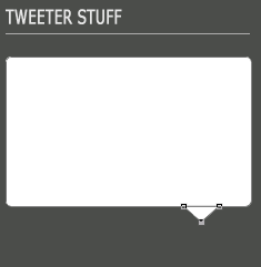
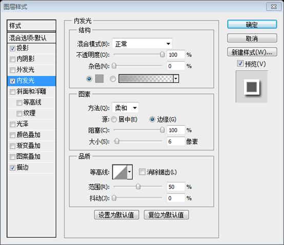
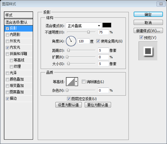
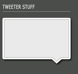
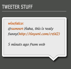
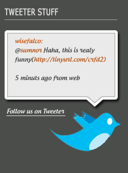
Step 31 Create the very bottom part where the repeated navigation will be placed. You can copy the rectangle from the top where the navigation is placed, move it down and make it about 40px high. Place it at the very bottom of your canvas. Please note that you may need to expand your canvas at this point so that all your graphics fit. If you need to do that, then go to Image > Canvas size and set the height to fit the entire layout. Create a duplicate navigation bar at the bottom. You can copy the rectangle where the top navigation bar is placed (0, 1260, 1200, 40), move it, and make it 40px high. Place it at the very bottom of your canvas and change the text color of Activity Page to: #494949. Note that you may need to expand your canvas in order for all the graphics to fit. If you need, click: Image > Canvas Size to set the appropriate height to fit the entire layout. Add copyright information on the left side of the navigation bar. Step 32 Step 32 Attention to detail again. Add a 1px white border to the top of the footer navigation area to have a better border effect. Step 33 Step 33 Add content to the footer so that you can position it appropriately according to the grid. Use Straight Line ToolDraw four straight lines (130, 1346, 220, 1), (370, 1346, 220, 1), (610, 1346, 220, 1) , (850, 1346, 220, 1), color: #acacac Use Text Tool above the straight line to add LATEST BLOG ENTRIES, RECENT COMMENTS, ADVERTISING, TWEETER STUFF. Text font: Verdana; font size: 12px, vertical scaling 150%; color: #e6e6e6 Below the first column, create three blogs entry. The button on the left is a rounded rectangle with a radius of 5px, size: 40px*18px, and color: #da7203. Layer style Copy the layer style of the yellow button in the navigation bar above Font of button text: Verdana Bold; Font size: 9px, bold, italic; Color: #e6e6e6 The font of the text on the right side of the button: Verdana; font size: 12px, bold; color: #e6e6e6 The font of the text below: Verdana; font size : 12px; Color: #e6e6e6 Insert conversation picture Add a color overlay layer style to it, color: #ff8a00 In front of each list there is the dialogue icon just made, the text font on the right is: Verdana; font size: 12px; color: #e6e6e6. The name of the person in bold The following message text font: Verdana; font size: 12px; color: #e6e6e6 Under the third column, use the rectangle tool to draw four rectangles, size: 100px*100px, respectively (610, 1368), (730, 1368), (610, 1482), (730, 1482) Add a white stroke to them Then add the appropriate ad image, move Place each image on top of the rectangle, right-click and select Create Clipping Mask In the fourth Below the column, use the Rounded Rectangle Tool to create a new rounded rectangle (850, 1367, 221, 135) with a radius of 5px ##Use Polygon ToolCreate an inverted triangle Path Selection ToolSelect this triangle and drag it to the appropriate position Direct Selection ToolSelect the bottom point , hold down Shift and move the point up to the appropriate position Stroke color: #fbfbfb
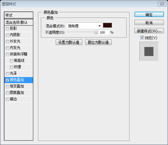
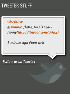
Text font: Androgyne; font size: 12px; color: #f3f3f3. Add a white line below, color: #f3f3f3 Add the following layer style to the image, color: #2e0909, and change the opacity of the layer to 28% Step 34 Step 34 Then just integrate the related layers. Final Design Postscript: The entire design is quite satisfactory. The previous steps are more detailed, while the following steps are briefly explained. For this reason, it took a lot of time to supplement the subsequent design process. Overall, some techniques are still used. For example, graying of icons, changing the hue of pictures, etc. I think the last dialog box design (which is based on the original picture to supplement the steps) is also a highlight. For more PS web design tutorials XXIV - Design a beautiful website from scratch For related articles, please pay attention to the PHP Chinese website! 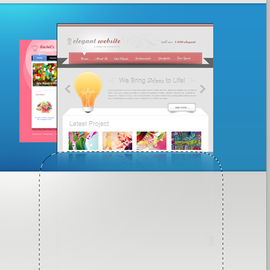
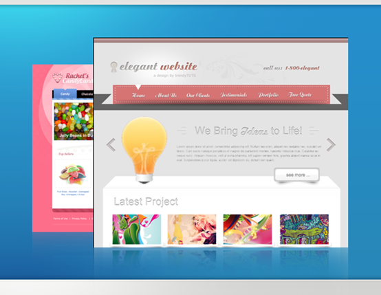
This is how our header should look after adding a nice tagline and some buttons. Don't forget to put all these graphics inside the “header” layer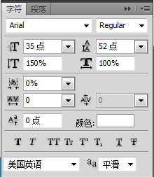

If you look at the final image preview, you can see that we have nice tabs in the content area. In order to create these tabs we'll need to perform a few extra steps, but it's definitely worth it. First, create a large rectangle shape with the Rounded Rectangle Tool. Make it 70px high and a radius of 10px or more if you wish. Now we have to get rid of the bottom radius and make a perfect corner out of it. Pick the Direct Selection Tool and click on the shape path. Click the vertical point and drag it down while holding the Shift key until it reaches the same level with the horizontal axis. So far so good but it's still deformed. You see the little handle. Click on it and move it upwards to the point of the path.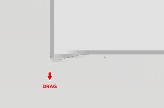
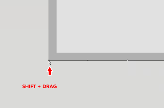
Now we have created a perfect corner. This is how it should look. Repeat this step for the right bottom corner .
Color: #b0b0b0 ##Step 22
Step 22
). Usually one tab is active and other active tabs are inactive. To make this explicit in our design, we need to find ways to implement it. I desaturated the other icons (
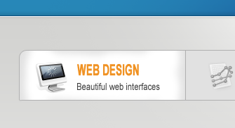
Add the shadow. Create a dark gray rectangle behind the tabs, as shown in the image.
Add a vector mask by clicking the little icon in the bottom of the layer palette.
Set the color to black, pick a large soft brush, and start deleting parts of the rectangle. As a result, we get a nice fake shadow effect behind our tabs.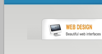
Finally the attention to detail. Draw in a 1px gray line on the bottom of the tabs. Mask the layer again like described earlier and with a big soft brush delete the left and right end of the line. Now we get a nicely faded line that follows our shadow behind the tabs.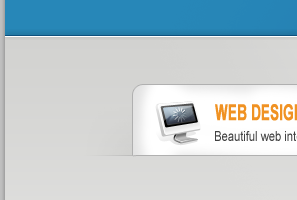
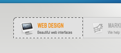
This is how our tabs should look.
This is how our tabs should look. 
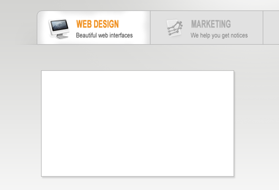
It's time to design the content for our first tab. We need a featured design image, a nice heading and some text. First we will create the featured image. I thought that it would be nice to break the edginess of the design by creating a nice stacked photos effect for our featured design image. To do this, draw a white rectangle with a 1px light gray border, and a very subtle drop shadow effect.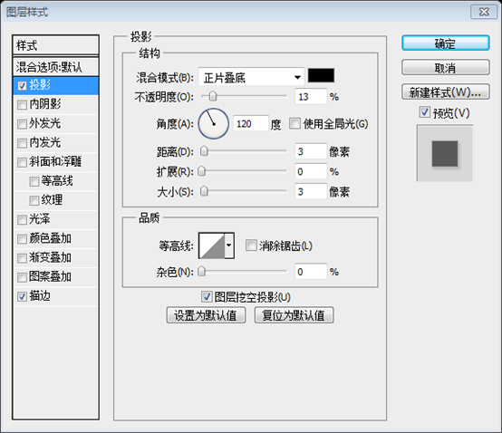

Now copy that layer and rotate it slightly with the Free Transform Tool. Do this one more time.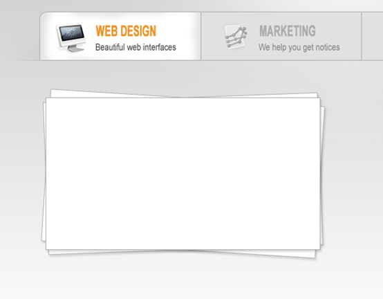
Import the image you selected and place it on top of the white rectangle. Don't worry about the image going out of the box, we'll fix it. Create a new selection based on the top rectangle, click: 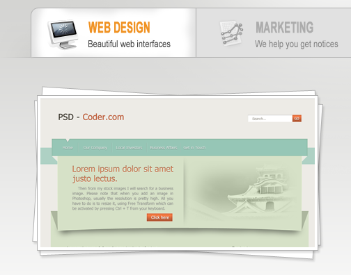
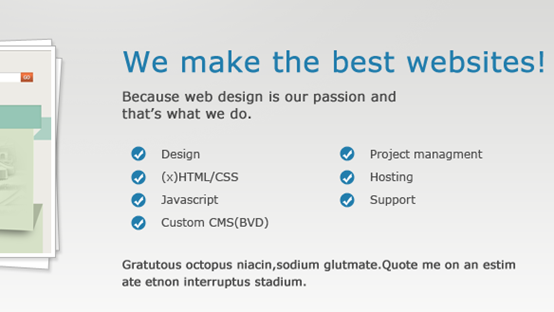
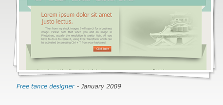
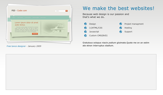
Current results: 
Then draw in another brighter rectangle by 10px smaller on all sides. Also add a 1px light gray border.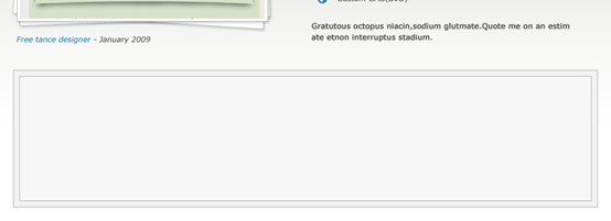


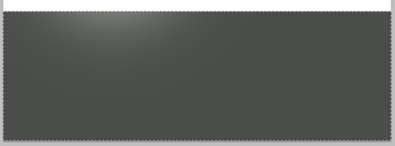
color: #dcdcdc

Attention to detail again. Add a 1px white line above the footer navigation box to give it a nice border effect.
Add some footer content and separate it nicely within your grid.
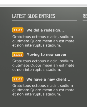


below the second column , there are message lists 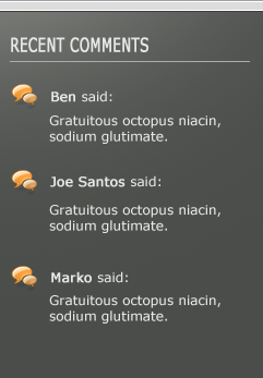
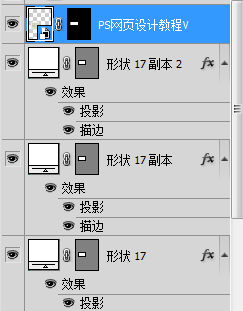
Finally organize all your layers inside the layer folders. This is how I've done it.
The Design

Hot AI Tools

Undress AI Tool
Undress images for free

Undresser.AI Undress
AI-powered app for creating realistic nude photos

AI Clothes Remover
Online AI tool for removing clothes from photos.

Clothoff.io
AI clothes remover

Video Face Swap
Swap faces in any video effortlessly with our completely free AI face swap tool!

Hot Article

Hot Tools

Notepad++7.3.1
Easy-to-use and free code editor

SublimeText3 Chinese version
Chinese version, very easy to use

Zend Studio 13.0.1
Powerful PHP integrated development environment

Dreamweaver CS6
Visual web development tools

SublimeText3 Mac version
God-level code editing software (SublimeText3)
 What are some common keyboard shortcuts that can significantly speed up a Photoshop workflow?
Jul 07, 2025 am 12:17 AM
Mastering Photoshop shortcut keys can significantly improve work efficiency. 1. Zoom and Navigation: Z key activates the zoom tool, Space bar Drag the quick pan canvas, double-click Z key to adapt the image to the window size, Ctrl/Cmd/-adjust the zoom level; 2. Layer management: Ctrl Shift N creates a new layer, Ctrl G group, Ctrl E merges layers, Shift [or] moves the layer level, Ctrl Click on the layer thumbnail to quickly select content; 3. Select and brush adjustment: M and L to switch rectangular marquee and lasso tools respectively, Shift adds/Alt to subtract selections, [or] adjusts the brush size, Shift [or] adjusts the hardness, so as to achieve efficient editing and smooth operation.
 How to restore an old photograph in Photoshop
Jul 12, 2025 am 12:40 AM
Repairing old photos can be achieved through key steps in Photoshop. The first is scanning and preliminary adjustment, including high-resolution scanning, cropping images, rotation correction and brightness/contrast adjustment; the second is to remove scratches and stains, use the imitation stamp tool to deal with large-area damage, repair tools to deal with small scratches, and pay attention to low transparency overlay and layering operations; the third is optional coloring and color tuning, and use the "hue/saturation" adjustment layer to increase retro tone; the last is to polish and output, check details, adjust sharpness, confirm resolution and select a suitable format to save. The entire process requires patience and meticulousness, especially when dealing with key parts such as the facial features of the characters.
 What are the key differences between Layer Masks and Vector Masks, and when should each be used?
Jul 16, 2025 am 12:03 AM
LayerMasks and VectorMasks are used in Photoshop with similar uses but different principles. LayerMasks is based on pixels and uses grayscale values to control the display and hiding of layer areas. It is suitable for photo detail editing, soft transition effects and fine brush adjustments, but zooming in may lead to jagging; VectorMasks is based on vector paths and shapes, and has resolution irrelevant resolution. It is suitable for graphics that require clear edges such as logos, icons or text frames, and can be scaled losslessly; the selection is based on the content type (photo or graphics), whether the size needs to be greatly adjusted, and the required edge effects (soft or sharp), and sometimes combined use can give full play to their respective advantages.
 How to create a custom gradient in Photoshop
Jul 07, 2025 am 12:24 AM
The key to creating a custom gradient in Photoshop is to master the use of the gradient editor. 1. First select the gradient tool (shortcut key G), click the top preview bar to open the "Gradge Editor"; 2. Click "New" in the editor to start customization, and you can also modify the style in the built-in gradient library; 3. Set color transition by adding, deleting and dragging the color slider, and double-clicking the slider to select specific colors; 4. Adjust the opacity stop point to control the transparency changes, click the diamond icon to add the transparency node; 5. Select linear, radial and other types in the gradient tool options to match design needs, and you can get started quickly after you are proficient.
 How can vector shapes be created and manipulated in Photoshop?
Jul 14, 2025 am 12:01 AM
TocreateandmanipulatevectorshapesinPhotoshop,usetheShapeToolstodrawvectorpathsonshapelayers,editanchorpointswiththeDirectSelectionTool,combineorsubtractshapesusingpathoperations,andrasterizewhennecessary.First,selectthedesiredshapetool—Rectangle,Elli
 What are artboards in Photoshop
Jul 14, 2025 am 12:04 AM
AnartboardinPhotoshopisamovable,resizablecontainerthatactsasanindividualcanvaswithinasingledocument.Itallowsdesignerstocreatemultiplelayoutsordesignvariationssidebyside,eachwithitsownsizeandcontent.Artboardsareidealforweblayouts,appscreens,banners,an
 How to select a specific color range in Photoshop
Jul 12, 2025 am 12:37 AM
ToselectaspecificcolorrangeinPhotoshop,usetheColorRangetool.1.GotoSelect>ColorRangeandclicktheeyedropperonthedesiredcolor.2.AdjusttheFuzzinessslidertocontrolselectionbreadth.3.AddmoresampleswithShift-clicks.4.EnableLocalizedColorClustersforcomplex
 What is the purpose of guides, grids, and rulers in achieving precise layouts?
Jul 15, 2025 am 12:38 AM
Rulers provide positioning references, Guides implement element alignment, and Grids builds a systematic layout. 1. Rulers display position coordinates, and can drag out reference lines to check element deviations and judge distance specifications; 2. Guides are virtual lines dragged out from rulers, accurately align elements and divide areas, and support locking and color settings; 3. Grids consists of rows and columns to control the overall layout rhythm, and adapt to responsive design, which are common, such as 12-column web page grids and 8px mobile grids. The combination of the three improves layout efficiency and professionalism.


