How to use maps to display data in ECharts
Dec 18, 2023 pm 04:09 PM
How to use maps to display data in ECharts
ECharts is a powerful data visualization tool that supports a variety of chart types, including line charts and bar charts , pie chart, etc. Among them, map charts are an important component in ECharts and can be used to display the data distribution in various regions. This article will introduce how to use the map function in ECharts and give detailed code examples.
Before we start, we need to prepare the following files:
- echarts.min.js: The core library file of ECharts.
- china.js: China map data file predefined in ECharts, used to draw China maps.
- Data file: The data file we prepared ourselves, in JSON format, contains data for each region.
First, introduce the necessary files in the HTML file:
<!DOCTYPE html>
<html>
<head>
    <meta charset="UTF-8">
    <title>ECharts地圖展示數(shù)據(jù)示例</title>
    <script src="echarts.min.js"></script>
    <script src="china.js"></script>
</head>
<body>
    <div id="map" style="width: 800px; height: 600px;"></div>
</body>
</html>
Then, write the code in the JavaScript file:
// 創(chuàng)建地圖實例
var myChart = echarts.init(document.getElementById('map'));

// 設(shè)置地圖參數(shù)
var option = {
    title: {
        text: '全國各省份數(shù)據(jù)分布',
        left: 'center'
    },
    tooltip: {
        trigger: 'item'
    },
    visualMap: {
        min: 0,
        max: 1000,
        left: 'left',
        top: 'bottom',
        text: ['高', '低'],           // 文本,默認(rèn)為數(shù)值文本
        calculable: true,
        inRange: {
            color: ['#e0ffff', '#006edd']
        }
    },
    series: [
        {
            name: '數(shù)據(jù)',
            type: 'map',
            mapType: 'china',
            roam: false,         // 禁止縮放平移
            label: {
                normal: {
                    show: true
                },
                emphasis: {
                    show: true
                }
            },
            data: [
                {name: '北京', value: 500},
                {name: '上海', value: 300},
                {name: '廣東', value: 800},
                // 這里填充自己的數(shù)據(jù)
            ]
        }
    ]
};

// 使用剛指定的配置項和數(shù)據(jù)顯示圖表
myChart.setOption(option);
In the above code, we first pass echarts.init method to create a map instance and bind it to the specified DOM element. Then, we configure the map's style and data by setting the option parameters. In series, we set the map type to map and specified the map data.
Finally, we use myChart.setOption(option) to apply the configuration item to the map instance to display the map.
It should be noted that we only provide part of the data in the code. You need to fill in the data and adjust related configurations according to your actual situation. At the same time, you can display maps of other regions by modifying the map data in the china.js file.
So far, we have completed the operation of using maps to display data in ECharts. Through careful configuration and data filling, you can achieve richer and more diverse map display effects. I hope this article can be helpful to your study and practice!
The above is the detailed content of How to use maps to display data in ECharts. For more information, please follow other related articles on the PHP Chinese website!

Hot AI Tools

Undress AI Tool
Undress images for free

Undresser.AI Undress
AI-powered app for creating realistic nude photos

AI Clothes Remover
Online AI tool for removing clothes from photos.

Clothoff.io
AI clothes remover

Video Face Swap
Swap faces in any video effortlessly with our completely free AI face swap tool!

Hot Article

Hot Tools

Notepad++7.3.1
Easy-to-use and free code editor

SublimeText3 Chinese version
Chinese version, very easy to use

Zend Studio 13.0.1
Powerful PHP integrated development environment

Dreamweaver CS6
Visual web development tools

SublimeText3 Mac version
God-level code editing software (SublimeText3)

Hot Topics
 How to make Google Maps the default map in iPhone
Apr 17, 2024 pm 07:34 PM
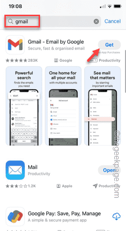
The default map on the iPhone is Maps, Apple's proprietary geolocation provider. Although the map is getting better, it doesn't work well outside the United States. It has nothing to offer compared to Google Maps. In this article, we discuss the feasible steps to use Google Maps to become the default map on your iPhone. How to Make Google Maps the Default Map in iPhone Setting Google Maps as the default map app on your phone is easier than you think. Follow the steps below – Prerequisite steps – You must have Gmail installed on your phone. Step 1 – Open the AppStore. Step 2 – Search for “Gmail”. Step 3 – Click next to Gmail app
 ECharts and Java interface: How to quickly implement statistical charts such as line charts, bar charts, pie charts, etc.
Dec 17, 2023 pm 10:37 PM
ECharts and Java interface: How to quickly implement statistical charts such as line charts, bar charts, and pie charts. Specific code examples are required. With the advent of the Internet era, data analysis has become more and more important. Statistical charts are a very intuitive and powerful display method. Charts can display data more clearly, allowing people to better understand the connotation and patterns of the data. In Java development, we can use ECharts and Java interfaces to quickly display various statistical charts. ECharts is a software developed by Baidu
 How to use php interface and ECharts to generate visual statistical charts
Dec 18, 2023 am 11:39 AM
In today's context where data visualization is becoming more and more important, many developers hope to use various tools to quickly generate various charts and reports so that they can better display data and help decision-makers make quick judgments. In this context, using the Php interface and ECharts library can help many developers quickly generate visual statistical charts. This article will introduce in detail how to use the Php interface and ECharts library to generate visual statistical charts. In the specific implementation, we will use MySQL
 How to add store address to Xiaohongshu map? How to fill in the store address setting?
Mar 29, 2024 am 09:41 AM
As Xiaohongshu becomes more and more popular among young people, more and more people choose to open stores on Xiaohongshu. Many novice sellers encounter difficulties when setting up their store address and do not know how to add the store address to the map. 1. How to add the store address to the map in Xiaohongshu? 1. First, make sure your store has a registered account on Xiaohongshu and has successfully opened a store. 2. Log in to your Xiaohongshu account, enter the store backend, and find the "Store Settings" option. 3. On the store settings page, find the "Store Address" column and click "Add Address". 4. In the address adding page that pops up, fill in the detailed address information of the store, including province, city, district, county, street, house number, etc. 5. After filling in, click the "Confirm Add" button. Xiaohongshu will provide you with the address
 Steps to draw dashboard using ECharts and Python interface
Dec 18, 2023 am 08:40 AM
The steps to draw a dashboard using ECharts and Python interface require specific code examples. Summary: ECharts is an excellent data visualization tool that can easily perform data processing and graphics drawing through the Python interface. This article will introduce the specific steps to draw a dashboard using ECharts and Python interface, and provide sample code. Keywords: ECharts, Python interface, dashboard, data visualization Introduction Dashboard is a commonly used form of data visualization, which uses
 How to use at-a-glance directions on Google Maps
Jun 13, 2024 pm 09:40 PM
A year after its launch, Google Maps has launched a new feature. Once you set a route to your destination on the map, it summarizes your travel route. Once your journey begins, you can "Browse" route guidance from your phone's lock screen. You can use Google Maps to see your estimated arrival time and route. Throughout your trip, you can view navigation information on your lock screen, and by unlocking your phone, you can view navigation information without accessing Google Maps. By unlocking your phone, you can view navigation information without accessing Google Maps. By unlocking your phone, you can view navigation information without accessing Google Maps. By unlocking your phone, you can view navigation information without accessing Google Maps. By unlocking your phone, you can view navigation information without accessing Google Maps. By unlocking your phone, you can view navigation information without accessing Google Maps.
 How to use histogram to display data in ECharts
Dec 18, 2023 pm 02:21 PM
How to use histograms to display data in ECharts ECharts is a JavaScript-based data visualization library that is very popular and widely used in the field of data visualization. Among them, the histogram is the most common and commonly used chart type, which can be used to display the size, comparison and trend analysis of various numerical data. This article will introduce how to use ECharts to draw histograms and provide code examples. First, we need to introduce the ECharts library into the HTML file, which can be introduced in the following way
 ECharts and golang technical guide: practical tips for creating various statistical charts
Dec 17, 2023 pm 09:56 PM
ECharts and golang technical guide: Practical tips for creating various statistical charts, specific code examples are required. Introduction: In the field of modern data visualization, statistical charts are an important tool for data analysis and visualization. ECharts is a powerful data visualization library, while golang is a fast, reliable and efficient programming language. This article will introduce you to how to use ECharts and golang to create various types of statistical charts, and provide code examples to help you master this skill. Preparation


