


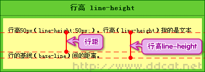
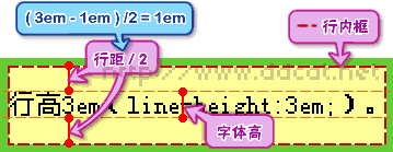
The line height includes the content area and the blank area that is symmetrically expanded based on the content area; generally speaking, it can also be considered as the vertical distance between the baselines of adjacent text lines. In CSS, you can use the line-height attribute to set the line height; this attribute sets the distance (line height) between lines, and negative values ??are not allowed.
The operating environment of this tutorial: Windows 7 system, CSS3&&HTML5 version, Dell G3 computer.
1. Baseline, bottom line, top line
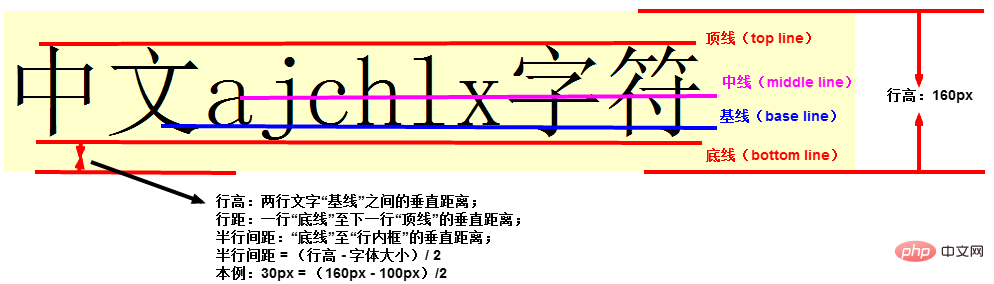
- The line height includes the content area and is based on the content area A symmetrically expanded white space; generally, it can also be thought of as the vertical distance between the baselines of adjacent text lines.
- The baseline is not the lower edge of Chinese characters, but the lower edge of the English letter "x"
2. Line spacing and line height
3. Content area
- The area wrapped by the bottom line and the top line may not necessarily be in practice You can see it, but it exists.
4. Inline box
- ##Inline box is just a concept, it cannot be displayed, but it And it does exist
- its height is the line height
- When there are no other factors (padding) affecting it, the inline box is equal to the content area
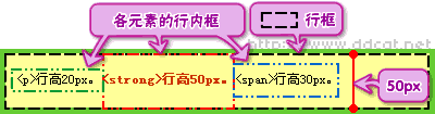
- The height of the row box is equal to the maximum value of the row height among all elements in the row
For inline elements such as em, strong, span, etc., their padding, margin, border-top, and border-bottom will not increase the row height.
- padding will be covered; margin will be reset to 0; border-top and border-bottom will also be covered.
- padding-left, padding-right, border-left and border-right are available.
The img element will affect the row height - Setting the padding, border and margin of the inline element will not increase the height of the outer element, as shown below:
-


In CSS we can use the line-height attribute to set the line height. The line-height attribute can be used to set the distance between lines (line height). Negative values ??are not allowed.
The line-height property affects the layout of the line box. When applied to a block-level element, it defines the minimum distance between baselines in that element rather than the maximum distance.
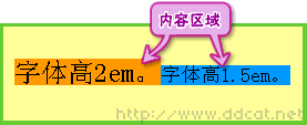
The calculated difference between line-height and font-size (known as "line spacing" in CSS) is divided into two halves and added to the top and bottom of a line of text content. The smallest box that can contain this content is a line box.
Example:
<!DOCTYPE html>
<html>

	<head>
		<meta charset="utf-8">
		<style type="text/css">
			p.small {
				line-height: 90%
			}

			p.big {
				line-height: 200%
			}
		</style>
	</head>

	<body>

		<p>
			這是擁有標(biāo)準(zhǔn)What is line height in css的段落。 在大多數(shù)瀏覽器中默認(rèn)What is line height in css大約是 110% 到 120%。 這是擁有標(biāo)準(zhǔn)What is line height in css的段落。 這是擁有標(biāo)準(zhǔn)What is line height in css的段落。 這是擁有標(biāo)準(zhǔn)What is line height in css的段落。 這是擁有標(biāo)準(zhǔn)What is line height in css的段落。 這是擁有標(biāo)準(zhǔn)What is line height in css的段落。
		</p>

		<p class="small">
			這個段落擁有更小的What is line height in css。 這個段落擁有更小的What is line height in css。 這個段落擁有更小的What is line height in css。 這個段落擁有更小的What is line height in css。 這個段落擁有更小的What is line height in css。 這個段落擁有更小的What is line height in css。 這個段落擁有更小的What is line height in css。
		</p>

		<p class="big">
			這個段落擁有更大的What is line height in css。 這個段落擁有更大的What is line height in css。 這個段落擁有更大的What is line height in css。 這個段落擁有更大的What is line height in css。 這個段落擁有更大的What is line height in css。 這個段落擁有更大的What is line height in css。 這個段落擁有更大的What is line height in css。
		</p>

	</body>

</html>
Rendering:
 (Learning video sharing:
The above is the detailed content of What is line height in css. For more information, please follow other related articles on the PHP Chinese website!

Hot AI Tools

Undress AI Tool
Undress images for free

Undresser.AI Undress
AI-powered app for creating realistic nude photos

AI Clothes Remover
Online AI tool for removing clothes from photos.

Clothoff.io
AI clothes remover

Video Face Swap
Swap faces in any video effortlessly with our completely free AI face swap tool!

Hot Article
Hot Tools

Notepad++7.3.1
Easy-to-use and free code editor

SublimeText3 Chinese version
Chinese version, very easy to use

Zend Studio 13.0.1
Powerful PHP integrated development environment

Dreamweaver CS6
Visual web development tools

SublimeText3 Mac version
God-level code editing software (SublimeText3)
Hot Topics


 What is 'render-blocking CSS'?
Jun 24, 2025 am 12:42 AM
What is 'render-blocking CSS'?
Jun 24, 2025 am 12:42 AM
CSS blocks page rendering because browsers view inline and external CSS as key resources by default, especially with imported stylesheets, header large amounts of inline CSS, and unoptimized media query styles. 1. Extract critical CSS and embed it into HTML; 2. Delay loading non-critical CSS through JavaScript; 3. Use media attributes to optimize loading such as print styles; 4. Compress and merge CSS to reduce requests. It is recommended to use tools to extract key CSS, combine rel="preload" asynchronous loading, and use media delayed loading reasonably to avoid excessive splitting and complex script control.
 What is Autoprefixer and how does it work?
Jul 02, 2025 am 01:15 AM
What is Autoprefixer and how does it work?
Jul 02, 2025 am 01:15 AM
Autoprefixer is a tool that automatically adds vendor prefixes to CSS attributes based on the target browser scope. 1. It solves the problem of manually maintaining prefixes with errors; 2. Work through the PostCSS plug-in form, parse CSS, analyze attributes that need to be prefixed, and generate code according to configuration; 3. The usage steps include installing plug-ins, setting browserslist, and enabling them in the build process; 4. Notes include not manually adding prefixes, keeping configuration updates, prefixes not all attributes, and it is recommended to use them with the preprocessor.
 How can you animate an SVG with CSS?
Jun 30, 2025 am 02:06 AM
How can you animate an SVG with CSS?
Jun 30, 2025 am 02:06 AM
AnimatingSVGwithCSSispossibleusingkeyframesforbasicanimationsandtransitionsforinteractiveeffects.1.Use@keyframestodefineanimationstagesforpropertieslikescale,opacity,andcolor.2.ApplytheanimationtoSVGelementssuchas,,orviaCSSclasses.3.Forhoverorstate-b
 What is the conic-gradient() function?
Jul 01, 2025 am 01:16 AM
What is the conic-gradient() function?
Jul 01, 2025 am 01:16 AM
Theconic-gradient()functioninCSScreatescirculargradientsthatrotatecolorstopsaroundacentralpoint.1.Itisidealforpiecharts,progressindicators,colorwheels,anddecorativebackgrounds.2.Itworksbydefiningcolorstopsatspecificangles,optionallystartingfromadefin
 What is the scope of a CSS Custom Property?
Jun 25, 2025 am 12:16 AM
What is the scope of a CSS Custom Property?
Jun 25, 2025 am 12:16 AM
The scope of CSS custom properties depends on the context of their declaration, global variables are usually defined in :root, while local variables are defined within a specific selector for componentization and isolation of styles. For example, variables defined in the .card class are only available for elements that match the class and their children. Best practices include: 1. Use: root to define global variables such as topic color; 2. Define local variables inside the component to implement encapsulation; 3. Avoid repeatedly declaring the same variable; 4. Pay attention to the coverage problems that may be caused by selector specificity. Additionally, CSS variables are case sensitive and should be defined before use to avoid errors. If the variable is undefined or the reference fails, the fallback value or default value initial will be used. Debug can be done through the browser developer
 CSS tutorial focusing on mobile-first design
Jul 02, 2025 am 12:52 AM
CSS tutorial focusing on mobile-first design
Jul 02, 2025 am 12:52 AM
Mobile-firstCSSdesignrequiressettingtheviewportmetatag,usingrelativeunits,stylingfromsmallscreensup,optimizingtypographyandtouchtargets.First,addtocontrolscaling.Second,use%,em,orreminsteadofpixelsforflexiblelayouts.Third,writebasestylesformobile,the
 What is the :target pseudo-class and how can it be used?
Jun 22, 2025 am 12:48 AM
What is the :target pseudo-class and how can it be used?
Jun 22, 2025 am 12:48 AM
CSS's :target pseudo-class is used to style the target element based on the URL fragment identifier. It works by the browser scrolling to the element when the URL contains a # symbol and element id and allows a specific style to be applied to the element via :target. Common use cases include highlighting the page section after navigation, creating tabs or slideshows without JavaScript, and improving accessibility to long pages. Usage tips include ensuring that id is unique, combining transition or animation effects, switching content visibility with display attributes, and considering compatibility with older browsers.
 CSS tutorial for creating loading spinners and animations
Jul 07, 2025 am 12:07 AM
CSS tutorial for creating loading spinners and animations
Jul 07, 2025 am 12:07 AM
There are three ways to create a CSS loading rotator: 1. Use the basic rotator of borders to achieve simple animation through HTML and CSS; 2. Use a custom rotator of multiple points to achieve the jump effect through different delay times; 3. Add a rotator in the button and switch classes through JavaScript to display the loading status. Each approach emphasizes the importance of design details such as color, size, accessibility and performance optimization to enhance the user experience.
