Detailed explanation of the usage of position attribute in CSS
Apr 02, 2020 pm 06:10 PMThis article introduces the usage, classification and usage effect display of the position attribute in CSS. I hope it will be helpful to friends who are learning CSS!

Detailed explanation of the usage of position attribute in CSS
1. What is the role of position attribute?
The CSS position property is used to specify how an element is positioned in the document. The top, right, bottom and left attributes determine the final position of the element. (MDN definition).
(Recommended learning: CSS tutorial)
2. What are the classifications of position?
1, static
Normal layout behavior, the current layout position of the element in the regular flow of the document. At this time the top, right, bottom, left and z-index properties have no effect.
The position remains unchanged.
2, relative
Under this keyword, the element is first placed at the position when no positioning is added, and then the position of the element is adjusted without changing the page layout (therefore, the element will be placed where the positioning is not added). Leave the location blank when adding targeting). position:relative is not valid for table-*-group, table-row, table-column, table-cell, table-caption elements.
Offset relative to its own position.
3. Absolute
Does not reserve space for the element, and determines the position of the element by specifying the offset of the element relative to the nearest non-static positioned ancestor element. Absolutely positioned elements can have margins set and will not be merged with other margins.
As if this element never existed, the offset of the element will be determined based on the non-static ancestor elements of this element.
4, fixed
Does not reserve space for elements, but specifies the position of the element by specifying its position relative to the screen viewport (viewport). The element's position does not change when the screen scrolls. When printing, the element will appear at a fixed location on each page. The fixed attribute creates a new stacking context. When the transform attribute of an element's ancestor is non-none, the container is changed from the viewport to that ancestor.
Lower versions of IE are not compatible.
5, sticky
The box position is calculated according to the normal flow (this is called the position in the normal flow), and then relative to the flow root (BFC) and containing block (of the element in the flow) nearest block-level ancestor). In all cases (even when the positioned element is a table), the positioning of this element does not affect subsequent elements. When element B is sticky positioned, the position of subsequent elements is still determined by the position of B when it was not positioned. position: sticky has the same effect as position: relative on table elements.
At the same time, sticky has the following problems:
1. Sticky will not trigger BFC.
2. The style sheet z-index is invalid. Writing style inline is valid.
3. Sticky is container-related, which means that the sticky feature will only take effect in the container it is in. This point is emphasized because in actual use, when the body is set to height: 100%, the sticky element stops at a certain position.
3. Test code
The public code of the test code is as follows:
<html html>
<head>
    <meta charset="utf-8">
    <title>position</title>
</head>
<style>
    .main-app{
        display: flex;
        justify-content: center;
        align-items: center;
    }
    .app-container {
        width: 100%;
        height: 300px;
        display: flex;
        justify-content: center;
        align-items: center;
    }
    #the-box{
        position: static;
        /* position: relative;
        top:100px;
        left:200px; */
    }
    .sub-box {
        width: 50px;
        height: 50px;
    }
</style>

<body>
    <div class="main-app">
        <div class="app-container">
            <div class="sub-box" style="background: gray;"></div>
            <div id="the-box" class="sub-box" style="background: green;"></div>
            <div class="sub-box" style="background: yellow;"></div>
            <div class="sub-box" style="background: red;"></div>
        </div>
    </div>
</body>

</html>
I selected the second element as our test object this time , the test environment is chrome 75 version.
1, static
#the-box{
    position: static;
}
Result:
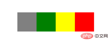
Normal document flow display
2, relative
#the-box{
    position: relative;
    top:100px;
    left:200px;
}
Result:
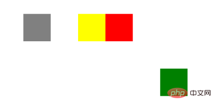
The set position is offset from its original position, but the original position is retained.
3, absolute
#the-box{
    position: absolute;
    top: 100px;
    left: 200px;
}
Result:

The original fixed position is occupied by other elements, because the parent element is non-static (flex ), so the current element is offset by the set position relative to the parent element.
4. sticky
You must specify one of the four thresholds top, right, bottom or left before sticky positioning can take effect. Otherwise the behavior is the same as relative positioning.
This feature is that the position of the element is fixed in the viewport. If the page does not have a scroll axis, the feature will not be displayed. At this time, we slightly change its parent element to make the page appear with a scroll axis.
.app-container {
    width: 100%;
    height: 3000px;
    display: flex;
    justify-content: center;
    align-items: center;
}
#the-box{
    position: sticky;
    top: 100px;
}
Result:
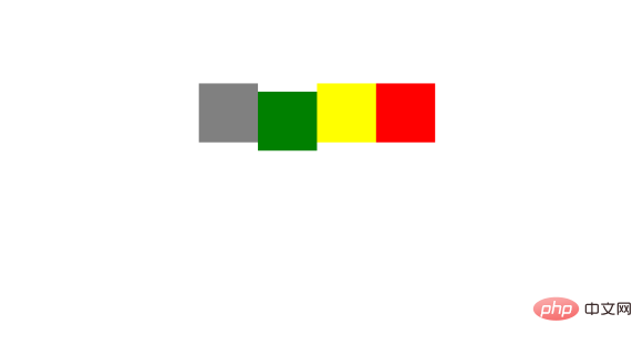
When we scroll the page and the element is more than 100px from the top, the current element position relative to the viewport remains unchanged when scrolling down. This feature can be used as a fixed table header.
5, fixed
cannot be used for versions below IE7. In fact, it is equivalent to fixing the position of the element in the browser window.
#the-box{
    position: fixed;
    top: 100px;
    left: 200px;
}
Result:
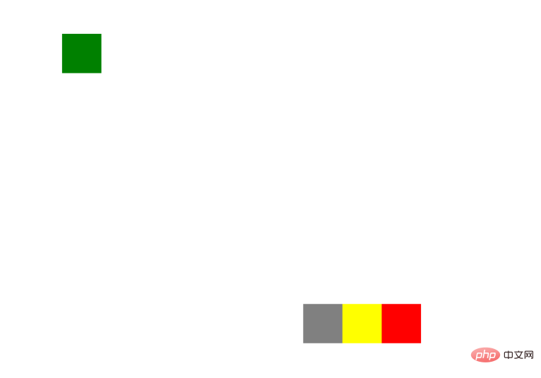
No matter how you scroll the scroll axis, the element position always remains the same.
6、inherit
Specifies that the value of the position attribute should be inherited from the parent element.
7, initial
The initial keyword is used to set CSS properties to their default values ??and can be applied to any CSS style. (IE does not support this keyword)
8, unset
As the name suggests, the unset keyword can be simply understood as not setting. Actually, it is a combination of keywords initial and inherit.
When we set unset to a CSS property:
If the property is a default inherited property, the value is equivalent to inherit
If the property is a non-inherited property, the value Equivalent to initial
9, revert
is not yet included in the specification.
The above is the detailed content of Detailed explanation of the usage of position attribute in CSS. For more information, please follow other related articles on the PHP Chinese website!

Hot AI Tools

Undress AI Tool
Undress images for free

Undresser.AI Undress
AI-powered app for creating realistic nude photos

AI Clothes Remover
Online AI tool for removing clothes from photos.

Clothoff.io
AI clothes remover

Video Face Swap
Swap faces in any video effortlessly with our completely free AI face swap tool!

Hot Article

Hot Tools

Notepad++7.3.1
Easy-to-use and free code editor

SublimeText3 Chinese version
Chinese version, very easy to use

Zend Studio 13.0.1
Powerful PHP integrated development environment

Dreamweaver CS6
Visual web development tools

SublimeText3 Mac version
God-level code editing software (SublimeText3)
 How to change text color in CSS?
Jul 27, 2025 am 04:25 AM
To change the text color in CSS, you need to use the color attribute; 1. Use the color attribute to set the text foreground color, supporting color names (such as red), hexadecimal codes (such as #ff0000), RGB values (such as rgb(255,0,0)), HSL values (such as hsl(0,100%,50%)), and RGBA or HSLA with transparency (such as rgba(255,0,0,0.5)); 2. You can apply colors to any element containing text, such as h1 to h6 titles, paragraph p, link a (note the color settings of different states of a:link, a:visited, a:hover, a:active), buttons, div, span, etc.; 3. Most
 How to purge unused CSS?
Jul 27, 2025 am 02:47 AM
UseautomatedtoolslikePurgeCSSorUnCSStoscanandremoveunusedCSS;2.IntegratepurgingintoyourbuildprocessviaWebpack,Vite,orTailwind’scontentconfiguration;3.AuditCSSusagewithChromeDevToolsCoveragetabbeforepurgingtoavoidremovingneededstyles;4.Safelistdynamic
 What is a stacking context?
Jul 27, 2025 am 03:55 AM
Astackingcontextisaself-containedlayerinCSSthatcontrolsthez-orderofoverlappingelements,wherenestedcontextsrestrictz-indexinteractions;itiscreatedbypropertieslikez-indexonpositionedelements,opacity
 Describe different CSS units and when to use them
Jul 27, 2025 am 04:24 AM
In web development, the choice of CSS units depends on design requirements and responsive performance. 1. Pixels (px) are used to fix sizes such as borders and icons, but are not conducive to responsive design; 2. Percentage (%) is adjusted according to the parent container, suitable for streaming layout but attention to context dependence; 3.em is based on the current font size, rem is based on the root element font, suitable for elastic fonts and unified theme control; 4. Viewport units (vw/vh/vmin/vmax) are adjusted according to the screen size, suitable for full-screen elements and dynamic UI; 5. Auto, inherit, initial and other values are used to automatically calculate, inherit or reset styles, which helps to flexibly layout and style management. The rational use of these units can improve page flexibility and responsiveness.
 How to use the CSS backdrop-filter property?
Aug 02, 2025 pm 12:11 PM
Backdrop-filter is used to apply visual effects to the content behind the elements. 1. Use backdrop-filter:blur(10px) and other syntax to achieve the frosted glass effect; 2. Supports multiple filter functions such as blur, brightness, contrast, etc. and can be superimposed; 3. It is often used in glass card design, and it is necessary to ensure that the elements overlap with the background; 4. Modern browsers have good support, and @supports can be used to provide downgrade solutions; 5. Avoid excessive blur values and frequent redrawing to optimize performance. This attribute only takes effect when there is content behind the elements.
 How to style links in CSS?
Jul 29, 2025 am 04:25 AM
The style of the link should distinguish different states through pseudo-classes. 1. Use a:link to set the unreached link style, 2. a:visited to set the accessed link, 3. a:hover to set the hover effect, 4. a:active to set the click-time style, 5. a:focus ensures keyboard accessibility, always follow the LVHA order to avoid style conflicts. You can improve usability and accessibility by adding padding, cursor:pointer and retaining or customizing focus outlines. You can also use border-bottom or animation underscore to ensure that the link has a good user experience and accessibility in all states.
 How to center text in CSS?
Jul 27, 2025 am 03:16 AM
Use text-align:center to achieve horizontal centering of text; 2. Use Flexbox's align-items:center and justify-content:center to achieve vertical and horizontal centering; 3. Single-line text can be vertically centered by setting line-height equal to the container height; 4. Absolute positioning elements can be combined with top: 50%, left: 50% and transform:translate (-50%, -50%) to achieve centering; 5. CSSGrid's place-items:center can also achieve dual-axis centering at the same time. It is recommended to use Flexbox or Grid first in modern layouts.
 What are user agent stylesheets?
Jul 31, 2025 am 10:35 AM
User agent stylesheets are the default CSS styles that browsers automatically apply to ensure that HTML elements that have not added custom styles are still basic readable. They affect the initial appearance of the page, but there are differences between browsers, which may lead to inconsistent display. Developers often solve this problem by resetting or standardizing styles. Use the Developer Tools' Compute or Style panel to view the default styles. Common coverage operations include clearing inner and outer margins, modifying link underscores, adjusting title sizes and unifying button styles. Understanding user agent styles can help improve cross-browser consistency and enable precise layout control.


