


This article mainly introduces the example of using css3 to implement a circular progress bar. The detailed code is compiled here, which is of great practical value. Friends in need can refer to it
When developing WeChat applet , encountering the need for a circular progress bar. Using canvas to draw is troublesome:
1. In order to achieve adaptation on different screens, the size of the progress bar must be dynamically calculated;
2. In the mini program, the canvas of canvas has The highest level, not easily expandable.
But using css3 and js to implement the progress bar can easily avoid this problem.
Note: This article is implemented using jquery, but the principle is the same. In the mini program, just define and change the corresponding variables.
1. Progress Bar style style
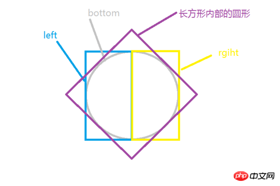
In daily development, the border of an element is often used to display a circular pattern. This technique is also used when using CSS3 to implement a circular progress bar. In order to realize the circular border above and dynamically cover the circular border below, a total of one circle, 2 rectangles and 2 semicircles are needed: one circle is used to display the underlying background, and two semicircles are used to cover the underlying background. The background shows the progress, and the other two rectangles are used to cover the progress that does not need to be displayed. As shown below:

The bottom circle at the bottom is the background of the progress bar. There are two rectangles left and right above the bottom, which are used to cover the progress bar that is not to be displayed. There is a semicircle inside each of the two rectangles to show progress. Under normal circumstances, a semicircle drawn using a square has an included angle of 45 degrees in diameter and horizontally. In order to make the two semicircles just enough to cover the entire circle, you need to use rotate in CSS3 to rotate the original square to achieve the effect of covering the entire background. As shown in the picture below (for clarity, it is represented by a square here):
As shown in the picture, rotate the semicircle inside the rectangle 45 degrees to the right (clockwise) to get the progress An image that covers the entire background. Rotate the semicircle 135 degrees to the left (counterclockwise) to get an image with only the progress bar background. Why should we rotate to the left instead of all the way to the right? Of course, the effect we want to achieve is: the progress starts from the top and finishes in time. At this point, the idea is very clear. You only need to control the display of progress on the left and right by the percentage.
The html and css code to implement this part is as follows:
html code
<p class="progressbar">
    <p class="left-container">
        <p class="left-circle"></p>
    </p>
    <p class="right-container">
        <p class="right-circle"></p>
    </p>
</p>
css code:
.progressbar{
    position: relative;
    margin: 100px auto;
    width: 100px;
    height: 100px;
    border: 20px solid #ccc;
    border-radius: 50%;
}
.left-container,.right-container{
    position: absolute;
    width: 70px;
    height: 140px;
    top:-20px;
    overflow: hidden;
    z-index: 1;
}
.left-container{
    left: -20px;
}
.right-container{
    right: -20px;
}
.left-circle,.right-circle{
    position: absolute;
    top:0;
    width: 100px;
    height: 100px;
    border:20px solid transparent;
    border-radius: 50%;
    transform: rotate(-135deg);
    transition: all .5s linear;
    z-index: 2;
}
.left-circle{
    left: 0;
    border-top-color: 20px solid blue;
    border-left-color: 20px solid blue;
}
.right-circle{
    border-right-color: 20px solid blue;
    border-bottom-color: 20px solid blue;
    right: 0;
}
2: js to control the progress bar
In order to make the logic of the progress bar more robust, js Part of the implementation needs to consider four situations:
1. The basic value and the changed value are both on the right.
2. The basic value is on the right and the changed value is on the left.
3. The changed value of the basic value is on the left.
4. The basic value is on the left and the changed value is on the right.
No matter in which case, the core needs to consider only two points: the change of angle and the amount of use time.
In the first case, it is relatively simple, and you can easily calculate the change in angle and the usage time. First, you need to set the time required to change the entire semicircle. After setting, just calculate the time required to change the angle based on the ratio. The code is as follows:
time = (curPercent - oldPercent)/50 * baseTime;
     //確定時間值為正
     curPercent - oldPercent > 0 ? '' : time = - time;
     deg = curPercent/50*180-135;
The second case is a little more troublesome. Because there is a transition from the progress on the right to the progress on the left. In order to change the progress smoothly, we need to use a timer here. After changing the right part, we can then modify the left part. The code is as follows:
//設(shè)置右邊的進度
  time = (50 - oldPercent)/50 * baseTime;
deg = (50 - oldPercent)/50*180-135;
$rightBar .css({
    transform: 'rotate('+ deg+ 'deg)',
    transition : 'all '+ time + 's linear'
})
//延時設(shè)置左邊進度條的改變
setTimeout(function(){
    time = (curPercent - 50)/50;
    deg = (curPercent - 50)/50*180 -135;

    $leftBar.css({
        transform: 'rotate('+ deg+ 'deg)',
        transition : 'all '+ time + 's linear'
    })
}, Math.floor(time*1000));000));
The third and fourth situations are similar to the previous situations and will not be discussed here.
The complete code for the function that controls the progress bar is as follows (implemented using jQuery):
/**
*設(shè)置進度條的變化
*@param {number} oldPercent 進度條改變之前的半分比
*@param {number} curPercent 進度條當前要設(shè)置的值
*@return {boolean} 設(shè)置成功返回 true,否則,返回fasle
*/
function setProgessbar(oldPercent, curPercent){
var $leftBar = $('#left-bar');
var $rightBar = $('#right-bar');
//將傳入的參數(shù)轉(zhuǎn)換,允許字符串表示的數(shù)字
oldPercent = + oldPercent;
curPercent = + curPercent;
//檢測參數(shù),如果不是number類型或不在0-100,則不執(zhí)行
if(typeof oldPercent ==='number' && typeof curPercent ==='number'
&& oldPercent >= 0 && oldPercent <= 100 && curPercent <= 100 && curPercent >= 0){
var baseTime = 1; //默認改變半圓進度的時間,單位秒
var time = 0; //進度條改變的時間
var deg = 0; //進度條改變的角度
if(oldPercent > 50){//原來進度大于50
if(curPercent>50){
//設(shè)置左邊的進度
time = (curPercent - oldPercent)/50 * baseTime;
//確定時間值為正
curPercent - oldPercent > 0 ? '' : time = - time;
deg = curPercent/50*180-135;
$leftBar .css({
transform: 'rotate('+ deg+ 'deg)',
transition : 'all '+ time + 's linear'
})
}else{
//設(shè)置左邊的進度
time = (oldPercent - 50)/50 * baseTime;
deg = (oldPercent - 50)/50*180-135;
$leftBar .css({
transform: 'rotate('+ deg+ 'deg)',
transition : 'all '+ time + 's linear'
})
//延時設(shè)置右邊進度條的改變
setTimeout(function(){
time = (50 - curPercent)/50;
deg = (50 - curPercent)/50*180 -135;
$rightBar.css({
transform: 'rotate('+ deg+ 'deg)',
transition : 'all '+ time + 's linear'
})
}, Math.floor(time*1000));
}
}else{//原來進度小于50時
if(curPercent>50){
//設(shè)置右邊的進度
time = (50 - oldPercent)/50 * baseTime;
deg = (50 - oldPercent)/50*180-135;
$rightBar .css({
transform: 'rotate('+ deg+ 'deg)',
transition : 'all '+ time + 's linear'
})
//延時設(shè)置左邊進度條的改變
setTimeout(function(){
time = (curPercent - 50)/50;
deg = (curPercent - 50)/50*180 -135;
$leftBar.css({
transform: 'rotate('+ deg+ 'deg)',
transition : 'all '+ time + 's linear'
})
}, Math.floor(time*1000));
}else{
//設(shè)置右邊的進度
time = (curPercent - oldPercent)/50 * baseTime;
//確定時間值為正
curPercent - oldPercent > 0 ? '' : time = - time;
deg = curPercent/50*180-135;
$rightBar .css({
transform: 'rotate('+ deg+ 'deg)',
transition : 'all '+ time + 's linear'
})
}
return true;
}
}else{
return false;
}
}
The above is the entire content of this article, I hope it will be helpful Everyone’s learning is helpful. For more related content, please pay attention to the PHP Chinese website!
Related recommendations:
How to use RGBa to adjust transparency in CSS3
When the mouse is hovered using CSS3 Border rotation
Use CSS3 to write grayscale filters to create black and white photo effects
The above is the detailed content of How to implement a circular progress bar using css3. For more information, please follow other related articles on the PHP Chinese website!

Hot AI Tools

Undress AI Tool
Undress images for free

Undresser.AI Undress
AI-powered app for creating realistic nude photos

AI Clothes Remover
Online AI tool for removing clothes from photos.

Clothoff.io
AI clothes remover

Video Face Swap
Swap faces in any video effortlessly with our completely free AI face swap tool!

Hot Article
Hot Tools

Notepad++7.3.1
Easy-to-use and free code editor

SublimeText3 Chinese version
Chinese version, very easy to use

Zend Studio 13.0.1
Powerful PHP integrated development environment

Dreamweaver CS6
Visual web development tools

SublimeText3 Mac version
God-level code editing software (SublimeText3)
Hot Topics


 How to achieve wave effect with pure CSS3? (code example)
Jun 28, 2022 pm 01:39 PM
How to achieve wave effect with pure CSS3? (code example)
Jun 28, 2022 pm 01:39 PM
How to achieve wave effect with pure CSS3? This article will introduce to you how to use SVG and CSS animation to create wave effects. I hope it will be helpful to you!
 Use CSS skillfully to realize various strange-shaped buttons (with code)
Jul 19, 2022 am 11:28 AM
Use CSS skillfully to realize various strange-shaped buttons (with code)
Jul 19, 2022 am 11:28 AM
This article will show you how to use CSS to easily realize various weird-shaped buttons that appear frequently. I hope it will be helpful to you!
 How to hide elements in css without taking up space
Jun 01, 2022 pm 07:15 PM
How to hide elements in css without taking up space
Jun 01, 2022 pm 07:15 PM
Two methods: 1. Using the display attribute, just add the "display:none;" style to the element. 2. Use the position and top attributes to set the absolute positioning of the element to hide the element. Just add the "position:absolute;top:-9999px;" style to the element.
 How to enlarge the image by clicking the mouse in css3
Apr 25, 2022 pm 04:52 PM
How to enlarge the image by clicking the mouse in css3
Apr 25, 2022 pm 04:52 PM
Implementation method: 1. Use the ":active" selector to select the state of the mouse click on the picture; 2. Use the transform attribute and scale() function to achieve the picture magnification effect, the syntax "img:active {transform: scale(x-axis magnification, y Axis magnification);}".
 It turns out that text carousel and image carousel can also be realized using pure CSS!
Jun 10, 2022 pm 01:00 PM
It turns out that text carousel and image carousel can also be realized using pure CSS!
Jun 10, 2022 pm 01:00 PM
How to create text carousel and image carousel? The first thing everyone thinks of is whether to use js. In fact, text carousel and image carousel can also be realized using pure CSS. Let’s take a look at the implementation method. I hope it will be helpful to everyone!
 How to implement lace borders in css3
Sep 16, 2022 pm 07:11 PM
How to implement lace borders in css3
Sep 16, 2022 pm 07:11 PM
In CSS, you can use the border-image attribute to achieve a lace border. The border-image attribute can use images to create borders, that is, add a background image to the border. You only need to specify the background image as a lace style; the syntax "border-image: url (image path) offsets the image border width inward. Whether outset is repeated;".
 How to set animation rotation speed in css3
Apr 28, 2022 pm 04:32 PM
How to set animation rotation speed in css3
Apr 28, 2022 pm 04:32 PM
In CSS3, you can use the "animation-timing-function" attribute to set the animation rotation speed. This attribute is used to specify how the animation will complete a cycle and set the speed curve of the animation. The syntax is "element {animation-timing-function: speed attribute value;}".
 Can css3 linear gradient achieve triangles?
Apr 25, 2022 pm 02:47 PM
Can css3 linear gradient achieve triangles?
Apr 25, 2022 pm 02:47 PM
CSS3 linear gradient can realize triangles; just create a 45-degree linear gradient and set the gradient color to two fixed colors, one is the color of the triangle and the other is transparent color. The syntax "linear-gradient(45deg, color value , color value 50%, transparent color 50%, transparent color 100%)".
