

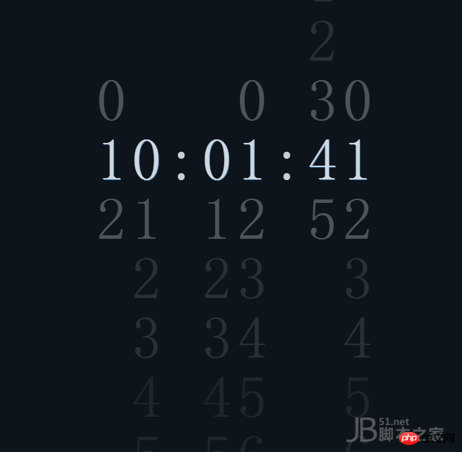
This article teaches you how to use JS code and CSS styles to achieve the animation effect of a rolling clock. Let’s learn together.
In this article, we use js and css style sheets to realize the animation effect of a rolling clock. This effect is generally used in the opening animation of the web page and the time display in the area. It is very beautiful and the animation effect is also very personalized. , let’s first look at the effect after running:
The following is the entire code of this rolling clock animation:
<!DOCTYPE html PUBLIC "-//W3C//DTD XHTML 1.0 Transitional//EN" "http://www.w3.org/TR/xhtml1/DTD/xhtml1-transitional.dtd">
<html xmlns="http://www.w3.org/1999/xhtml">
<head>
<meta http-equiv="Content-Type" content="text/html; charset=gb2312" />
<title>CSS3+JS滾動(dòng)數(shù)字時(shí)鐘代碼-腳本之家</title>
<style>
body{text-align: center;background-color: #0e141b;color: rgba(224, 230, 235, 0.89);font-family: 'Roboto Condensed', sans-serif;font-weight: 300;overflow: hidden;}
.column,.colon{display: inline-block;vertical-align: top;font-size: 86px;line-height: 86px;}
.column{-webkit-transition: -webkit-transform 300ms;transition: -webkit-transform 300ms;transition: transform 300ms;transition: transform 300ms, -webkit-transform 300ms;}
.colon{-webkit-transition: -webkit-transform 300ms;transition: -webkit-transform 300ms;transition: transform 300ms;transition: transform 300ms, -webkit-transform 300ms;-webkit-transform: translateY(calc(50vh - 43px));transform: translateY(calc(50vh - 43px));}
.colon:after{content: ':';}
.num{-webkit-transition: opacity 500ms, text-shadow 100ms;transition: opacity 500ms, text-shadow 100ms;opacity: 0.025;}
.num.visible{opacity: 1.0;text-shadow: 1px 1px 0px #336699;}
.num.close{opacity: 0.35;}
.num.far{opacity: 0.15;}
.num.distant{opacity: 0.1;}
</style>
</head>
<body>
<p class="column">
<p class="num">0</p>
<p class="num">1</p>
<p class="num">2</p>
</p>
<p class="column">
<p class="num">0</p>
<p class="num">1</p>
<p class="num">2</p>
<p class="num">3</p>
<p class="num">4</p>
<p class="num">5</p>
<p class="num">6</p>
<p class="num">7</p>
<p class="num">8</p>
<p class="num">9</p>
</p>
<p class="colon"></p>
<p class="column">
<p class="num">0</p>
<p class="num">1</p>
<p class="num">2</p>
<p class="num">3</p>
<p class="num">4</p>
<p class="num">5</p>
</p>
<p class="column">
<p class="num">0</p>
<p class="num">1</p>
<p class="num">2</p>
<p class="num">3</p>
<p class="num">4</p>
<p class="num">5</p>
<p class="num">6</p>
<p class="num">7</p>
<p class="num">8</p>
<p class="num">9</p>
</p>
<script>
'use strict';
var size = 86;
var columns = Array.from(document.getElementsByClassName('column'));
var d = undefined,
c = undefined;
var classList = ['visible', 'close', 'far', 'far', 'distant', 'distant'];
var use24HourClock = true;
function padClock(p, n) {
return p + ('0' + n).slice(-2);
}
function getClock() {
d = new Date();
return [use24HourClock ? d.getHours() : d.getHours() % 12 || 12, d.getMinutes(), d.getSeconds()].reduce(padClock, '');
}
function getClass(n, i2) {
return classList.find(function (class_, classIndex) {
return i2 - classIndex === n || i2 + classIndex === n;
}) || '';
}
var loop = setInterval(function () {
c = getClock();
columns.forEach(function (ele, i) {
var n = +c[i];
var offset = -n * size;
ele.style.transform = 'translateY(calc(50vh + ' + offset + 'px - ' + size / 2 + 'px))';
Array.from(ele.children).forEach(function (ele2, i2) {
ele2.className = 'num ' + getClass(n, i2);
});
});
}, 200 + Math.E * 10);
</script>
</body>
</html>Note: The top one is CSS style content, where you can adjust the color, font, etc.
<style>
body{text-align: center;background-color: #0e141b;color: rgba(224, 230, 235, 0.89);font-family: 'Roboto Condensed', sans-serif;font-weight: 300;overflow: hidden;}
.column,.colon{display: inline-block;vertical-align: top;font-size: 86px;line-height: 86px;}
.column{-webkit-transition: -webkit-transform 300ms;transition: -webkit-transform 300ms;transition: transform 300ms;transition: transform 300ms, -webkit-transform 300ms;}
.colon{-webkit-transition: -webkit-transform 300ms;transition: -webkit-transform 300ms;transition: transform 300ms;transition: transform 300ms, -webkit-transform 300ms;-webkit-transform: translateY(calc(50vh - 43px));transform: translateY(calc(50vh - 43px));}
.colon:after{content: ':';}
.num{-webkit-transition: opacity 500ms, text-shadow 100ms;transition: opacity 500ms, text-shadow 100ms;opacity: 0.025;}
.num.visible{opacity: 1.0;text-shadow: 1px 1px 0px #336699;}
.num.close{opacity: 0.35;}
.num.far{opacity: 0.15;}
.num.distant{opacity: 0.1;}
</style>The JS code is mainly used to control the scrolling effect of animation, and CSS is used to control the size of numbers and other content.
The above is what I compiled for everyone. I hope it will be helpful to everyone in the future.
Related articles:
How to use javascript to obtain different prices every day within the date range
How to implement the image loading component in vue
Why will Node.js become a web application development?
How to get the file upload progress in Node.js?
How to implement the longest common subsequence in javascript
About how vue implements dynamic loading of image src
The above is the detailed content of How to implement a rolling digital clock in JS+CSS. For more information, please follow other related articles on the PHP Chinese website!

Hot AI Tools

Undress AI Tool
Undress images for free

Undresser.AI Undress
AI-powered app for creating realistic nude photos

AI Clothes Remover
Online AI tool for removing clothes from photos.

Clothoff.io
AI clothes remover

Video Face Swap
Swap faces in any video effortlessly with our completely free AI face swap tool!

Hot Article
Hot Tools

Notepad++7.3.1
Easy-to-use and free code editor

SublimeText3 Chinese version
Chinese version, very easy to use

Zend Studio 13.0.1
Powerful PHP integrated development environment

Dreamweaver CS6
Visual web development tools

SublimeText3 Mac version
God-level code editing software (SublimeText3)
Hot Topics


 What is 'render-blocking CSS'?
Jun 24, 2025 am 12:42 AM
What is 'render-blocking CSS'?
Jun 24, 2025 am 12:42 AM
CSS blocks page rendering because browsers view inline and external CSS as key resources by default, especially with imported stylesheets, header large amounts of inline CSS, and unoptimized media query styles. 1. Extract critical CSS and embed it into HTML; 2. Delay loading non-critical CSS through JavaScript; 3. Use media attributes to optimize loading such as print styles; 4. Compress and merge CSS to reduce requests. It is recommended to use tools to extract key CSS, combine rel="preload" asynchronous loading, and use media delayed loading reasonably to avoid excessive splitting and complex script control.
 What is Autoprefixer and how does it work?
Jul 02, 2025 am 01:15 AM
What is Autoprefixer and how does it work?
Jul 02, 2025 am 01:15 AM
Autoprefixer is a tool that automatically adds vendor prefixes to CSS attributes based on the target browser scope. 1. It solves the problem of manually maintaining prefixes with errors; 2. Work through the PostCSS plug-in form, parse CSS, analyze attributes that need to be prefixed, and generate code according to configuration; 3. The usage steps include installing plug-ins, setting browserslist, and enabling them in the build process; 4. Notes include not manually adding prefixes, keeping configuration updates, prefixes not all attributes, and it is recommended to use them with the preprocessor.
 How can you animate an SVG with CSS?
Jun 30, 2025 am 02:06 AM
How can you animate an SVG with CSS?
Jun 30, 2025 am 02:06 AM
AnimatingSVGwithCSSispossibleusingkeyframesforbasicanimationsandtransitionsforinteractiveeffects.1.Use@keyframestodefineanimationstagesforpropertieslikescale,opacity,andcolor.2.ApplytheanimationtoSVGelementssuchas,,orviaCSSclasses.3.Forhoverorstate-b
 What is the conic-gradient() function?
Jul 01, 2025 am 01:16 AM
What is the conic-gradient() function?
Jul 01, 2025 am 01:16 AM
Theconic-gradient()functioninCSScreatescirculargradientsthatrotatecolorstopsaroundacentralpoint.1.Itisidealforpiecharts,progressindicators,colorwheels,anddecorativebackgrounds.2.Itworksbydefiningcolorstopsatspecificangles,optionallystartingfromadefin
 What is the scope of a CSS Custom Property?
Jun 25, 2025 am 12:16 AM
What is the scope of a CSS Custom Property?
Jun 25, 2025 am 12:16 AM
The scope of CSS custom properties depends on the context of their declaration, global variables are usually defined in :root, while local variables are defined within a specific selector for componentization and isolation of styles. For example, variables defined in the .card class are only available for elements that match the class and their children. Best practices include: 1. Use: root to define global variables such as topic color; 2. Define local variables inside the component to implement encapsulation; 3. Avoid repeatedly declaring the same variable; 4. Pay attention to the coverage problems that may be caused by selector specificity. Additionally, CSS variables are case sensitive and should be defined before use to avoid errors. If the variable is undefined or the reference fails, the fallback value or default value initial will be used. Debug can be done through the browser developer
 CSS tutorial focusing on mobile-first design
Jul 02, 2025 am 12:52 AM
CSS tutorial focusing on mobile-first design
Jul 02, 2025 am 12:52 AM
Mobile-firstCSSdesignrequiressettingtheviewportmetatag,usingrelativeunits,stylingfromsmallscreensup,optimizingtypographyandtouchtargets.First,addtocontrolscaling.Second,use%,em,orreminsteadofpixelsforflexiblelayouts.Third,writebasestylesformobile,the
 CSS tutorial for creating loading spinners and animations
Jul 07, 2025 am 12:07 AM
CSS tutorial for creating loading spinners and animations
Jul 07, 2025 am 12:07 AM
There are three ways to create a CSS loading rotator: 1. Use the basic rotator of borders to achieve simple animation through HTML and CSS; 2. Use a custom rotator of multiple points to achieve the jump effect through different delay times; 3. Add a rotator in the button and switch classes through JavaScript to display the loading status. Each approach emphasizes the importance of design details such as color, size, accessibility and performance optimization to enhance the user experience.
 What are the three ways to insert CSS into a webpage?
Jun 24, 2025 am 12:36 AM
What are the three ways to insert CSS into a webpage?
Jun 24, 2025 am 12:36 AM
There are three ways to insert web pages in CSS: 1. Inline styles are suitable for single element modification or debugging, but are not conducive to maintenance and reuse; 2. Internal style sheets are suitable for small projects or test pages, and the current page style is unified but cannot be shared across pages; 3. External style sheets are most recommended, suitable for multi-page projects, centrally manage styles, improve maintenance and loading speed. In actual development, external style sheets are preferred, and the other two methods are considered in special circumstances.
