


To add a secondary axis in Excel, first ensure your chart type supports it (like column, bar, line, or area), avoiding unsupported types like pie or radar charts. Next, with two data series present, click the chart, use the Chart Elements button to select Axes > Secondary Axis or right-click the data series and choose "Plot Series On > Secondary Axis". Finally, customize the appearance by matching colors, labeling both axes, adjusting scale values if needed, and changing chart types for clarity when one dataset is significantly smaller.

Adding a secondary axis in Excel is super handy when you're comparing two data sets that have different scales. Like, imagine you've got sales numbers in the thousands and percentage growth in single digits — trying to show both on the same axis makes one of them basically disappear. The fix? A secondary axis. Let's jump into how to do it.
Select the right chart type
Before even thinking about a secondary axis, make sure your chart supports it. Most combo charts (like column line) work well. If you're using something like a pie chart or a 3D chart, you’re out of luck — those don't support secondary axes.

Here’s what to check:
- Stick with column, bar, line, or area charts
- Avoid pie, doughnut, or radar charts
- Combo charts are often the easiest path
If you're not already on a compatible chart, convert it first by right-clicking the chart > Change Chart Type and picking a combo or standard format.

Add the secondary axis in just a few clicks
Once your chart is set up with two data series, here’s how to separate them:
- Click on the chart to select it
- Click the Chart Elements button (the plus sign)
- Hover over Axes, then click the arrow next to it and choose Secondary Horizontal Axis or Secondary Vertical Axis, depending on what you need
- Or, right-click the data series you want to move to the secondary axis > Format Data Series > Plot Series On > Secondary Axis
This will instantly add a second axis — usually on the right side for vertical or top for horizontal — and your selected data series will shift to use that instead.
Customize appearance so it doesn’t get confusing
Now that you’ve got two axes, things can get messy fast. Here’s how to clean it up:
- Make sure each data series clearly matches its axis (e.g., line color matches axis color)
- You can format the secondary axis by right-clicking it and choosing Format Axis — adjust min/max values if needed
- Label both axes so viewers know what they’re looking at
- If one data series is way smaller, consider changing its chart type (like switching from bar to line)
The goal is clarity — people shouldn’t have to guess which line goes with which scale.
And that’s pretty much it. Once you know where the options live, adding a secondary axis becomes second nature. It’s not complicated, but it’s easy to overlook unless you really need it — like when your boss asks why one data set looks flat when it’s actually doing great, just on a different scale.
The above is the detailed content of how to add a secondary axis to an excel chart. For more information, please follow other related articles on the PHP Chinese website!

Hot AI Tools

Undress AI Tool
Undress images for free

Undresser.AI Undress
AI-powered app for creating realistic nude photos

AI Clothes Remover
Online AI tool for removing clothes from photos.

Clothoff.io
AI clothes remover

Video Face Swap
Swap faces in any video effortlessly with our completely free AI face swap tool!

Hot Article
Hot Tools

Notepad++7.3.1
Easy-to-use and free code editor

SublimeText3 Chinese version
Chinese version, very easy to use

Zend Studio 13.0.1
Powerful PHP integrated development environment

Dreamweaver CS6
Visual web development tools

SublimeText3 Mac version
God-level code editing software (SublimeText3)
Hot Topics


 How to Use Parentheses, Square Brackets, and Curly Braces in Microsoft Excel
Jun 19, 2025 am 03:03 AM
How to Use Parentheses, Square Brackets, and Curly Braces in Microsoft Excel
Jun 19, 2025 am 03:03 AM
Quick Links Parentheses: Controlling the Order of Opera
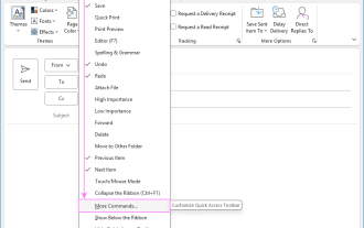 Outlook Quick Access Toolbar: customize, move, hide and show
Jun 18, 2025 am 11:01 AM
Outlook Quick Access Toolbar: customize, move, hide and show
Jun 18, 2025 am 11:01 AM
This guide will walk you through how to customize, move, hide, and show the Quick Access Toolbar, helping you shape your Outlook workspace to fit your daily routine and preferences. The Quick Access Toolbar in Microsoft Outlook is a usefu
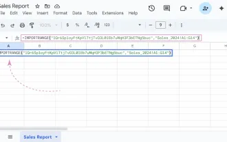 Google Sheets IMPORTRANGE: The Complete Guide
Jun 18, 2025 am 09:54 AM
Google Sheets IMPORTRANGE: The Complete Guide
Jun 18, 2025 am 09:54 AM
Ever played the "just one quick copy-paste" game with Google Sheets... and lost an hour of your life? What starts as a simple data transfer quickly snowballs into a nightmare when working with dynamic information. Those "quick fixes&qu
 Don't Ignore the Power of F9 in Microsoft Excel
Jun 21, 2025 am 06:23 AM
Don't Ignore the Power of F9 in Microsoft Excel
Jun 21, 2025 am 06:23 AM
Quick LinksRecalculating Formulas in Manual Calculation ModeDebugging Complex FormulasMinimizing the Excel WindowMicrosoft Excel has so many keyboard shortcuts that it can sometimes be difficult to remember the most useful. One of the most overlooked
 6 Cool Right-Click Tricks in Microsoft Excel
Jun 24, 2025 am 12:55 AM
6 Cool Right-Click Tricks in Microsoft Excel
Jun 24, 2025 am 12:55 AM
Quick Links Copy, Move, and Link Cell Elements
 Prove Your Real-World Microsoft Excel Skills With the How-To Geek Test (Advanced)
Jun 17, 2025 pm 02:44 PM
Prove Your Real-World Microsoft Excel Skills With the How-To Geek Test (Advanced)
Jun 17, 2025 pm 02:44 PM
Whether you've recently taken a Microsoft Excel course or you want to verify that your knowledge of the program is current, try out the How-To Geek Advanced Excel Test and find out how well you do!This is the third in a three-part series. The first i
 How to recover unsaved Word document
Jun 27, 2025 am 11:36 AM
How to recover unsaved Word document
Jun 27, 2025 am 11:36 AM
1. Check the automatic recovery folder, open "Recover Unsaved Documents" in Word or enter the C:\Users\Users\Username\AppData\Roaming\Microsoft\Word path to find the .asd ending file; 2. Find temporary files or use OneDrive historical version, enter ~$ file name.docx in the original directory to see if it exists or log in to OneDrive to view the version history; 3. Use Windows' "Previous Versions" function or third-party tools such as Recuva and EaseUS to scan and restore and completely delete files. The above methods can improve the recovery success rate, but you need to operate as soon as possible and avoid writing new data. Automatic saving, regular saving or cloud use should be enabled
 5 New Microsoft Excel Features to Try in July 2025
Jul 02, 2025 am 03:02 AM
5 New Microsoft Excel Features to Try in July 2025
Jul 02, 2025 am 03:02 AM
Quick Links Let Copilot Determine Which Table to Manipu
