


This article explores Bootstrap's card component, a versatile tool for creating visually appealing and responsive web layouts. We'll cover its uses, customization, and best practices for optimal performance.

Why Use Bootstrap Cards?
Bootstrap, a leading responsive web framework, simplifies creating stunning layouts. Its advantages include:
- Effortless Responsive Design: Requires minimal HTML and CSS knowledge.
- Mobile-First Approach: Prioritizes mobile responsiveness.
- Cross-Browser Compatibility: Works seamlessly across major browsers.
- Flexbox-Based Grid: Streamlines alignment and spacing.
- Extensive Components: Offers reusable elements like buttons, modals, and cards.
The latest Bootstrap version significantly enhances the card component, replacing older elements like panels and thumbnails.
Understanding Bootstrap Cards
Bootstrap cards are flexible containers for various content types (text, images, multimedia). Key features include:
-
Simplicity: Easily created using classes like
card-bodyandcard-text. - Content Versatility: Supports titles, images, lists, and more.
- Responsiveness: Adapts to different screen sizes using Bootstrap's grid system.
- Customization: Utility classes allow for styling adjustments (colors, borders, alignment).
- Advanced Layouts: Supports card groups, decks (deprecated in Bootstrap 5), and column layouts for complex arrangements.
Essential Bootstrap Card Classes
Here's a summary of key classes:
-
card: The main card container. -
card-body: The card's content area. -
card-title: Styles the card title (often used with<h3></h3>or<h4></h4>). -
card-text: Styles standard text within the card. -
card-header: Creates a header section. -
card-footer: Creates a footer section. -
card-img-top/card-img-bottom: Positions images at the top or bottom. -
list-group/list-group-item: Creates lists within the card. -
card-group: Groups cards with equal width and height. -
card-deck: (Deprecated in Bootstrap 5) Aligns cards with spacing. -
text-*/bg-*: Utility classes for text and background colors.
Integrating Bootstrap
Include Bootstrap via a CDN or download it from http://www.miracleart.cn/link/735dd629ab696e3a1bfcc0fe0d687bb1. Here's a CDN example for index.html:
<!DOCTYPE html>
<html lang="en">
<head>
    <meta charset="utf-8">
    <meta name="viewport" content="width=device-width, initial-scale=1, shrink-to-fit=no">
    <link href="https://cdn.jsdelivr.net/npm/bootstrap@5.3.3/dist/css/bootstrap.min.css" rel="stylesheet" integrity="sha384-QWTKZyjpPEjISv5WaRU9OFeRpok6YctnYmDr5pNlyT2bRjXh0JMhjY6hW+ALEwIH" crossorigin="anonymous">
    <title>Bootstrap Card Example</title>
</head>
<body>
    <div class="container mt-5">
        <div class="card" style="width: 18rem;">
            <div class="card-header bg-primary text-white">
                Example Card Header
            </div>
            <div class="card-body">
                <h5 class="card-title">Example Card Title</h5>
                <p class="card-text">This is an example card using Bootstrap 5.</p>
                <a href="http://www.miracleart.cn/link/93ac0c50dd620dc7b88e5fe05c70e15b" class="btn btn-primary">Go somewhere</a>
            </div>
        </div>
    </div>

    <??>
</body>
</html>
This uses a CDN for easy setup. Refer to the Bootstrap documentation for more detailed setup options.
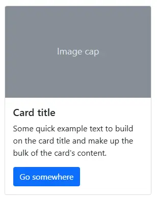
Creating Basic Cards
A simple card uses the .card class as a container, with .card-body, .card-title, .card-text, and .card-img-top for content. Examples and screenshots are provided in the original text, demonstrating horizontal cards, list groups, headers, footers, image overlays, and image caps. These are all visually illustrated in the original text.
Responsive Design
Bootstrap's grid system ensures responsiveness. The original text provides code examples and screenshots demonstrating responsive card layouts using row and column classes.
Adjusting Card Size
Control card width and height using inline styles (style="width: 10rem;") or Bootstrap utility classes. The original text provides examples and screenshots. It also discusses the shift to rem units in newer Bootstrap versions for better scalability.
Card Styling
Customize card appearance using utility classes like bg-*, text-*, and border-* for background, text, and border colors. Examples and a screenshot showcasing various styles are included in the original text. The use of header styles is also explained.
Advanced Layouts
The original text details creating advanced layouts using card-group (for attached cards of equal size), the replacement of card-deck with the grid system (for spaced cards), and the absence of card-columns in Bootstrap 5 (suggesting alternatives like CSS Masonry or Masonry.js). Visual examples are provided.
Performance Optimization
The article concludes with essential performance optimization techniques: lazy loading images, optimizing image sizes, minifying CSS/JS, using SVGs for icons, preloading/prefetching resources, reducing DOM complexity, and optimizing fonts. Code examples illustrate best practices.
Conclusion
Bootstrap cards are powerful tools for creating modern, responsive web layouts. The article provides a comprehensive guide, covering basic usage, customization, advanced layouts, and performance optimization. The original text's screenshots and code examples are essential for understanding the concepts discussed here.
The above is the detailed content of Bootstrap Card Component: a Complete Introduction. For more information, please follow other related articles on the PHP Chinese website!

Hot AI Tools

Undress AI Tool
Undress images for free

Undresser.AI Undress
AI-powered app for creating realistic nude photos

AI Clothes Remover
Online AI tool for removing clothes from photos.

Clothoff.io
AI clothes remover

Video Face Swap
Swap faces in any video effortlessly with our completely free AI face swap tool!

Hot Article
Hot Tools

Notepad++7.3.1
Easy-to-use and free code editor

SublimeText3 Chinese version
Chinese version, very easy to use

Zend Studio 13.0.1
Powerful PHP integrated development environment

Dreamweaver CS6
Visual web development tools

SublimeText3 Mac version
God-level code editing software (SublimeText3)
Hot Topics


 What is 'render-blocking CSS'?
Jun 24, 2025 am 12:42 AM
What is 'render-blocking CSS'?
Jun 24, 2025 am 12:42 AM
CSS blocks page rendering because browsers view inline and external CSS as key resources by default, especially with imported stylesheets, header large amounts of inline CSS, and unoptimized media query styles. 1. Extract critical CSS and embed it into HTML; 2. Delay loading non-critical CSS through JavaScript; 3. Use media attributes to optimize loading such as print styles; 4. Compress and merge CSS to reduce requests. It is recommended to use tools to extract key CSS, combine rel="preload" asynchronous loading, and use media delayed loading reasonably to avoid excessive splitting and complex script control.
 External vs. Internal CSS: What's the Best Approach?
Jun 20, 2025 am 12:45 AM
External vs. Internal CSS: What's the Best Approach?
Jun 20, 2025 am 12:45 AM
ThebestapproachforCSSdependsontheproject'sspecificneeds.Forlargerprojects,externalCSSisbetterduetomaintainabilityandreusability;forsmallerprojectsorsingle-pageapplications,internalCSSmightbemoresuitable.It'scrucialtobalanceprojectsize,performanceneed
 Does my CSS must be on lower case?
Jun 19, 2025 am 12:29 AM
Does my CSS must be on lower case?
Jun 19, 2025 am 12:29 AM
No,CSSdoesnothavetobeinlowercase.However,usinglowercaseisrecommendedfor:1)Consistencyandreadability,2)Avoidingerrorsinrelatedtechnologies,3)Potentialperformancebenefits,and4)Improvedcollaborationwithinteams.
 CSS Case Sensitivity: Understanding What Matters
Jun 20, 2025 am 12:09 AM
CSS Case Sensitivity: Understanding What Matters
Jun 20, 2025 am 12:09 AM
CSSismostlycase-insensitive,butURLsandfontfamilynamesarecase-sensitive.1)Propertiesandvalueslikecolor:red;arenotcase-sensitive.2)URLsmustmatchtheserver'scase,e.g.,/images/Logo.png.3)Fontfamilynameslike'OpenSans'mustbeexact.
 What is Autoprefixer and how does it work?
Jul 02, 2025 am 01:15 AM
What is Autoprefixer and how does it work?
Jul 02, 2025 am 01:15 AM
Autoprefixer is a tool that automatically adds vendor prefixes to CSS attributes based on the target browser scope. 1. It solves the problem of manually maintaining prefixes with errors; 2. Work through the PostCSS plug-in form, parse CSS, analyze attributes that need to be prefixed, and generate code according to configuration; 3. The usage steps include installing plug-ins, setting browserslist, and enabling them in the build process; 4. Notes include not manually adding prefixes, keeping configuration updates, prefixes not all attributes, and it is recommended to use them with the preprocessor.
 What are CSS counters?
Jun 19, 2025 am 12:34 AM
What are CSS counters?
Jun 19, 2025 am 12:34 AM
CSScounterscanautomaticallynumbersectionsandlists.1)Usecounter-resettoinitialize,counter-incrementtoincrease,andcounter()orcounters()todisplayvalues.2)CombinewithJavaScriptfordynamiccontenttoensureaccurateupdates.
 CSS: When Does Case Matter (and When Doesn't)?
Jun 19, 2025 am 12:27 AM
CSS: When Does Case Matter (and When Doesn't)?
Jun 19, 2025 am 12:27 AM
In CSS, selector and attribute names are case-sensitive, while values, named colors, URLs, and custom attributes are case-sensitive. 1. The selector and attribute names are case-insensitive, such as background-color and background-Color are the same. 2. The hexadecimal color in the value is case-sensitive, but the named color is case-sensitive, such as red and Red is invalid. 3. URLs are case sensitive and may cause file loading problems. 4. Custom properties (variables) are case sensitive, and you need to pay attention to the consistency of case when using them.
 What is the conic-gradient() function?
Jul 01, 2025 am 01:16 AM
What is the conic-gradient() function?
Jul 01, 2025 am 01:16 AM
Theconic-gradient()functioninCSScreatescirculargradientsthatrotatecolorstopsaroundacentralpoint.1.Itisidealforpiecharts,progressindicators,colorwheels,anddecorativebackgrounds.2.Itworksbydefiningcolorstopsatspecificangles,optionallystartingfromadefin
